Construction and real estate activities are very specific. By targeting the world’s leading brands, customers with claims to the luxury segment will always have a clear idea of what logo they want to see.
Such interesting personalities as Petr and Fed Novikov, ex-Strelka and Airbnb, the founders of Apt Buildings, have their worldview and creative vision. They have a non-standard approach to visual art and to life in general, as well as to business. Fresh thoughts and views that make you move immovable, or rather real estate. For such creative personalities, home is not just a place to live. It is a platform for realizing your creative ambitions, dreams, emotions, aesthetic taste, and new stunning ideas. It is important for them to create a house in which one could live not just for a long time, but even forever, so that not in a box, but in an oasis, where every corner will be filled with its special meaning.
The Apt brand has become an example of a unique visualization style, taking into account the preparation for the release of the logo and, in general, the entire process of creative generation.
The logo is not about like and being elevated to the rank of hype on the Internet; it is not something monstrously ancient and will be a symbol of the eternal and unshakable, cosmic and fantastic. This is a non-trivial view of trivial things.
It would seem, what can surprise you now when so many ideas and different creatives are promoted in the visual world culture? It turns out that there is something.
The idea of the logo is based on the concept of “subconscious luxury.” Textures, shapes, visual illusions, creating riddles and solving puzzles that only half-open outwardly, and then think out for yourself.
Different, exclusive, and somewhat even funny. These descriptive characteristics should be used on a par with the Apt brand.
I wanted to emphasize simplicity and grace in the brand logo. There are only three letters, but how to connect them to make it innovative and even with a wow-effect? It was impossible to imagine a naive, simple, and childish design. This would be a decision to cut the entire creative initiative in the bud.
Therefore, we came up with our own unique and inimitable “face” of the brand. There were no clear guidelines, no associations, a complete carte blanche for designers. Therefore, they went all out, looking for the right approach to creating an image.
Thus, following the path of modeling, we studied the features of texture, alternatives to font images of the alphabet. Simple scribbles were used, which could be stylized and made something unusual.
Several fundamentally different approaches were implemented at the stage of preparing the sketches. The ideas of the logo were depicted in the form of old stamps, volumetric letters, on a stone, cast from metal, and, of course, more familiar forms for the layman, just for comparison.
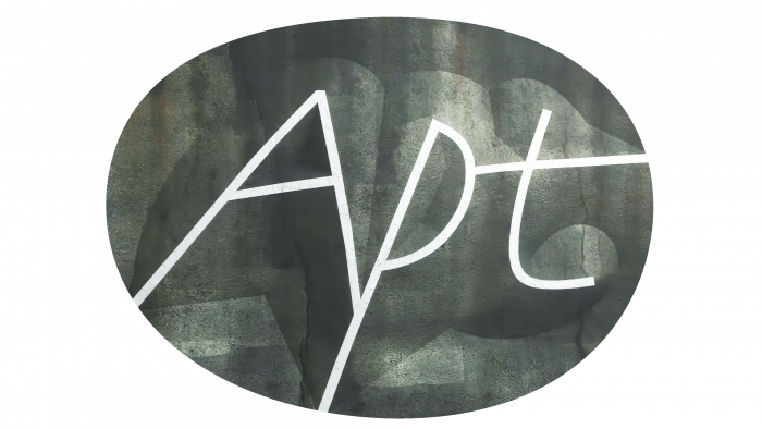
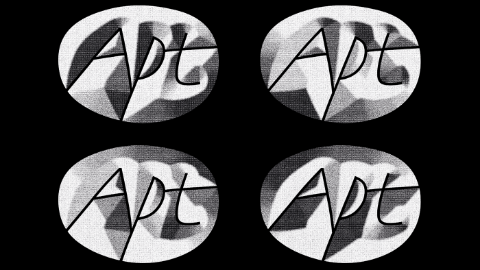
It turned out unexpectedly cool. The thin lines of the three letters encircled in an uneven circle, even closer to the shape of an oval, were rendered by the designers on different stone surfaces, which gave a three-dimensional effect to the name. The secret to the beauty and spectacle of the image lies in the use of different rendering models, although in reality, the logo looks like uneven lettering made by a pen with a thin rod.
The image is transformed in combination with other elements. It seems that the creative people wanted to show precisely the harmony and unity with the surrounding world and the environment. They certainly succeeded 100%.


