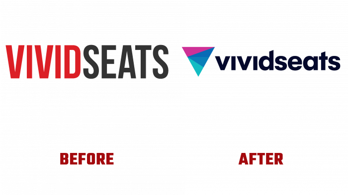
One of the features of our time is to ensure the simplicity and convenience of performing various actions for the consumer of goods and services. Such conditions are provided in its field by the independent trading platform Vivid Seats, which has carried out a series of transformations that culminated in a change in strategy and changes in its image.
Founded in 2001 in Chicago by Illinois Jerry Bednyak and Eric Vassilatos as a virtual ticketing organization, it is now the third most established reseller. Its functions include mediation between buyers and businesses that sell tickets with delivery. In 2014, there was a need to expand the office part of the enterprise. The headquarters was moved to West Loop. The old premises were left for the operators. Increasing the volume and reach of potential customers, the company acquired Fanxchange, Toronto, in 2019, which was engaged in developing various types of software. Thus, Vivid Seats expanded its capabilities and reduced the cost of this direction for its own needs. To improve the quality of service and increase attractiveness, the company has developed several improvements, including a loyalty program, which includes rewards, free tickets, the ability to climb several levels, giving privileges, birthday gifts.
The site decided to combine the current changes with the reorganization of its own visual identity. The popular web service INDUSTRY carried out its development and implementation in the field of rebranding. The update has affected the brand, website, and all applications. The new logo has become a vivid reflection of the company’s personality. The symbol of a triangular prism reflects its versatility with a multicolored iridescent face. The triangular prism pointing downwards symbolizes the completeness and fluidity of all that exists, which indicates the constancy of improving changes, moving forward in its development. Vivid Seats. Next to it, there is a name without spaces in a single capital type Afical Neue Extra Bold in monochrome. To create an attractive symmetry, the top of the “d” leg has an angle similar to the top of the “t.” The roundness of the letters and the absence of an assertive lowercase character in the word ensured a pleasant visual perception, ease of memorization, and demonstration of the equivalence for the company of all its customers, buyers, and sellers.


