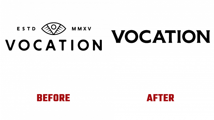
Founded in 2015 by John Hickling, Vocation brewery in the British town of Hebden Brigde has changed its visual identity. Created as an enterprise for additional income by a bank employee, a specialist in IT technologies, the brewery suddenly began to bring in huge profits. The products turned out to be of such high quality and taste that today the company has 60 employees, and the sales volume amounted to about 10 million cans per year. John Hickling decided to change the corporate identity of his enterprise to expand the reach of consumers. The company began selling its beer directly to restaurants, bars, hotels without intermediaries. To create a new visual identity, the company’s founder turned to the design agency Robot Food.
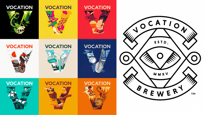
The new style has changed the direction of the visual reference. Now the main focus was on promoting the brand, the brewery itself. The renewal also affected the brand strategy, according to the new sales policy. Expanding sales beyond the specific product location became an urgent need, since being sold only through the retail network, the brand was lost among the abundance of similar offers, even of inferior quality. At the same time, the exclusivity of the design was preserved – the gambling inherent in the brand, joy, everything that made the brand noticeable.
To achieve the desired result, the technology was applied – “simplify and expand.” It is distinguished by a high degree of efficiency of influence on the buyer, functionality that combines the component, and flexibility in forming a new identity. The main focus was on the logo text mark. In this way, the designers have achieved the required attention to the brand itself. Designed by Lewis McGuffie specifically for this purpose, the Hebden typeface renders it visually a somewhat ponderous industrial name. The letter “V” made with the expansion of the upper ends of the “legs” and the same design in the lower part gives the special text appeal. For the formation of visual unity, the same graphic techniques were used on the letters “A,” “T,” “I,” and “N.” The “V” design made it particularly effective as a single sign, the use of which provided individuality to all advertising products. The brand’s overall style has moved away from the use of a central black color, expanding its visualization to original multicolor with bold and bold combinations.


