Winnipeg Goldeyes, the top baseball team in the Canadian capital of Manitoba, has undergone a full rebranding for the first time since its inception. The team made a name for itself in 1994 at the Northern League competition. Taking this name, the team demonstrated patriotism towards their region. The main symbol was the freshwater gold-eyed fish found in Lake Winnipeg and is a favorite delicacy not only for residents. Lately, the team has experienced many changes caused by the transfer to another league, the successes achieved in previous seasons, and the loneliness caused by the pandemic. Today is the time to move forward and innovate – making dramatic changes to your visual identity.
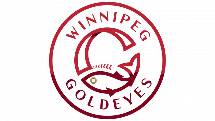
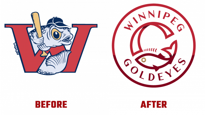
The makeover was based on past achievements and the entire history of the team. The abandonment of the cartoon character in the form of a fish in a baseball cap reduced the visual burden on the emblem. It made it readable in any application, even when reduced in size. The simplification of the image is not just a tribute to the modern trend. The circle shape adopted for its display provided a better visual perception of the emblem, creating all the conditions for a high-quality display of the logo on various types of media and in digital technologies. Placement of the team name around the central element – the letter “G” on the inner circle of the emblem ensured the ease of reading the text and the required emphasis on the letter. To enhance the accent effect, this element was made in two parts, complimenting each other and ensuring the creation of the required shape. The lower half of the letter is made in the form of a “golden eye” beating with its tail and having a golden eye. The upper one is the intersection of two curving ribbons symbolizing the “Red” and “Assiniboine” crossing near the stadium.
The letter symbol can be associated with the letter “G” only with a stretch in this design. It more closely resembles the “C” silhouette due to the slight twist of the tail tip, designed to play the role of the central line of G. However; the emblem has become more accurately convey not only the spirit of the baseball team but also the characteristics of the entire region.
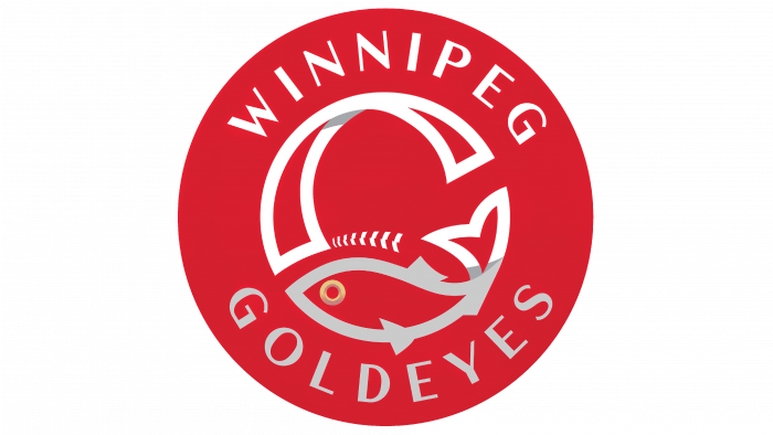
The symbology has retained the team’s traditional red color as a filled background. White was taken as the color of the logo elements – for the upper half and gray, in which all parts of the composition in the lower sector of the circle are made. The combination of these shades of color created the required visual impact on the fans and the contrast that delineates the elements of the composition.


