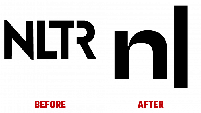
NewsLabTurkey strives to educate and inform individuals and legal entities in Turkey’s journalism industry about the practice of journalism. The brand tried to visualize its goals and objectives by creating a new modern identity developed and implemented by Oğuzhan Öçalan. As a leading representative of the Turkish digital journalism sector, the brand has developed many additional directions, demonstrating the arrival of a new era of evolution built on the digital revolution. The computer era has created new ways of thinking and human behavior, paving the way for other methods and technologies. One of these “gifts” was digital technology, making it possible to write and depict everything digitally.
NewsLabTurkey tried to visualize its idea using modern technology, using live graphic elements, which were realized with the help of a beautiful and immortal cursor. The idea of using the cursor as an ideal conceptual graphic display of the brand’s essence did not appear out of nowhere. Dealing with the issue of rebranding in digital format, the cursor brought inspiration, made you realize its importance and necessity. With its help, it became possible to transform the brand’s voice into a dynamic and attractive one, rather than the one used until recently.
The cursor began to work very effectively with fonts, which required the right approach to the details of corporate typography. The font for the logo was required to be organic in its graphic design, as the brand uses type, writing, fonts as its most important tool. The choice fell on the retro-type Clash Display, which looks very impressive in modern digital media, as it has a digital atmosphere. This graphical property renders the font very well in headings, captions, word signs, making it easy to read at any scale and memorable. For the main text, Zodiak was selected, which shone with beautiful and smooth curves, various options for styles, and ease of reading.
To create an imitation of the cursor effect, a graphic animation was created – a vertical line glyph, which was part of the font itself. The full-size line was not used to provide a consistent composition without creating a dominant cursor.
Considering the presence of 7 sub-brands, a special color palette was applied, making it possible to separate them, providing individuality and recognizability. They have acquired their dynamic visual language that is in no way dissonant with the main voice of the brand itself. The result was an original, unique, and contemporary interpretation of a new style and visual identity.


