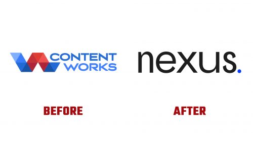
Nexus, formerly known as Content Marketing Works, has launched its new brand identity to mark a significant shift in its operational focus and to reinforce its commitment to serving the mining, energy, and agriculture industries more effectively. As a newly established entity in 2023, Nexus operates under the umbrella of Aspermont, a leading B2B media services provider with a rich heritage in the global resources sector. This strategic realignment aims to leverage Aspermont’s extensive media network, including prestigious titles like Mining Journal and Mining Magazine, to deliver unparalleled marketing solutions to clients within these core industries.
The rebranding initiative, led by the Sydney office of SomeOne, introduces the Nexus logo as a cornerstone of the agency’s new visual and strategic direction. The previous branding, while functional, lacked the distinctiveness and flexibility required to stand out in a competitive marketplace. The new name, Nexus, suggests a more dynamic and interconnected approach to integrated marketing, emphasizing the agency’s role in bridging ideas and audiences across a global platform. This name change reflects a broader ambition to connect Aspermont’s clients with over 3 million industry contacts, providing strategic direction, creative production, media planning, and content distribution through an extensive network.
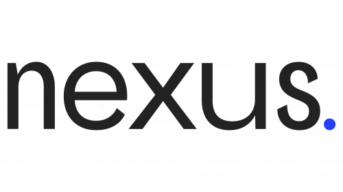
The design of the new Nexus logo breaks away from conventional formats, adopting an all-lowercase wordmark that plays with letter widths to create a visually engaging and memorable identity. While the “u” in the logo is pronouncedly wider than the other characters, and the “n” appears narrower, this unconventional choice adds character and distinguishes the brand in the marketplace. The logo’s design nuances, including the balanced, thicks, and thins, and the strategic use of space, align with the brand’s narrative of connection and integration.
A key aspect of the new branding is the tagline “Point, made,” which complements the visual identity and underscores Nexus’s commitment to making impactful statements for its clients. Including a period at the end of the wordmark is not just a stylistic choice but a deliberate element that ties the brand’s tone of voice to its visual representation, enhancing the overall brand coherence.


