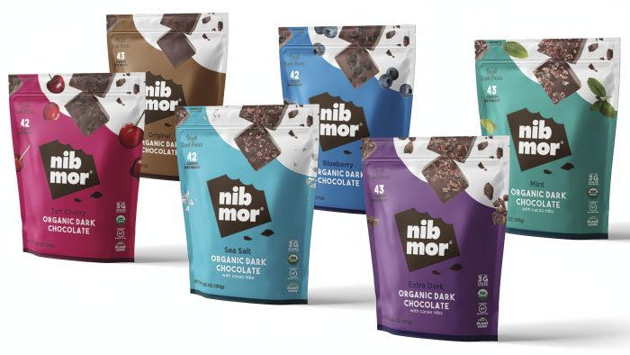
The company is confident that beautiful packaging will help attract more consumers.
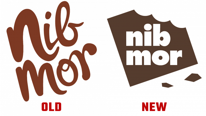
A healthy lifestyle is a kind of modern trend, and after analyzing the growth in demand for healthy products, the “nib mor” brand presented a new packaging design. The centerpiece is the updated logo – a piece of bitten chocolate with the company’s name inside.
A vibrant color palette of shades reminiscent of chocolate ingredients was used for the packaging design. The company expects the rich colors to grab the attention of families and make the product stand out on store shelves. The designers chose a simple font that perfectly complements the overall picture.
The “nib mor” brand confirms the quality of products with a large list of certificates that emphasize the organic nature of chocolate. The product is perfect for those who want to eat healthily and take care of their health. Chocolate in the new packaging can be seen on the company’s official website and bought at Sprouts, Whole Foods, and Wegmans.
The CEO of Prabha Cheemalapati shared that they have already received feedback from their customers who praise the new design and are extremely happy with the packaging. In 2020, “nib mor” sales grew 30% in physical stores and 50% in e-commerce. The company will not be satisfied with what has already been achieved and wants to become more popular this year.


