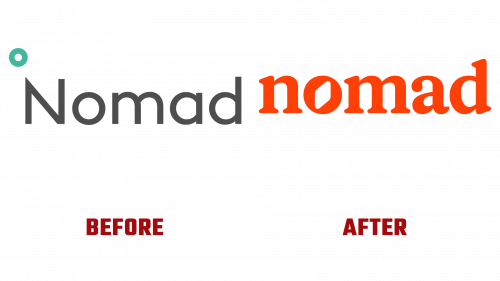
Nomad Health, an industry leader in healthcare staffing, has unveiled a revolutionary new brand identity, marked by the introduction of an updated Nomad Health logo. This rebranding represents a significant strategic shift for the company, symbolizing a transition towards a more empathetic and human-centered approach in their services, a move reflecting the evolving ethos of healthcare.
The previous logo, characterized by the use of Lineto’s Brown typeface, projected a professional yet somewhat impersonal image, resonating with the clinical aspect of healthcare. In contrast, the newly unveiled Nomad Health logo marks a departure towards a warmer and more engaging persona. This change underscores the company’s recognition of the importance of the human element in healthcare staffing.
At the heart of the new logo is a blend of modern design and meaningful symbolism. The logo incorporates GT Alpina, paired with Romek Rounded, a choice that exudes friendliness and warmth with its rounded serifs. Notably, a compass is ingeniously integrated within the “o” of Nomad, reflecting the company’s namesake and symbolizing guidance and exploration for healthcare professionals on their career paths.
This rebranding is more than a mere aesthetic update; it is indicative of a deeper transformation in Nomad Health’s brand strategy. The adoption of a warm orange color palette, moving away from the traditional clinical blue, signifies a fresh and welcoming outlook. This choice is particularly impactful, given Nomad Health’s goal to demystify and humanize the often complex and impersonal landscape of healthcare staffing.
The updated branding also includes a new set of illustrations. Shifting from simple, child-like drawings, the new illustrations embrace a mature editorial style that adds sophistication and depth to the brand’s storytelling. The use of white space in these illustrations imparts a distinctive, almost ethereal quality, enhancing their appeal while avoiding abstraction.
Typography in the rebranding employs lighter weights of Alpina and Romek Sharp, interspersed with italics for emphasis, creating a polished and engaging textual experience. While using a bouncing line graphic might border on cliché, it effectively conveys a sense of dynamism and fluidity, crucial in the fast-paced world of healthcare.
However, one area where the rebranding could improve is in its use of photography. The current focus on cityscapes tends to evoke more of a travel or transportation service feel, somewhat misaligned with the company’s core mission and values. A more tailored photographic approach could better reflect the essence of healthcare staffing.
Overall, the new brand identity of Nomad Health marks a significant advancement, evolving from a strictly professional demeanor to one that radiates warmth, empathy, and accessibility. This rebranding resonates with Nomad Health’s commitment to facilitating a seamless, efficient, and human-focused experience in healthcare staffing.


