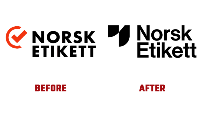
Norwegian company Norsk Etikett, one of the leading suppliers of self-adhesive labels, recently rebranded the company with a new look. What began as a family business in Sandnes has grown into a major international company, demonstrating continued successful development throughout its glorious history. Today the brand is reaching a new level of development, which is reflected in the visual renewal of its identity and website. The visualization change, carried out for the first time in many years, reflected the company’s current position as a specialized print shop that is making every effort to maintain a leading position in its type of business. At the same time, the identity ensured the creation of a visual expression that advantageously highlighted the overall dedication to its business and customers, strict adherence to commitments, and the guarantee of consistently high-quality products.
The company’s new identity and strategy were developed by Studio Oker, which carried out the task in close collaboration with the client. The result was a platform completely different from previous versions. Important points such as sustainability, active social inclusion, respect for gender equality, and the inviolability of employees’ rights were advantageously portrayed. The visualization was built on the demonstration of several important components – the high craftsmanship of the quality labels through the use of a complex production process, represented by several video clips and clear digital images; the diversity of the product itself, which is symbolically represented by the sign in the logo. The logo itself includes a text block in the form of the brand name in a sans serif font such as Neue Haas Grotesk Display 65 Medium by Linotype. Its architecture made it easy to use on different surfaces, combined with various elements. Its clarity and the use of modern technology in its creation ensured that it was easy to read and visualize both on print media and digital platforms.
A minimalist style was the main focus of this digital project, which provided the logo with a simple and clear visualization. The classic and contrasting black chosen as the main corporate color reflected the brand’s high level of professionalism, its serious attitude to the commitments made, and its responsible approach to the production process of its products.
The brand’s website used a strict grid design with subtle layering that enhanced the impact. The emphasis was placed on the importance of people, their skills, and abilities, which ensure the success of the main product – quality and aesthetic label.


