Northeastern Mutual’s logo synthesizes the old and the new. The emblem emphasizes the impressive age of the company, which carries invaluable experience, and at the same time, pays attention to modern innovations in order to always offer its clients the best.
Northeastern Mutual: Brand overview
Northeastern Mutual is an American insurance and asset management company based in Milwaukee. It serves 5 million individuals and employs 6,700 people. The company offers retirement, life, and health insurance, financial planning, and investment services. In 2023, $6.8 million will be used to pay dividends.
Meaning and History
The company sticks to simplicity and brevity when creating its visual style. Each symbol is based on a wordmark. The main differences are in fonts and color. The first logo appeared after 1865 when the company’s name was changed to Northwestern Mutual Life. The subsequent rebranding was associated with the global expansion of the insurer’s range of services. The minimal changes in the company’s nearly 200-year history emphasize the reliability and consistency of its operations.
What is Northeastern Mutual?
It is an insurance and investment company that has consistently paid dividends since 1872. NM has a net income of $425 million on assets of $308 billion. The firm is ranked among the top 10 financial advisors in the U.S. among independent brokers.
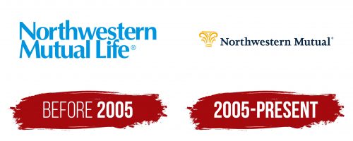
before 2005
The first Northwestern Mutual Life Insurance logo was a two-tiered lettering in blue letters. The name “Northwestern” refers to the origin of the organization. The insurer was founded in Wisconsin, the American Northwest, and originally served residents of that region.
The word “Mutual” indicates the formation of insurance assets through member contributions. Thus, depositors were the owners of a company that represented their interests exclusively.
The addition of “Life” emphasized the main direction of activity – life insurance. The organization, for a long time, was engaged only in this type of policy.
Glyphs of different thicknesses meant flexible insurance plans and diversified funds for stable profits.
The blue color represented a dream. With proper planning and regular contributions, one could improve one’s standard of living, secure retirement benefits, etc. As a part of the American dream, the insurance system helped people to face the future with confidence.
2005 – today
In 2000, in honor of the new millennium, the company changed its name to Northeastern Mutual. By the 21st century, the insurer had greatly expanded its services to include accounting, financial planning, health insurance, and investments. Thus, the term life no longer reflected all of NM’s capabilities.
The logo, updated in conjunction with the renaming, features a structure on the left side that resembles the capital – the top of a column. It is this part that serves as the foundation supporting the upper structures. This choice shows that the company is a reliable foundation. Using NM insurance programs, a person can confidently build his “building of life.”
The image resembles a fountain with many jets. In this image, the company appears as a source of abundance. Revenues are pouring out to customers like streams of water.
The image also resembles champagne sprays, indicating the realization of dreams, celebration, and the joy of working with NM.
The gold color of the illustration emphasizes that the firm deals with financial matters. The organization’s mission is to enhance the well-being of clients. Insurance benefits ensure a decent standard of living.
The inclusion of an antique detail in the logo hints at Northwestern Mutual’s venerable age and experience. The company was founded in the century before last (1857) when columns were an integral part of architecture.
The image is followed by the new name of the organization – Northwestern Mutual. The phrase is arranged in one line, symbolizing the company’s movement forward into the future.
Font and Colors
The main colors of the logo are black and gold. The first emphasizes the importance of the insurer in the market, confident position, and reliability. The second predicts profit and wealth in cooperation with him. The company’s dividends are twice as high as those of its competitors and have been consistently paid for more than 150 years.
The font used is Jessica Serial Bold with serifs. This choice epitomizes a business company that understands honor and integrity. The font emphasizes strict adherence to laws and fulfillment of obligations.
