Ensuring effective cybersecurity is the core mission of NortonLifeLock (NASDAQ: NLOK). Expanding its capabilities and improving, the brand underwent a rebranding this year, making it possible to visually convey all the changes. Namely, the development of the brand, the growth of ambitions, and a new strategy in the implementation of measures to create products that increase the protection and safety of a person in all areas of his digital life. The new visual identity demonstrates Norton’s commitment to being a useful ally for users in the fight against the dark issue of cybercrime and acting as a catalyst for radical change in the industry, eliminating fear and mistrust and empowering. Keeping pace with its increasingly digital-reliant consumer and making it a vital part of their personal lives, Norton has transformed itself from an antivirus developer and provider to the world’s leading cybersecurity brand.
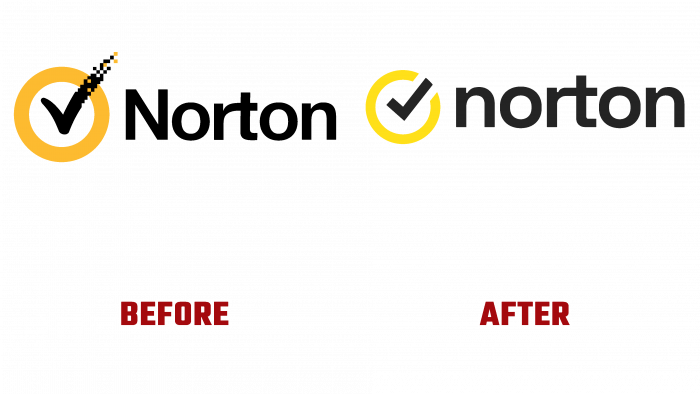
The company’s new visibility is a new promise, reflecting its increased role in modern society. When developing the logo, the significance of the brand’s heritage, its history of development, and the need to preserve recognition were considered. The iconic elements were retained in their general graphic design. But at the same time, the designers significantly improved the visual perception of the entire logo composition, increased the digital quality of each element, added clarity, saturation and adjusted the scale ratio between them. The change also affected the color shade.
A smaller traditional sign – the circle with a checkmark in it became bright yellow, making it stand out better against the black background of other elements, increasing contrast and better focusing on it. The checkmark became clear in its outlines and fulled in the fill color. The brand name font was kept the same type as the previous version, with a richer hue. But all the letters became uppercase – the same height, which positively affected the overall visual perception of the entire composition as a whole. At the same time, the rejection of the variability in the font made the sign more concise and easy to read, removing additional distractions.
All the actions and changes provided the logo with a brighter, simplified design, reflecting the information that provides the brand with its new digital protection. At the same time, an emphasis was placed on visual informing about simplifying the use of new products, creating a new, well-thought-out user interface.


