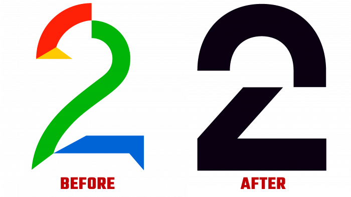
The first broadcast of the terrestrial channel TV 2 was conducted in 1992 in the A/S system as a full member of the European Broadcasting Union. As a public, commercial TV channel, it became the first free channel in Norway. It is headquartered in Bergen and today employs over 1000 people. This fall, the channel has undergone dramatic changes in its identity. He acquired a new logo and style developed by the Scandinavian design agency Bold, which has preserved the brand’s history. Today, the channel broadcasts live sports, entertainment, films, series, and local and international news. The popular TV series “Real Housewives” is also broadcast. The channel is essentially a variant of the American equivalent of ABC, CBS, and NBC.
The new logo was created based on the historical past of the TV channel. During its creation, the visual profile was modernized. The logo is a sign consisting of two elements – the number “2” divided into two parts. It follows the general principle of two-step rhythm movement. The first step carries the harmonious expression of TV 2, and the second step is the harmonious dynamics of the character. Its symbolism was inspired by the brand’s name, namely “two” – a concept on two contrasts, two forms, two sides. Considering the diversity of Norway’s population and complex ethnic problems, the logo of the TV channel – news and entertainment – becomes a unifying symbol.
The logo font was completely designed by the designers based on a combination of hard and soft corners. It is both functional and memorable. Very readable in all applications and communications. The family of non-standard sans serif fonts applied only improved the brand identity. The unexpected decision in type served a lofty conceptual purpose. The graphics turned out to be very readable at any scale. At the same time, in motion, the entire system comes to life while being connected with subtle sound effects. Everything is so simple and intuitive that the system relies on basic blocks in images and videos in a discreet color palette. The visualization is very interesting, encouraging people to go to the channel. All this demonstrates the spectacularity of the new style of TV 2.


