The Koninklijke Nederlandse Vereniging Voor Afval- en Reinigingsdiensten (NVRD), the Royal Dutch Association for Waste and Cleaning Services, has taken a significant step towards reinforcing its commitment to sustainability and waste management with the introduction of a new brand identity. The NVRD, established in 1907, plays a pivotal role in organizing and representing the myriad of service companies operating at the municipal level across The Netherlands. It also shapes national public policy on waste, recycling, and sustainability initiatives. As part of the European Union’s Municipal Waste Europe program, the NVRD is instrumental in pushing the agenda for a circular economy to transform all recoverable waste into new raw materials by 2050.
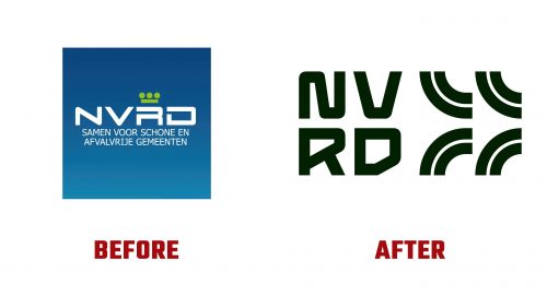
Designed by Arnhem-based Airsolid, the new NVRD logo signifies a fresh perspective on the association’s objectives and methodology. Moving away from the traditional linear design motifs that characterized its previous identity, the updated logo embraces circularity in form and concept. This transformation aligns perfectly with the NVRD’s mission to transition from a linear to a circular economy, emphasizing the importance of keeping recoverable materials in use for as long as possible through repair, recycling, and reuse.
The visual rebrand introduces a clever use of geometry. It features the NVRD initialism in a stacked formation accompanied by a similarly stacked icon. The design incorporates rounded corners in the letterforms, progressing from the most linear to the most circular shapes, mirroring the journey from linear to circular economic models. This nuanced approach refreshes the NVRD’s visual presence and embeds the association’s forward-thinking ideals directly into its logo.
The centerpiece of the new identity is an icon composed of four quadrants of a circle, cleverly arranged to suggest both the potential for a complete loop and a forward-facing arrow. This dual symbolism captures the essence of the NVRD’s goal: accelerating the transition towards a circular economy where waste management and recycling are not just end processes but integral components of a sustainable cycle. While the metaphor of circles representing high-efficiency waste management is a sophisticated concept, the design’s simplicity helps convey this message effectively, making it accessible even to those unfamiliar with industry vernacular.


