


![]() NYPD (New York City Police Department) Logo PNG
NYPD (New York City Police Department) Logo PNG
The NYPD logo shows that the organization stands guard over law and order. Its workers own different weapons; they will always help protect the weak and restore justice. The emblem inspires confidence in the police and security.
The New York Police Department (NYPD) began in 1845, building upon earlier colonial night-watch systems dating back to Dutch New Amsterdam. Initially composed of “men in blue” patrolling the growing city, the department underwent dramatic changes, facing internal conflicts, corruption scandals, and frequent reorganizations throughout the 19th and 20th centuries. Women first joined in limited roles as matrons, later becoming official officers, while technological advances such as fingerprinting, radio communication, forensic labs, and police vehicles reshaped operations. The NYPD confronted significant social unrest in the 1960s and 1970s, managing events like the Stonewall riots and combating rising crime rates intensified by the crack epidemic in the 1980s. Innovations such as CompStat and the “broken windows” strategy in the 1990s significantly reduced crime, though controversial practices like “stop-and-frisk” later sparked widespread criticism and reform. Following the September 11 attacks, counterterrorism became a core focus, expanding the department’s international presence. In recent years, community engagement, transparency measures, and advanced technology have continued to shape the NYPD’s approach to policing New York City.
Meaning and History
![]()
This law enforcement organization has replaced the outdated night watch system. Until 1857, it was led by the mayor of New York until the metropolitan government supplanted him. Today, the NYPD is an expanded law enforcement structure dedicated to providing a wide range of professional services. These include the fight against drug trafficking and organized crime, control of public transport, criminal investigations, patrolling ports, countering banditry, theft, and robbery, emergency services, anti-terrorist operations, etc.
The most difficult period in the activities of the New York police was recorded in the 80s and 90s of the last century during the rampant crack epidemic. The first black officer in this department appeared in 1911, and the first female police officer in 1918. In 1992, the NYPD saw the largest protest related to one of the innovations. The union sponsored the riot. However, the situation has returned to normal. In 1994, the local police introduced CompStat, a digital, geographic crime-tracking system. It is now widely used by other police departments in the United States and Canada.
All squads and uniformed police use a single identity mark, which is a registered brand. In total, the two types of logos reflect the historical values of the American population.
1845 – 1971
![]()
The emblem originally depicted the silhouettes of two people holding a miniature shield, with a bird flying over it. One of them was holding a whip in his hand. Underneath the bottom was the designation “Police” in large capital letters. The lettering was so large that it almost matched the size of the people depicted in the logo. For it, use a bold font with slight curvatures at the ends. At the top was a winding ribbon that read “City of New York.” All elements were placed on a figured shield with a carved top, double edging, and sand harp protrusions at the top and bottom.
1971 – today
![]()
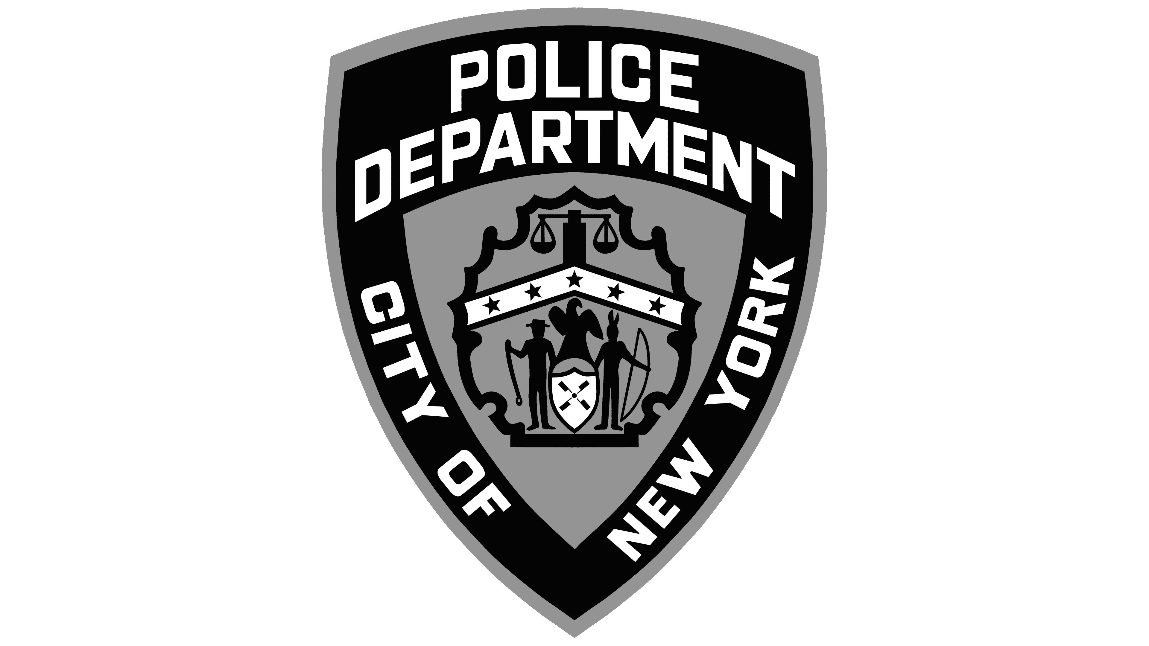
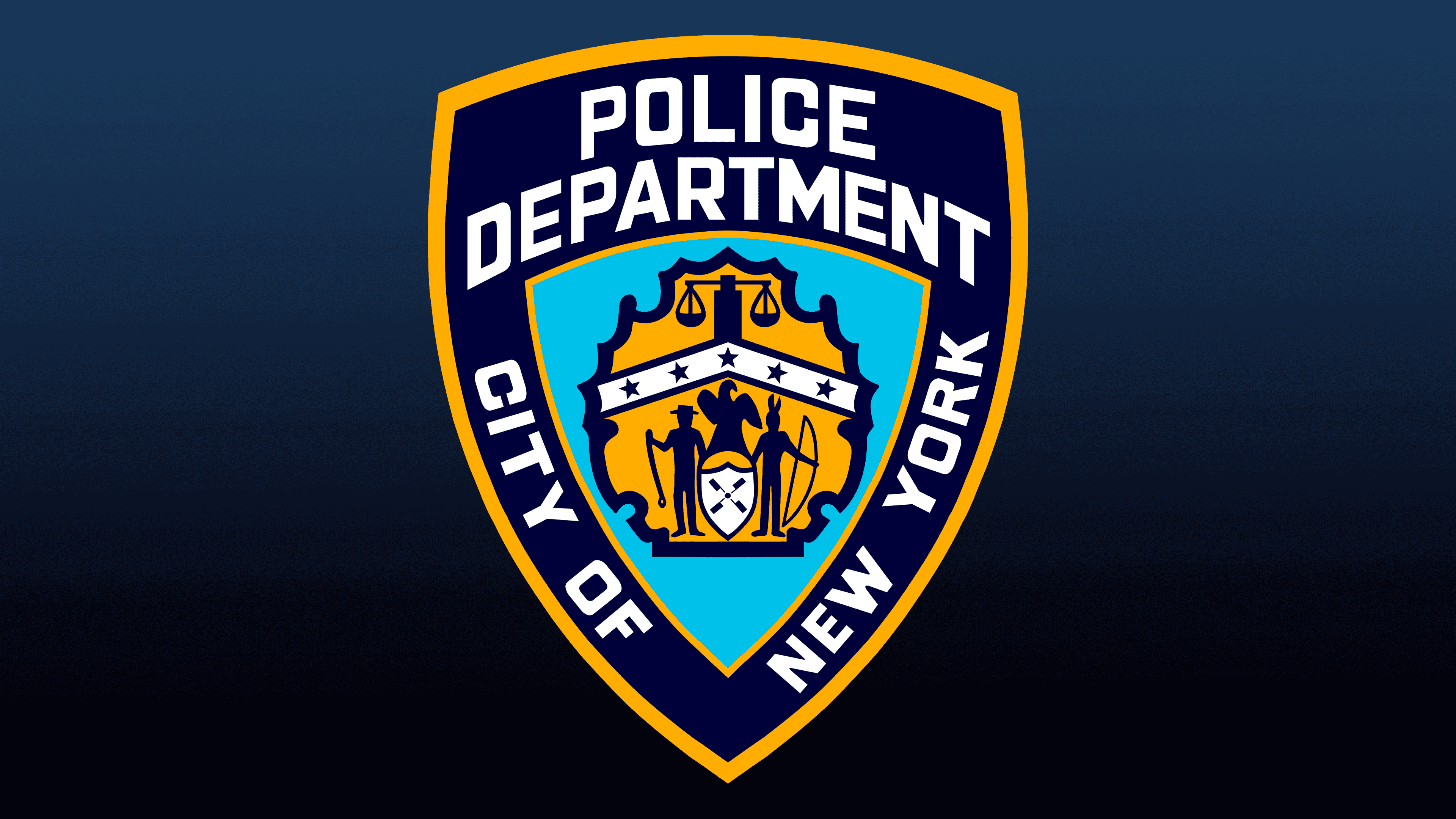
The current logo represents the police service and is used as a uniform chevron and police badge. It is based on a triple shield. The first is the largest background, with a yellow border around the edge. The second is the central one, which is part of the structure of basic elements, where the key signs of the city are located. The third is emblematic, in the hands of two people. On the right, it is held by an Indian (a representative of the indigenous population, with a bow); on the left, a cowboy with a whip to chase cattle. They are recognizable by their attributes and hats: one has a roach, and the other has a wide-brimmed hat.
The miniature shield depicts the wings of a windmill, and above it is a large bird; a white triangular stripe fences off the lower elements with five five-pointed stars in dark blue. Above are the two scales of justice. The background of everything in the middle is a carved figure whose edge resembles a maple leaf. All of this is housed in a light blue triangular shield. There are three inscriptions around it: “Police Department” (top), “City of” (left), and “New York” (right). White letters appear distinct in a dark blue space.
Font and Colors
The identity of the NYPD not only reflects the nature of its service but also underscores its historical roots and ideological significance. The logo indicates that the city police are maintaining order and protecting the population from various potential threats. The graphic symbol is based on images of the region’s indigenous representatives.
The typeface used in the logo resembles several fonts. So, it notes visual similarities with Bank Gothic, Industry Black, and Microgramma. The color scheme consists of two shades of yellow, white, and blue (dark and light).