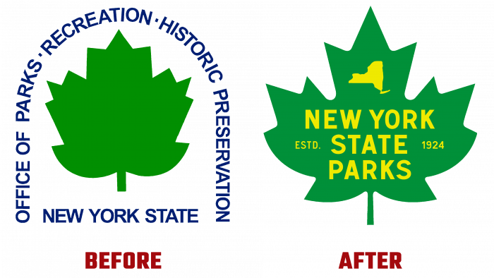
New York State is known for many parks and green spaces, many of which are not only recreational but also historical heritage. The New York State Office of Parks, Recreation, and Historic Preservation (NYS OPRHP) is responsible for controlling, protecting, and recreation of more than 335,000 acres of this land. On August 30, 2021, the FDA presented its new logo to the public in New York. Since its inception in 1970, the former Agency has grown into the Office and has not changed its visual identity.
Today, the parks are regularly visited by over 62 million Americans and visitors a year. Their importance has increased significantly, providing ample opportunities for cultural recreation for residents and guests of the region. At the same time, their role as one of the important sources of replenishment of the regional budget has increased. There was a need to increase the costs of maintaining and developing territories. This can be done only by ensuring effective information promotion of the Department’s activities, attracting more and more attention of tourists and residents.
One of the ways to achieve the required goal was a complete rebranding. The organization’s new image was developed by id29, a design agency based in Troy, NY. Park enthusiasts have enthusiastically received the redesigned emblem and a series of vintage posters for the various park areas. The traditional element of the logo, a green maple leaf, has acquired a clear shape and a brighter green color. Text – New York State Parks moved from the space surrounding the sheet to the inner margin. The arrangement of the words was chosen in a staggered manner, with each one aligned in the center. It was decided to use an original and attractive serif typeface like Etcetera Type Co., which brings the spirit of the 70s to the logo. Above is a stylized outline of the state’s parklands. To the left and right of the organization’s name is a link to the April 1924 date of the New York State Council of Parks approval law.
The use of light yellow and rich, bright green provided the composition with attractiveness, harmony, and ease of memorization. This combination effectively complements each other. Green balances the impulsiveness of yellow, which in turn adds warmth and optimism to green. At the same time, these colors accurately convey the spirit of the organization, providing an accurate visualization of NYS OPRHP’s core business and challenges.


