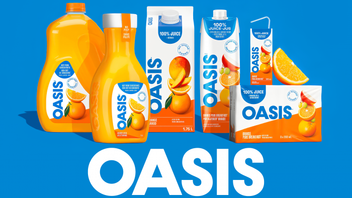
Oasis juices have been part of the home menu of many Canadian families for over 40 years. Their important difference is the rich selection of flavors and the absolute absence of sugar, which allows you to enjoy the natural taste of the ripe fruits used in cooking. The brand is one of the flagship lines of Lassonde. This North American corporation is one of the most successful businesses in the manufacturing and selling natural drinks and juices without the addition of artificial ingredients. Today the company informed the fans of its products about the need for changes that will be made to the familiar trademark for the first time in several decades.
Such actions responded to the changing tastes and perception of the surrounding world by the modern generation of consumers. In addition, the appearance on the market of a large number of alternative offers of similar products, which are often inferior to the quality of Oasis, has a more effective visual design of the product for the consumer, which catches the eye on the supermarket shelves, which chooses in their favor. Changing the logo is a test of the brand loyalty of its admirers and an opportunity to confirm the manufacturer’s ambitions. In light of the change in Lassonde’s implementation strategy and positioning, it was decided to maintain a consistent style across the Oasis line of sub-brands, ensuring individual recognition of each with a full sense of unity with the main brand.
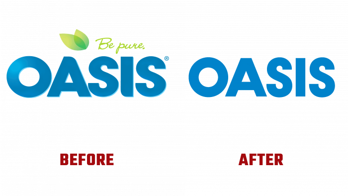
No major changes were made. Maintaining recognition while creating a better visual effect has become the main goal of rebranding. The new logo was not a revelation and did not demonstrate the uniqueness of its design. However, he got rid of some of his predecessor’s unfortunate moments. The cheap-looking green leaf in a gradient design against the background of a monochromatic, bright blue brand name did not become enough. And also were removed unnecessary, blurring the whole picture of the rounding of the corners of the letters “A” and “J.” The adherence to tradition is demonstrated by maintaining the type and color of the logo of the previous version. In turn, such a move has a big plus – adherents of the product will not need to get used to their pet’s new and unfamiliar image. For beginners, it is easier and more convenient to distinguish the product from others visually. The step is simple but effective enough for the evolution of a well-known brand, which will not alienate its admirers while at the same time satisfying the preferences of the new generation of buyers.


