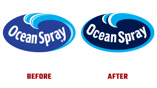
Ocean Spray, synonymous with cranberries, is entering a new era. As it nears its 100th birthday, the brand has decided it’s time for a makeover, introducing a new logo about embracing the future while nodding to a century-old legacy.
Ocean Spray has grown into a massive cooperative, starting with just three cranberry farmers. Now, it’s not just about cranberries but about bringing some tart goodness to people in over 100 countries. Given that the cooperative oversees about 700 farms, it can be confidently stated that they know a thing or two about cranberries.
So, what’s new with the Ocean Spray logo? It’s simpler, cleaner, and a bit more modern. Gone are the days of the complex wave design. Now, we’ve got a sleek swoosh that feels like it’s moving forward like Ocean Spray. The typeface also has a facelift, making the brand name easier to read and more contemporary.
This isn’t just about looking good on a bottle or a carton. Ocean Spray’s new look, especially the bold blues and the vibrant logo splash, tells a story. It’s about freshness, quality, and the adventurous spirit of cranberries. And let’s not forget that this rebranding brings a new packaging design that aims to catch your eye and invite you to taste the richness of cranberries in a way you’ve never done before.
Ocean Spray is preparing to celebrate a century of cranberries with a new brand style. It’s a promise to keep innovating and bringing those unique health benefits and the unmatched taste of cranberries to your table. And with this new look, they’re ready to remind the world: Ocean Spray is here to stay, bold and tart as ever.
While Ocean Spray is getting a bit of a facelift, at its heart, it remains dedicated to its roots – supporting family farmers and delivering the cranberry goodness they’re famous for.


