![]() Oceania Football Confederation Logo PNG
Oceania Football Confederation Logo PNG
The Oceania Football Confederation logo symbolizes unity and diversity within Oceania’s football community. Its concise form reflects cooperation among the region’s countries, united by their shared passion for football and dedication to developing the sport regardless of economic factors.
The Oceania Football Confederation was formed due to the Asian Confederation’s refusal to grant membership to Australia and New Zealand. The idea emerged in 1964 during the Tokyo Olympics, following discussions between FIFA President Stanley Rous, Australian Jim Bayutti, and New Zealander Sid Guppy.
OFC was officially established in 1966 by Australia, New Zealand, Fiji, and Papua New Guinea. A central figure was Charles Dempsey, a New Zealander of Scottish descent. The first Oceania Cup was held in 1973, with New Zealand emerging as the champions. Australia won the second edition in 1980, after which the competition ceased for many years.
A key milestone occurred in 1996 when FIFA recognized OFC as a full confederation and relaunched the tournament as the Oceania Nations Cup. In 2000, controversy arose when Dempsey refused to vote for South Africa as the host of the 2006 World Cup, despite receiving instructions from the confederation.
Australia left OFC in 2006 to join the AFC. Since 2007, the confederation has organized the OFC Champions League for clubs. Lambert Maltock from Vanuatu has led OFC since 2019. Currently, OFC comprises 11 full and two associate members, mostly small island nations with limited influence on global football.
Meaning and History
![]()
What is Oceania Football Confederation?
It is a football organization coordinating matches in Oceania under FIFA’s jurisdiction. It includes national associations from thirteen Pacific states, ranging from well-known island territories to smaller Pacific nations. The confederation organizes continental competitions and World Cup qualifying matches. The winner of the regional qualifiers advances to the World Cup through intercontinental playoff matches.
1966 – 1997
![]()
The logo used by the Oceania Football Confederation served as the visual foundation of the OFC’s early identity as a continental sports institution. It was adopted with the organization’s approval and remained unchanged for over three decades, reflecting both the region’s geographic distinctiveness and its organizational autonomy.
The composition is based on a circular structure, with the inner section containing an abstracted landscape. The silhouette of a shoreline, whose curve conveys a sense of remoteness and isolation, is visually balanced by the silhouette of a palm tree and a circle interpreted as either the sun or the moon. This element adds symbolic ambiguity, ranging from a daytime tropical scene to a nighttime maritime view. The visual metaphor resonates with the image of Oceania’s geographic fragmentation, yet a shared culture and spatial context maintain its unity.
The outer ring contains the organization’s name, “OCEANIA O.F.C.,” arranged along the circumference. The typeface exhibits traits reminiscent of older typefaces, such as Zurich or early modifications of Helvetica Rounded, with increased letter spacing and consistent geometry. The lettering was likely customized by hand or set with a nonstandard typeface typical of mid-20th-century typography.
The palette is limited to a single tone: dark blue, matching both the maritime context and the expectations of an official sports brand. The color scheme provided visual restraint, reinforcing the association with the flags of regional nations and sports emblems of that era. The color was perceived as a symbol of structural seriousness and territorial connection to the oceanic environment.
This emblem was the first attempt to visually articulate a unified football organization for the region, where each element functioned as part of a collective narrative of remoteness, connection to nature, maritime identity, and order.
1998 – 2010
![]()
The emblem adopted by the Oceania Football Confederation after it received official status as a continental member of FIFA in 1996 marked the first full-scale redesign aimed at enhancing international perception and institutional consolidation. This visual transition accompanied a new phase in positioning the OFC as a full-fledged participant in the global football arena. It reflected the intention to merge sports symbolism with regional identity.
The design composition is based on a circular structure and incorporates several thematic layers. The upper half features a stylized silhouette of a palm tree set against a starburst of sharply geometric yellow rays radiating from the center. The form reinforces a sense of expansion and growth, while the palm tree itself represents the region’s tropical nature, distinctiveness, and autonomy. Surrounding the palm is a ring of eleven white stars, each representing a member country, with their even distribution conveying equal representation within the continental framework.
The lower half features an image of a soccer ball in the classic hexagonal style, rendered in dark blue and silver. This element integrates a globally recognized sports symbol into a local context, emphasizing the organization’s connection to the sport. The lower arc of the circle contains the inscription “Oceania Football Confederation,” set in the FF Meta typeface, a humanist font characterized by its compact form and rounded strokes, which is associated with modern institutional identities of the late 1990s.
The color palette features three dominant shades: deep blue, symbolizing the oceanic environment and the international sports context; golden yellow, referencing the island climate and the region’s visual warmth; and vivid green, associated with tropical flora and the natural landscape. The combination creates a rich yet balanced visual rhythm, uniting geographic origin, sports identity, and the symbolism of international unity.
This logo marked an important period of institutional consolidation and external legitimization for the OFC.
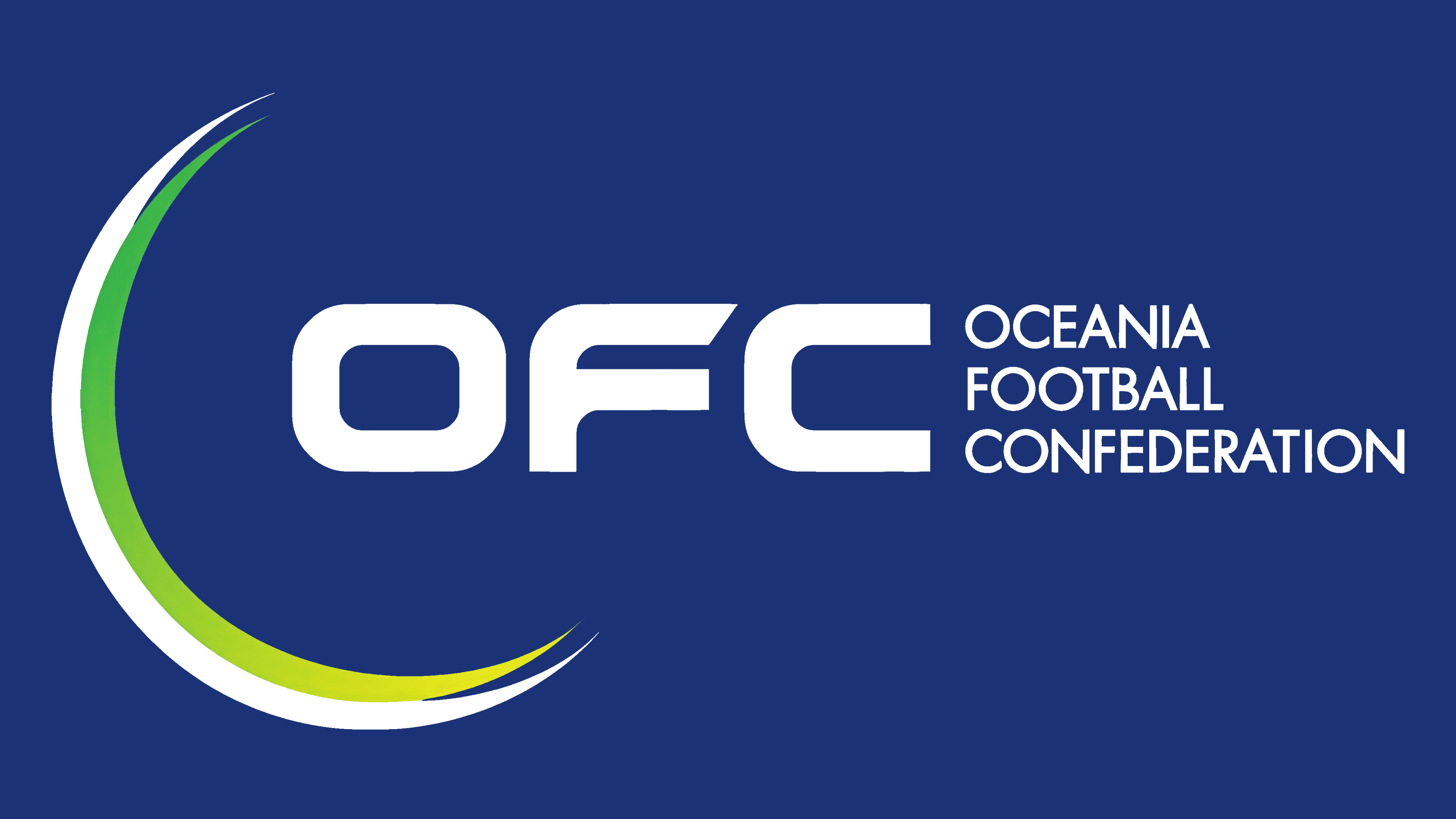
2011 – today
![]()
The current OFC emblem was approved on January 19, 2011, at the organization’s Congress held in American Samoa, at the start of David Chung’s new presidential term. The new visual mark was quickly put into use, making its debut first at the U-17 Youth Championship in New Zealand and then at the beach soccer tournament in Tahiti, thereby establishing the updated identity across all levels of the confederation’s official competitions.
The structure of the emblem is minimalist and technological in form. The composition is built on the interaction of two arc-shaped elements forming a semi-open structure, reminiscent of an orbital path or a stylized crescent. The visual rhythm is created by layering two components: the outer arc is rendered in a deep blue tone, while the inner one features a soft gradient from light green to yellow, creating a dynamic wave of color. This design visually references the symbolism of movement, growth, and reach, while also serving as a metaphor for the region’s geography, such as island arcs, isolated territories, and maritime routes.
The inscription “OFC,” placed to the right, is set in uppercase geometric sans serif letters with enclosed forms, soft curves, and uniform stroke thickness. The typography conveys confidence, modernity, and precision. The spatial arrangement of the letters emphasizes static stability in contrast to the moving arc, forming a dialogue between dynamism and stability, a concept connected to the guided development of football in the region.
The color system continues the traditions of earlier OFC emblems, adapting them to a contemporary context: blue is associated with the Pacific Ocean and the international sports stage, green with tropical nature and island flora, and yellow with the sunny climate and sandy landscapes of Oceania. The combination of these shades within the curvilinear structure creates an effect of forward motion and integration.
The visual concept eschews traditional symbolism, such as palms, balls, or stars, in favor of an abstract language that conveys development, connections, and an adaptive system. The new mark became the foundation for the entire OFC brand identity in the 2010s and remains in use as a marker of its digital, organizational, and visual presence in the football ecosystem.