


![]() Olympics Logo PNG
Olympics Logo PNG
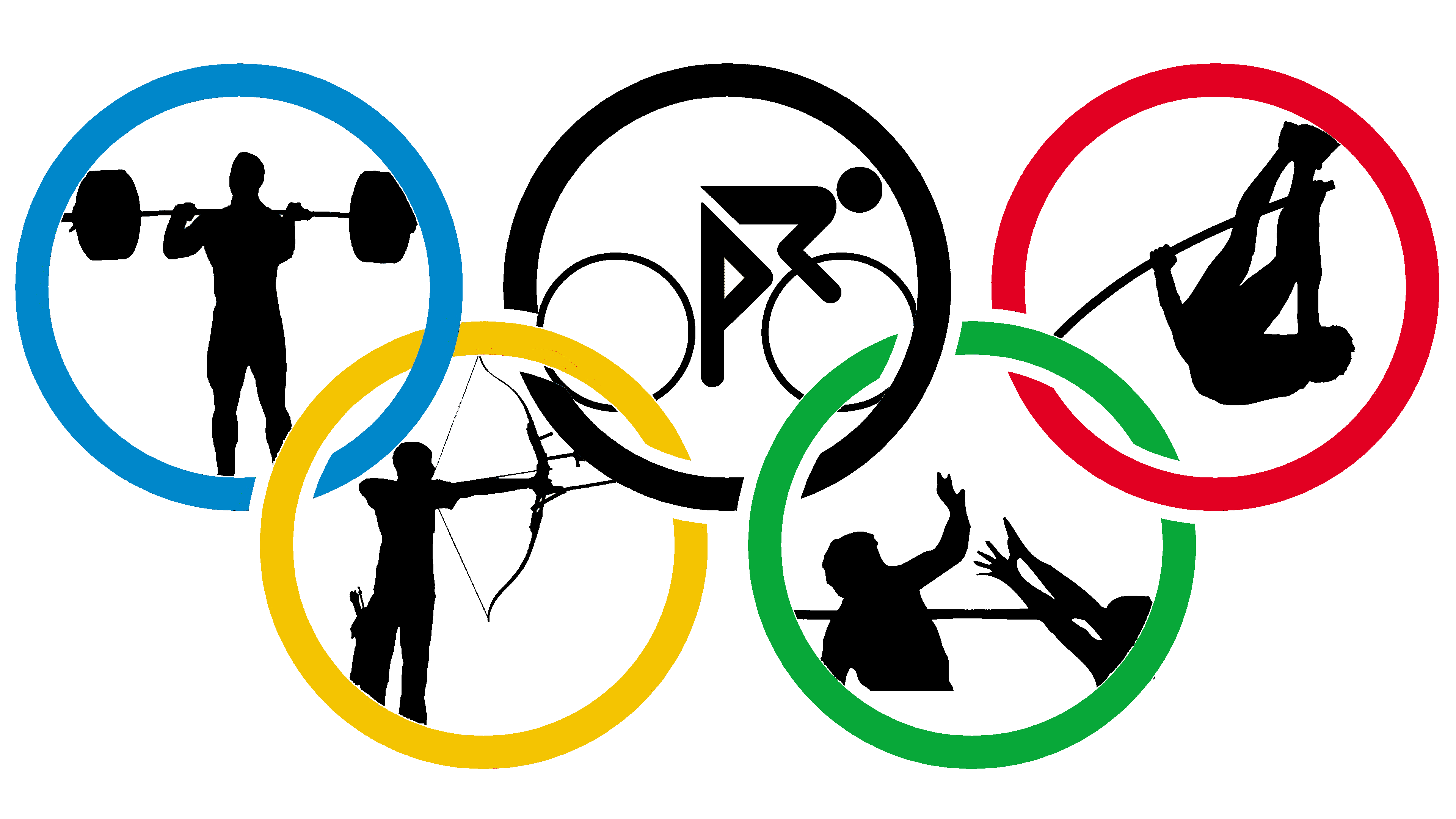
The competition emblem symbolizes unification. The Olympic logo symbolizes the commonwealth of participating countries, the teamwork of athletes, and the various competitions that make up a single sporting event.
Meaning and History
![]()
International competitions are associated with an ancient Greek tradition. It is believed that in 776 BC. NS. The Greeks began to organize sports events with religious overtones. They were held every four years, and the period between them was called the Olympiad and was used as a special system for measuring time. The location has always been the same: the small town of Olympia. There were organized ritual competitions in honor of the supreme god Zeus, and the winners were immortalized in statues. With the arrival of the Romans, the Olympic Games were banned as a pagan practice.
It was not until 1894 that the multi-sport events were restored, although there had been other attempts to bring them back. Gradually, the competition was divided into two seasons because it was impossible to show winter sports in the summer. As it developed, the Olympics had its symbols, including talismans, slogans, and hymns. One symbol was an emblem featuring five rings. It is still used today, decorating the flag since 1913.
What is Olympics?
These international sports events have existed since the 19th century. They have their scheme and frequency, which occur once every four years. The first competitions took place in Greece (in 1896) and, more recently, in Japan (in 2021).
1913 – 1986
![]()
Almost all the games’ symbols were created by Pierre de Coubertin, the founder of the International Olympic Committee. He was an intellectual, historian, and educator. Pierre considered physical education the most important thing in schooling, as in Ancient Greece. He never managed to introduce his ideas into the French education system, but he revived the Olympics, which he always romanticized.
As a result, Pierre de Coubertin created the famous logo of five interconnected rings in different colors. They were originally colored green, yellow, red, black, and blue. So, the designer tied the flags of competing countries together, taking several colors from each. At the same time, the rings corresponded to the continent and were intended to highlight the competition’s global nature.
It was rumored that the five-ringed symbol was of ancient Greek origin. Two American TV presenters who came to Delphi and saw similar rings carved in stone at the stadium allowed them in. As it turned out, these attributes did not appear under the Greeks, but in 1936, a ceremony of standard-bearers was held in Delphi in honor of the next games.
When creating the Olympic emblem, Pierre de Coubertin was not inspired by Ancient Greece’s history. He created a five-ring symbol similar to the USFSA logo, featuring two intertwined red and blue rings. The Olympic Games flag officially debuted in 1920 in the Belgian city of Antwerp. Due to the lack of standardization, the pattern could change in row height and density, and in line width. The final version was adopted in 1957. The IOC members approved it as the most successful modification of the original.
1986 – 2010
![]()
An unknown designer developed the new emblem. The International Olympic Committee instructed the designers to make empty spaces at the joints of the rings so that the five elements do not merge, as required by outdated printing technology. Only one-color versions of the logo remained solid.
2010 – today
![]()
In 2010, the empty areas between the rings were painted over. The artists restored integrity to the Olympic symbol and brought it closer to the original created by Pierre de Coubertin in 1913. The modern version differs from the old one in thin and neat lines. The colors have not changed; the designers have updated only the shades.
Tokyo 2020 Olympics Logo
![]()
Developers adapt the Olympic emblem for each game, so each season has its own decals. At the same time, traditional rings always appear in all versions. They are usually shown below the host city’s symbol.
Such elements of identity are created 4-5 years before the event begins. The original logo for the Tokyo 2020 Olympic Games was unveiled in 2015. It had a T-shape and the city’s name to represent the team tomorrow. However, the symbol proposed by Kenjiro Sanro was never used. Another designer noted that his work resembled the chosen emblem and filed a lawsuit demanding damages. In response, the organizers of the international sporting event reversed their decision and re-ran the competition to select the best logo.
In 2016, the version proposed by Asao Tokolo won. At first glance, this is a simple abstraction, but it has a hidden meaning. The checkered pattern conveys the idea of unity. It consists of squares and two types of rectangles to symbolize diversity. The quadrangular figures are arranged in a circle and painted indigo blue, a color characteristic of Japanese culture. Below, the inscription “TOKYO 2020” appears between the graphic element and the Olympic rings.
Font and Colors
Intertwining rings are great for an international event because they represent a connection. They are arranged in two rows in the shape of the letter “W.” Their symbolism was also noted by the psychoanalyst and psychiatrist Carl Gustav Jung, who considered interlocking rings long before the Olympic Games logo was created, as a personification of people and continuity. There are similar motives in other spheres of life, such as Freemasonry, marriage rituals, and sacred geometry. This idea is based on the properties of the Vesica Piscis mathematical form created by the intersection of two identical discs.
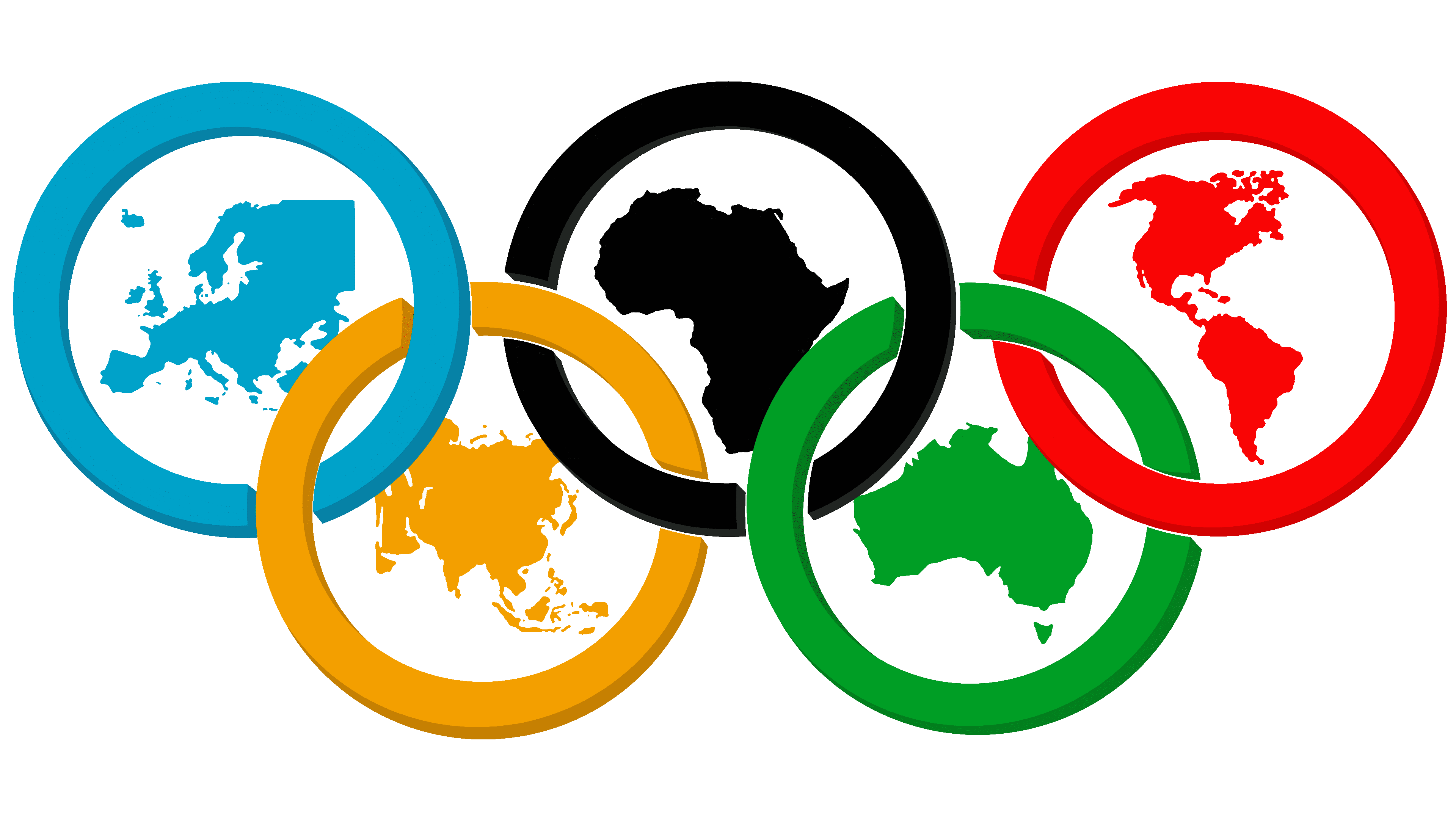
The logo’s lettering changes every four years as the host cities develop their identities. But the five-ringed symbol always has a traditional shape and a classic palette. Each segment has a different color: red, green, black, yellow, and blue. They represent the five continents whose inhabitants take part in international sports competitions.
At the same time, colors are not tied to specific parts of the world because Pierre de Coubertin did not assign them that meaning. He chose the palette on a different principle. The “father” of the Olympics sought to ensure that the six colors could represent the flags of all countries worldwide. That is, if the rings represent inhabited continents, then their color scheme symbolizes individual states.
FAQ
What is an Olympic emblem?
This is a unique design representing a specific version of the Olympic Games. Each host city creates its logo to showcase its culture and themes. These emblems appear on promotional items, merchandise, and media to create a recognizable image for each Olympic event.
The design usually includes symbols representing the host city or country’s heritage and important landmarks. Colors and styles may reflect the host city’s national colors or themes. The design includes the city’s name, the year of the Games, and the Olympic rings. Emblems have changed, adapting to new design trends and technologies.
Who is the woman in the Paris Olympic logo?
The Paris logo features Marianne, the emblem of the French Republic. Her image reflects the values of humanity, brotherhood, generosity, and mutual aid central to the Olympic and Paralympic Games. Marianne traditionally symbolizes freedom and the enduring spirit of the French Republic. This design choice combines local heritage with the global spirit of the Games, reinforcing the Olympic brand’s message of unity and cultural celebration.
What do the 7 Olympic rings represent?
There are only five rings, not seven. Each ring represents one of the world’s inhabited continents: America (both North and South America), Africa, Europe, Asia, and Oceania. They are colored blue, yellow, black, green, and red on a white background. These colors were chosen because every national flag has at least one of them. This shows the purpose of the Olympic Games: to unite people from around the world in the spirit of justice and excellence. The rings are intertwined to show the unity of continents and athletes worldwide. The Arctic and Antarctic are excluded because they are uninhabited. The design was created in 1913 by Baron Pierre de Coubertin, the founder of the modern Olympic Games.
What do the 5 Olympic rings stand for?
The five rings represent the continents from which the athletes participating in the games come: Europe, America, Africa, Asia, and Oceania. Each ring is one of five colors: green, blue, red, yellow, and black. These colors were chosen because the flags of every participating country include at least one of them.
What is the 2020 Olympic logo?
The 2020 logo, representing Tokyo, showcases Japanese design. In the center is a circle formed by a traditional checkered pattern called “ichimatsu moyo,” which dates back to Japan’s Edo period. This pattern was chosen for the Olympic logo to reflect a deep appreciation for Japanese culture and heritage. The design combines traditional and modern elements, connecting Tokyo’s historical roots with its modern status as a major global city.
Who designed the logo for the 2020 Olympics?
The Japanese logo was designed by Asao Tokolo, an experienced designer who studied at Tokyo Zokei University. Tokolo incorporated elements of ancient Japanese culture into his design, particularly the Ichimatsu Moyo pattern. This traditional Edo-period checkered pattern combines historical Japanese elements with a modern look. His work showcases Japan’s rich cultural heritage and contributes to its identity on the global stage.