Greek yogurt Oikos is very popular in Greece itself and enjoys well-deserved success, successfully competing with other producers in the USA and other countries of the world. A brand has managed to demonstrate its product at least once; it will gain popularity and receive orders from trade distributors. A part of the company’s promotional portfolio is owned by the American Danone North America, which considers the product manufacturing technology promising. The quality and taste will attract more and more buyers, not only in America.
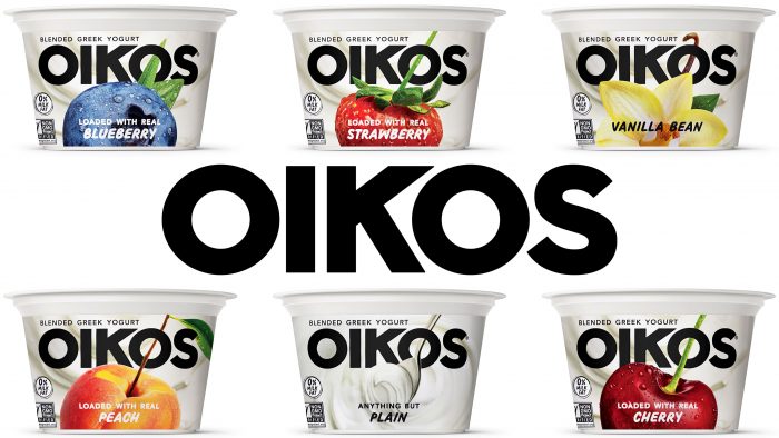
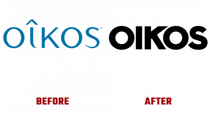
With the help of Danone North America and Beardwood & Co., the new packaging provided a completely different visual perception of the product. Large, covering almost the entire surface of the brand name – an austere black font of the name with a small “R” at the top of the last letter with an image of fruit or vanilla in the lower part created a unique composition that immediately influences the taste buds through visual perception. It is impossible to look past such delicious and juicy fruits, depicted in their whole form with shiny droplets of moisture, which look so natural that you want to take it with your hands and immediately put it in your mouth. The same goes for the image of a vanilla flower, which accurately conveys its natural beauty.
The images are located in the center of the composition and are in front of the text, covering the letters along the bottom edge. The developers managed to give the fruit volume, which is reflected in their perception by the consumer. A good solution was to make the background image of the yogurt itself with soft and velvety waves that occur when the product is shaken due to its consistency.
The dynamic and natural depictions of the yogurt components and the background in the emblem are very well balanced by the brand name, creating a rigid fixation of the eye directly on all elements.
Rejection of the image of a spoon on the emblem is a demonstration of the rejection of all sorts of conventions, including a spoon, if there is a desire to taste a healthy and natural product. The rebranding made it possible to make changes both in the packaging and in the options for selling it. Today, Oikos yogurt with the new logo is available in single packs, 4-packs, quarts throughout America.


