The creative agency Okaybro, led by Dave Taylor, created a cool identity for several brands that highlighted the uniqueness and experience for South Mountain Products and two of its brands, Shredderhosen and Birch Trail Bicycle Co.
South Mountain Products, for example, deals in things for mountain lovers. Everything associated with Shredderhosen refers to clothing for sports and outdoor activities. This includes mountaineering, hiking, and rock climbing. In addition to the visual creativity, Okaybro also came up with a fun slogan, “Not Seriously Dialed.”
Had to develop an image that would refer to the corporate style associated with Swiss mountains, twists, turns, and climbs and descending from the mountain. The playful corporate style would have given the understanding that clothes are for adventure, fun, and life’s steep turns.
The result was three minimalist but very accurate logos that conveyed the brand’s core message.
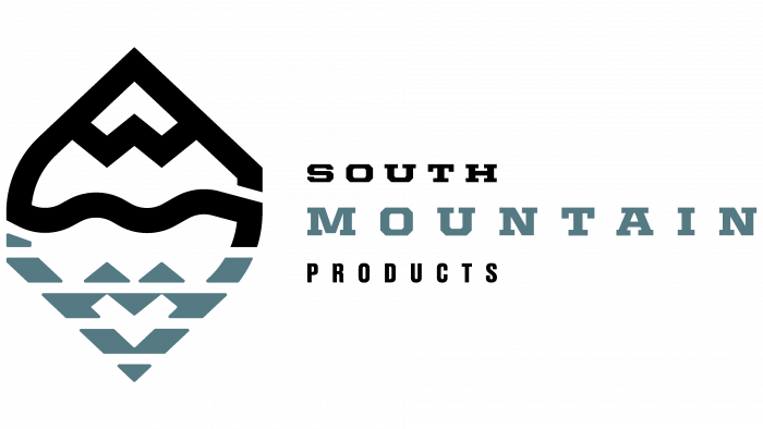
South Mountain Products, for example, received a visual solution in the form of a mountain outline and its blurred image, as if reflected in water, to show the connection to mountains and mountain sports. The logo combines the main letters S and M to talk about a witty idea, which was realized thanks to the mountain scenery.
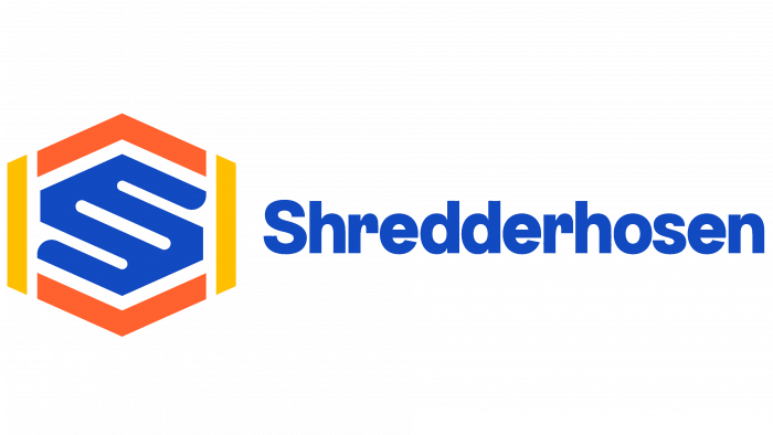
The Shredderhosen brand has acquired an identity associated with a laconic logo in the form of a duplicated letter S. It looks technological and harmonious. The letters are circled in abstract shapes while forming a closed seal or likeness. The logo has different variations in color, and the key colors are navy blue, orange, yellow, and white. The logo resembles a shoe element, which characterizes it as an effective brand-specific sign.
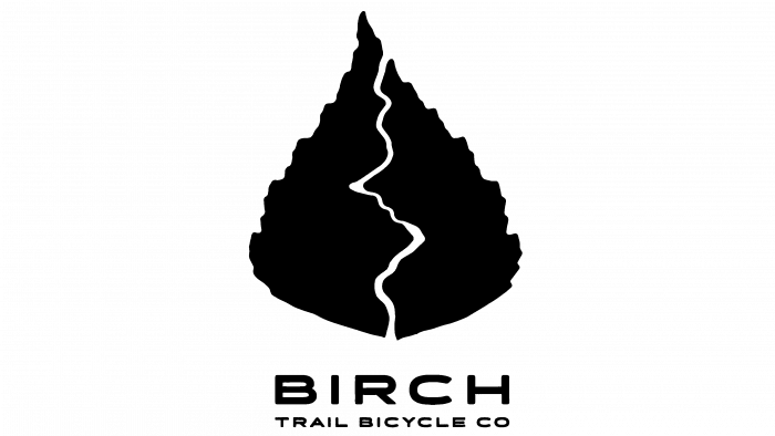
A wonderful illustration of the dynamic recreation and nature union came from Birch Trail Bicycle Co. The logo depicts a birch leaf, inside which a trail for cyclists is “laid out.” A very original solution and simple at the same time. Immediately it becomes clear to which brand this image refers.
It is safe to say that the logos are unique, impressive and make it clear what brands do. Nowadays, there are so many different abstract and laconic logos that it’s very difficult to express oneself lost in ideas. The creative agency Okaybro did a great job, so we can only wish the brands success and prosperity. We wish the agency not to lose its creative fervor and continue implementing unsurpassed ideas.


