


![]() Oklahoma City Thunder Logo PNG
Oklahoma City Thunder Logo PNG
The team’s emblem primarily conveys boundless love for basketball. The Oklahoma City Thunder logo consists of a ball. It is the central element and the meaning of life for the franchise. There are also open dynamics, two lines are directed to the right and serve as a background for a triangular shield.
The history of the Oklahoma City Thunder dates back to 1967, when the Seattle SuperSonics, a franchise that spent decades in Seattle as the region’s main NBA presence, began play. The team won its only championship in 1979 against the Washington Bullets. In 1994–95, it led the league in wins but lost in the first round to the Denver Nuggets.
In 2006, owner Howard Schultz sold the club to a group led by Clay Bennett for $350 million. Disputes over a new arena led to relocation, and in 2008, the team moved to Oklahoma City, rebranding as Thunder while leaving the SuperSonics identity in Seattle.
The roster foundation was formed through consecutive draft picks. Kevin Durant was selected in 2007, Russell Westbrook in 2008, and James Harden in 2009. By 2010, Durant became the youngest scoring leader, and the team improved from 23 to 50 wins, reaching the playoffs.
In 2011, Thunder reached the Western Conference Finals, losing to the Dallas Mavericks. In 2012, the team defeated the Dallas Mavericks, the Los Angeles Lakers, and the San Antonio Spurs to reach the NBA Finals, where it lost to the Miami Heat. In 2014, Durant won MVP with 32.0 points per game.
In 2016, the team led the Golden State Warriors 3–1 but lost the series. Durant then joined that club. In 2017, Westbrook averaged a triple-double and won MVP. After trades involving Harden, Westbrook, and Paul George, the franchise shifted to a rebuilding mode.
The next phase centered on Shai Gilgeous-Alexander, acquired in a deal with the Los Angeles Clippers. By the 2024–25 season, he averaged 32.7 points, won MVP, and led the team back to the NBA Finals for the first time since 2012.
Meaning and History
![]()
When the Oklahoma City basketball club “Thunder” was called “SuperSonics” and based in Seattle, it changed its emblem six times. Having moved to a new state, the team chose a different name and conducted a global redesign. True, fans criticized the new logo: in a survey conducted in the winter of 2020, it was ranked among the worst in the NBA. The reason for such a low rating is the lack of a graphic connection to the nickname Oklahoma City Thunder.
The team combined the orange-black and raspberry-cream colors of two Oklahoma universities or organizations, creating a mind-boggling style. Thunder could make absolutely any logo, even the simplest one, and everyone would like it. The main thing is that the residents of the indigenous state are happy to have a club playing in one of the USA’s leading leagues.
Relocation is always complex, but creating a team logo is a small but pleasant task. Since then, the Oklahoma City Thunder logo has become a symbol not only of the basketball club but of all of Oklahoma. Regardless of their preferences, fans from all over the state united in their love for the Thunder.
Recently, well-known basketball journalist Zach Lowe stated that the team’s logo is outdated and needs updating. And although this is just one person’s opinion, his words sparked heated debates among Oklahoma residents online over the past few days. Opponents of the update write that the logo does not matter for the Thunder’s success. They believe it should be “left alone,” as everyone is already used to it. Everyone recognizes the popular franchise by this image. But proponents say the emblem is too complex, banal, and overloaded with unnecessary details. Clay Bennett noted that the light blue color matches the state flag (which speaks of love for the team in all cities). Yellow means sunlight, and the reddish-orange shade symbolizes the sunset of the heavenly body. For some people, the value of this logo is even more precious than its appearance.
Another argument of the proponents is that creating a new logo will improve merchandising. Therefore, the team’s fans will stand in numerous queues to purchase club merchandise with the new emblem. The old form will remain in the past. But wearing an outdated logo will show that you have been a Thunder fan and have always supported the club. The updated logo could become the face of the NBA, like the emblems of the Celtics or Bulls, while the emblem will remain the same as it was when the team moved to Oklahoma.
What is Oklahoma City Thunder?
This team entered the National Basketball Association in 1967 and is now part of the Northwest Division. Formerly known as the “Seattle SuperSonics,” the team was forced to move to Oklahoma due to a lack of funds for a new stadium. Since then (since 2008), it has been known as the “Oklahoma City Thunder.”
1968 – 1970
![]()
In 1968, a promising new basketball team appeared in Seattle, a city in the western USA. It was named after the shuttle, the “SuperSonics.” One of the club’s earliest emblems depicted Seattle’s main attraction: the Space Needle. The observation tower is inside the ball, surrounded by a curved strip narrowing towards the end. This is the shuttle’s trail, which was gaining altitude and flew over the inscription “SEATTLE SUPERSONICS.”
1971
![]()
The 1971 logo is less conceptual. The designers left the green ball and wrote the team name in white letters in the center.
1972 – 1975
![]()
A year later, the developers returned to the cosmic theme. But they depicted the shuttle not literally but abstractly, giving the word “SONICS” the shape of a flying ship. The shuttle is heading to a planet shaped like a basketball. Above the tail of the first letter “S,” there is a reduced inscription: “SEATTLE SUPER.”
1976 – 1995
![]()
Eight years after creating the first club logo, the designers decided to diversify the color palette. After the 1976 redesign, another color appeared on the emblem: yellow. The designers colored the inside of the ball, which is half-cut and resembles a semicircular window. Behind the improvised window, the silhouettes of Seattle buildings are visible, including the recognizable top of the Space Needle. The club’s name is written in two lines below.
1996 – 2001
![]()
The 1996 logo is more colorful. The designers used several shades of orange to depict the word “SONICS” in large letters. The city name is not as noticeable as it is written in small white font. As before, the basketball occupies a central place: with the lower part of the Space Needle, it forms the letter “I.” The background is a green inverted lateral oval with a yellow-red contour.
2002 – 2008
![]()
These six years were the last for the Seattle Sonics basketball team. In the last five years of the Seattle SuperSonics, the basketball players wore a multi-component logo consisting of a circle with a ball, a large white letter “S,” and a green hexagonal plate with the inscription “Seattle Sonics.”
2009 – present
![]()
In 2008, a series of major changes occurred:
- The team moved to another city.
- It was named “Thunder.”
- The world saw its debut logo, which, as principal owner Clay Bennett confessed, combined elements of other clubs’ logos: Oklahoma State Cowboys, Cowgirls, and Sooners.
There is no official version of the word “Thunder” in the name. However, two assumptions were also made. Thus, Oklahoma City is located in an area with frequent tornadoes and hurricanes, which usually accompany Thunder. Another assumption concerns the local Indians, who called themselves just that.
Font and Colors
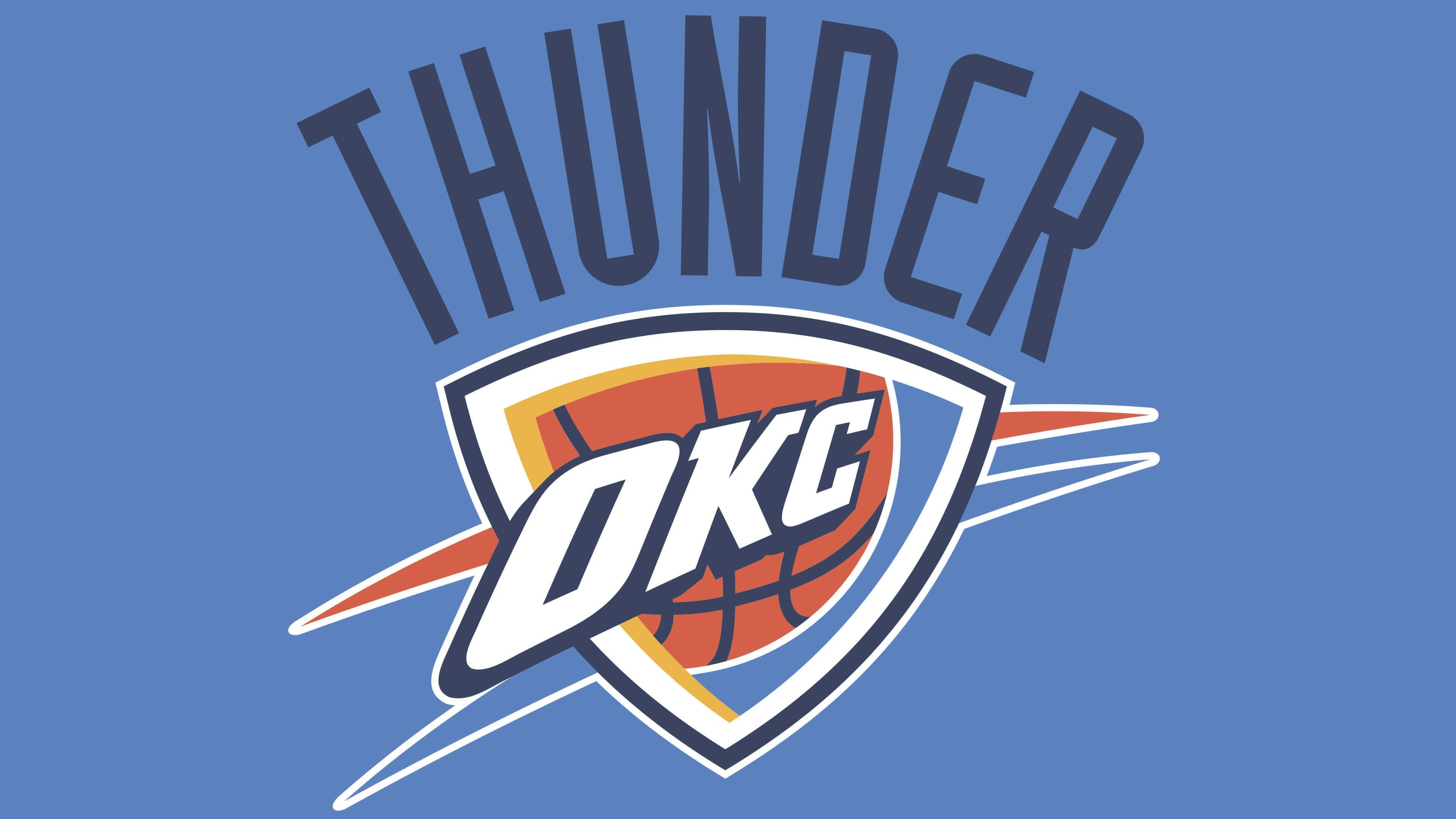
The first name of the Oklahoma City Thunder brand, introduced on September 3, 2008, features a triangular shield with a basketball fragment and large white letters “OKS.” Behind the shield are two lines of light orange and blue colors. Above them is a semicircular inscription, “THUNDER.” This word was not chosen at random; it was adopted as the club’s nickname in tribute to the legacy of the Indians.

okc logo
THUNDER is written in elongated blue letters with serifs. The club used its stylized font for the abbreviation. The letters “OKS” gradually narrow, creating the impression that they are moving away. A similar technique can be seen in the “Seattle SuperSonics” logo from 1996 to 2001. Thanks to the dark blue contours, the white inscription looks voluminous.
The logo includes other colors: reddish-orange, yellow, and light blue. According to Clay Bennett, the first symbolizes the sunset, the second denotes the sun, and the third matches the shade of the national flag. Thus, the team owner tried to justify the choice of palette when fans began criticizing the logo, which they believed was not bright enough.
FAQ
What does the OKC Thunder logo represent?
The OKC Thunder logo is multifaceted. In the center is a triangular shield adorned with a basketball. Two uneven lines, red and blue, are in the background. Across the shield is the word “OKC,” white, slanted, and distorted. The team’s nickname is at the top, arranged in an arch shape. It uses a blue sans-serif font.
When did the “Thunder” appear in OKC?
This National Basketball Association franchise was moved from Seattle to Oklahoma City in 2008 after the league owners approved the relocation.
Why is “Oklahoma City” called “Thunder”?
The team’s name was chosen for two reasons. First, Oklahoma City was once the headquarters of the 45th Infantry Division, a military unit known as the “Thunderbirds.” Second, this city is geographically located in Tornado Alley.
Who owns the “Oklahoma City Thunder”?
As of 2021, the Oklahoma City Thunder club is owned by the Professional Basketball Club LLC, headed by American businessman Clayton Ike Bennett.