At a fashion retailer, the Old Navy logo conveys the color of the water, which links it to the name. The smooth lines of the oval and even letters create a unique balance of the two elements that serve as the basis for the concept of the fashion brand. And it lies in the availability of goods, so there is no exquisite monogram in the emblem – only a clear form of ordinary printed glyphs.
Old Navy: Brand overview
| Founded: | March 11, 1994 |
| Founder: | Gap Inc. |
| Headquarters: | San Francisco, California, U.S. |
| Website: | oldnavy.gap.com |
Old Navy is a company that owns a clothing brand of the same name and an international chain of stores. Its outlets are open in various countries worldwide, including the United States, the Philippines, and Mexico. Business management is carried out from the main office in the Californian city of San Francisco.
Until the mid-1990s, there was a Gap Warehouse division from the American corporation Gap, Inc. But in 1994, a rebranding was carried out, and the old company was replaced by a new one – Old Navy Clothing Co. Its appearance was marked by the opening of the first company store in the city of Colma. The trading network expanded so rapidly that it reached the international level in seven years.
Meaning and History
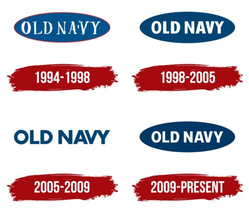
Just as continuous was the process of improving the Old Navy identity, although all brand logos are relatively similar to each other, they have several differences. They have in common that they contain the same lettering and have the same color scheme: a combination of white and dark blue. But the difference lies in such details as the shape of the letters.
What is Old Navy?
Old Navy is one of the largest fashion retailers that offer affordable clothing and accessories in different countries. This company appeared in 1994, at the same time its first stores were opened in the United States. Now it is one of six divisions of the American corporation The Gap, Inc.
1994 – 1998
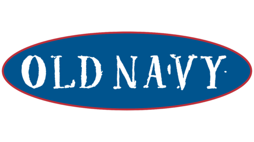
The first Old Navy logo featured a blue ellipse with a thin red outline. Inside it was the brand name, represented by white capital glyphs. Serif font was used for both words. The inscription was indistinct, with partially erased lines.
1998 – 2005
After a slight adjustment in 1998, the phrase “OLD NAVY” became well-readable. The designers changed the typeface to favor a bold sans-serif with narrow letter spacing. And at the same time, they removed the red outline along the ellipse’s edge, so the logo became two-color – white and blue.
2005 – 2009
As a result of another redesign, the oval base disappeared. So that the inscription does not get lost on a white background, the developers had to make it dark blue. At the same time, the letters, which were previously elongated vertically, acquired a more balanced shape because they had equal proportions of width and height. The only imperfection was at the end of the word “NAVY,” where the “V” and “Y” joined at the top.
2009 – today
In 2009, a logo began to be used that is very similar to the version introduced in 1998. It has the white lettering “OLD NAVY” against a dark blue ellipse, but the font has been slightly changed: the letters and the spacing between them are visually more balanced.
Font and Colors
The brand name inside a horizontal oval is the basic element of the Old Navy identity. This bold and memorable logo combines the softness of rounded baselines with the roughness of bold rectangular glyphs. The same contrast exists in the colors, as the white lettering is formed using negative space on a dark blue background.
Bold geometric sans-serif font converted to uppercase makes the company name more visible. It is similar to a range of similar grotesques, including Rational TW Text Bold by Rene Bieder, Workaday Bold by Yes Please, and Verb Extra Condensed Extrabold by Yellow Design Studio. Another related font is Futura Condensed Bold, designed by typographer Paul Renner.
The combination of dark blue (#003763) and white (#FFFFFF) was not chosen by chance. The fact is that Gap, Inc. Corporation has a similar color scheme, and it is she who owns the Old Navy brand. Blue symbolizes constancy, honesty, and a good reputation. White is the personification of perfection and purity.
Old Navy color codes
| Dark Midnight Blue | Hex color: | #003763 |
|---|---|---|
| RGB: | 0 55 99 | |
| CMYK: | 100 44 0 61 | |
| Pantone: | PMS 2955 C |
