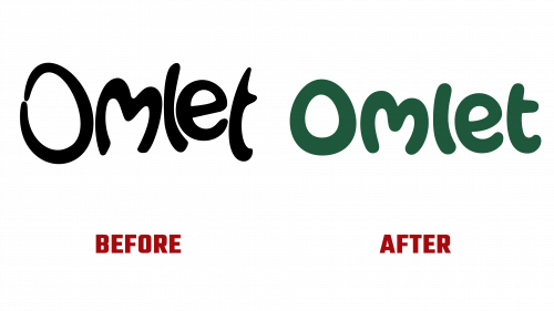
Omlet, celebrated for its innovative approach to pet care products, has recently introduced a reinvigorated brand identity, showcasing its commitment to animal-centric design. This significant step coincides with the company’s ambitious plans for international expansion. The refreshed Omlet logo, a creative endeavor by the London-based design firm Ragged Edge, encapsulates the brand’s evolution since its founding in 2004 by four Royal College of Art students.
The initial Omlet logo was characterized by a distinctive, somewhat unruly charm, reflecting a chicken-led insurrection. This design, featuring rough, scrambled typography and an egg-shaped ‘O’, was unique and conveyed the essence of the brand, yet it lacked a certain refinement. The new logo, however, marks a significant departure from its predecessor, retaining the playful spirit while introducing a more sophisticated and consumer-friendly aesthetic.
At the heart of the redesigned logo is the egg-shaped ‘O’, now rendered with a softer and more inviting touch that aligns seamlessly with Omlet’s focus on pet comfort. The ‘m’ in the logo, shaped like a heart, and the cozy ‘e’ symbolize the company’s dedication to pet well-being. The half-armed ‘t’ injects a dose of whimsy, representing Omlet’s innovative approach to pet product design.
The rebranding extends beyond the logo to include a thoughtful color palette inspired by the natural habitats of pets. This choice of colors not only adds warmth to the brand’s identity but resonates with the environments pets inhabit, reflecting Omlet’s deep understanding of their needs.
Complementing the visual elements is a carefully crafted brand voice, inviting customers into the world of Omlet. It reflects the careful consideration and research that go into each product, aiming to enhance the lives of pets and their owners.
The new Omlet logo is not just a visual update; it’s a reflection of the company’s philosophy and strategy. It represents Omlet’s readiness to take on the global market while staying true to its core principle: designing innovative products that are also deeply attuned to the needs and well-being of animals.
As Omlet steps into a new era of growth and innovation, its rebranded identity – led by the new logo – stands as a testament to the brand’s commitment to making a positive impact in the lives of pets and their owners worldwide.


