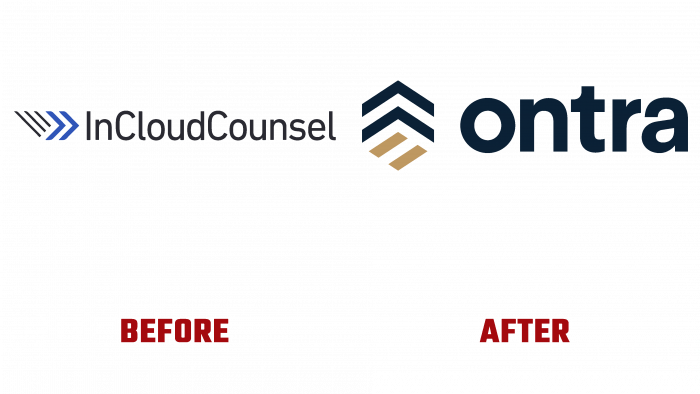
Announcing the second round of funding, InCloudCounsel has changed its name, logo, and style. Providing services for the automation of work with contracts and their analytics, the brand has established itself as a world leader in this area. He chose his new name – Ontra, because of its origin – as a derivative of cONTRAct. The monogram very accurately embodies the brand’s mission – the desire to provide any contracts with greater efficiency, freeing those responsible for their development and management, opening up more opportunities for other, no less important matters. The updated platform fully meets the needs of the modern market in creating a complex technical solution that simplifies the process of day-to-day contracting. Founded in 2014, the company was engaged in solving one of the most important problems faced by lawyers, consultants, and managers in the process of concluding contracts. This problem was and is the routine and volume of work. Ontra has provided the ability to minimize repetitive legal tasks, reduce legal costs and risks, speed up the process, freeing up resources.
These improvements brought the platform to a leading position, requiring radical changes in the brand’s external identity, strategy, and corporate style, including its name. To start creating the logo, a creative approach was applied to the graphic execution of the uppercase font, which is very close to the type of Genera Semi Bold by Wahyu and Sani Co. Its color – white, was chosen based on its maximum contrast to the selected dark saturated background and its effect on the viewer. The background on which the sign and the text are applied are selected from shades close to black, ensuring the emblem’s visual identity, attractiveness, and memorability.
The two lower lines in the sign, located to the left of the name, are made as an accent element. They are located at an angle to the horizontal, and as an equal sign, symbolize equal opportunities and advantages that all parties who use the platform acquire when signing contracts. Their gold color draws attention to the importance of this feature that distinguishes Ontra. Symbols above the golden elements resembling mathematical “more” signs or direction arrows pointing upward with an acute angle visually demonstrate only forward movement and constant gain from using the platform – reducing repetitions and routine and increasing time and resource savings.


