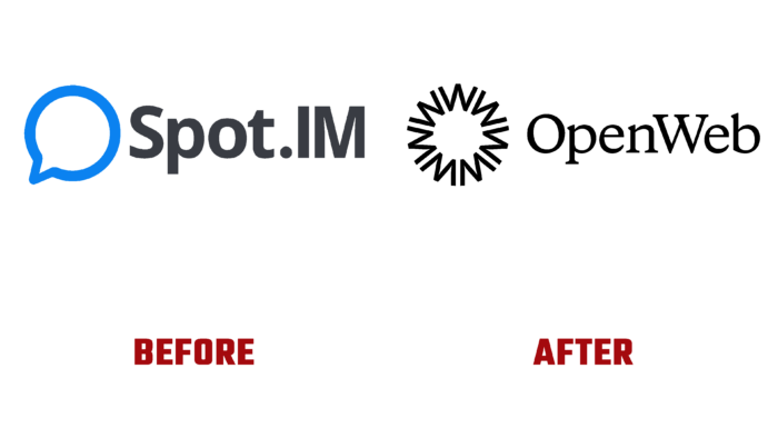
In the wake of the development of services to ensure high-quality and comfortable online communication in 2012, it was developed and implemented by Israeli programmers Nadav Shoval and Ishay Green. The platform was simple and easy to use. It is designed for social interaction, building group communities, building an extended network around digital content, and providing the convenience of moving conversations to publish sites. In 2020, the brand underwent significant changes that have led to a complete name change. The company received a new visual definition by becoming OpenWeb. She acquired the ability to track and filter sections in the comments to identify anonymous people. This is achieved through the use of self-developing artificial intelligence, which builds its work on the analysis of the language used and using other methods. The growing brand has already covered over one hundred million active users, opening offices in New York City, Tel Aviv, and Kyiv. As an enterprise committed to creating conditions for improved online communication, the brand again felt the need to change its own identity.
The main goal was to develop a new visual and verbal version, which would become a strategic basis for implementing modern forms of reflection of current changes. Today’s requirements have led to the need to effectively change the entire brand strategy to meet the increased ambitions. Experienced and creative employees of the COLLINS studio dealt with redesign issues. To form the most accurate and relevant image of the company, the studio staff carried out thorough and lengthy work to study the characteristics of the company, market research to obtain a complete understanding of the problem being solved, to find solutions that open up great opportunities and prospects for the updated company.
The ingenious solution was to turn to retro typography, which is completely unexpected in this area. Fonts typical for that time, variants of the design of newspaper headlines of past decades were used, in which the designers drew the necessary inspiration. Starting with a concise, minimalist logo, the designers made it bright by applying the original combination of seven Ws visually forming the letter O. This option has become the most effective way to convey the harmony and exchange that characterizes the brand. The unique combination of centuries-old visual styles with modern digital execution and motion design has led to a unique digital technique for introducing open source content libraries. This made it possible to visually reflect the various possible conversations while maintaining a strict color system, which made it possible to create a clear and maximally illustrated interface design.


