![]() Opera Logo PNG
Opera Logo PNG
At the company, the Opera logo features the same iconic symbol as the program’s icon: the red letter “O.” It has a three-dimensional design, achieved through color transitions. The “O” stands for Opera.
Meaning and History
![]()
The name Opera in Italian means “work,” and this includes both the process of labor and its result. This is very symbolic, given how much effort the web browser creators put into developing their promising project. But branding was a separate work. The designers have identified the center of the identity as the letter “O.” They made it red for two reasons. First, the bright color immediately attracts attention. Secondly, the inscription on the first Opera logo was also red, a tribute to tradition.
What is Opera?
Opera is a Norwegian company formerly known as Opera Software. It produces software, including its famous web browser for computers and mobile devices. It owns several branches in ten countries around the world.
1994 – 1999
![]()
The browser, which has been in development since 1994, has a lot of text in its logo. The most important and noticeable was the red word “Opera.” It was done in a typeface stylized as handwritten. At the bottom was the second part of the name “software.” Designers designed it with lowercase bold italics. On the right was the promotional phrase “THE BROWSER THAT WAS MADE FOR YOU!” in black. Capital letters were used there, with the first “T” enlarged. A long horizontal stripe underlined the motto, the same dark blue as the word “software.” The background for all the inscriptions was a rectangle with computer-themed drawings.
1999 – 2001
![]()
In 1999, designers created a logo for Opera with a large red “O.” It was outlined with thin lines and cast a gray shadow, making the image look three-dimensional. The company name was written at the bottom, split into two lines and centered. The first word consisted of bright red capital letters, set in a stylized Greek font. And for the second, an individual set of gray lowercase glyphs was used.
2001 – 2010
![]()
After the redesign, the “O” had no outlines, but a gray shadow remained. The inscription has been moved to the right and enlarged for better readability. At the same time, the font was slightly modified, especially in the word “software,” where the letters “f” and “t” were connected by a common horizontal stroke.
2010 – 2015
![]()
In 2010, the “O” lost its shadow, but a gradient created the volume: the letter was darkened at the bottom. The designers enlarged the company name and updated the typeface with a more standard bold sans serif for both words. The case and location of the inscription remained unchanged. But the colors have changed: the red has become more saturated, and the gray has acquired a lighter shade.
2015 – today
![]()
In September 2015, Opera Software rebranded and became simply Opera. At the same time, its logo also changed: the second half of the inscription disappeared, and the “O” took the form of a three-dimensional ring. Designers have achieved volume with a smooth gradient and a sharp delineation of shades, combining them into a single letter. The word on the right is composed of thin black sans-serif glyphs and has nothing to do with past design options.
According to the designers of the Opera logo, “O” is not just a letter. This is the gateway to the Internet, where users can expect fun communication, useful information, and the opportunity to learn and have fun. The three-dimensional “O” serves as a portal to an interesting new world.
Font and Colors
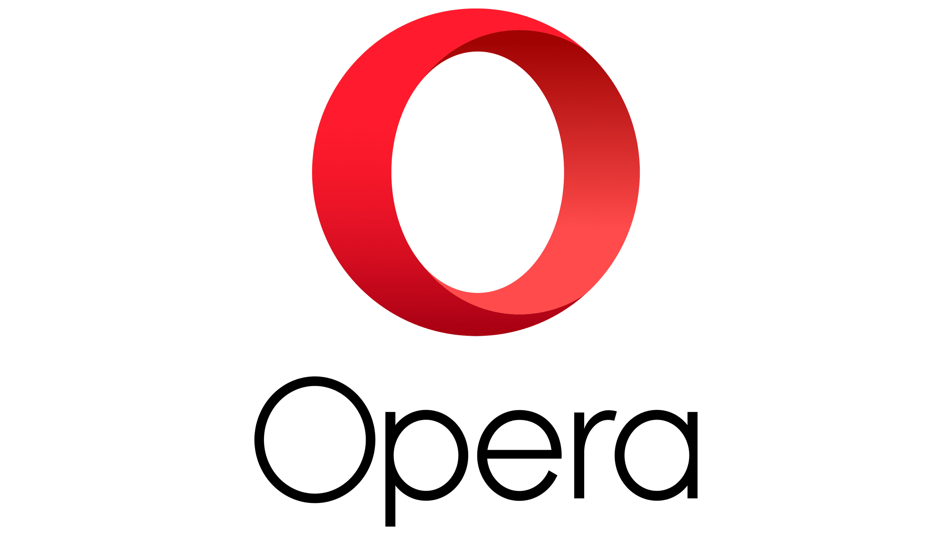
Since 2015, the Opera logo has been written in a thin geometric sans-serif typeface. With their thickness and round shape, the letters resemble the corresponding characters from SoftMaker’s Montreal Serial Light, BluHead Studio’s Churchward Legible Light, and other similar typefaces. The monotonous black color of the wordmark blends in well with the red gradient used for the 3D “O” emblem.