Anyone waiting for the sequel to the Orange series Beastars can breathe a sigh of relief as the creators announce the creation of the next season of the anime series. True, this message brought with it some disappointment since the third season will be the last. Based on the work of the same name by Paru Itagaki, the story of anthropomorphic animals in a civilization similar to the modern one tells about a terrible murder on a school campus, which a group of student friends is trying to solve. The world created by Itagaki is inhabited by two main groups – herbivores and carnivores, which are in some equilibrium with each other, so fragile that any deviation from the norms of coexistence can cause a terrible explosion of violence. The series premiered in 2019 in Japan and the U.S. she could only be seen in 2020. The success of the first season necessitated the rapid creation of a sequel. He was nominated for the Ursa Major Award for Best Dramatic Series.
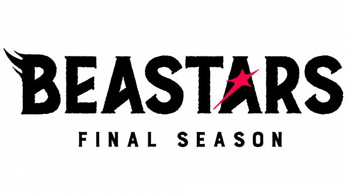
The announcement for the new season did not contain information on the number of episodes planned for it. However, it is assumed to contain at least the traditional 12. The release date of the third season was also not announced. But the logo has already been created and presented to the general public on Twitter pages. It is the textual title of the series in uppercase capital letters. Their graphic design – with serifs and additional elements in black color – should convey the essence and atmosphere of the series. The use of black was carried out without strict adherence to the boundaries within each letter. The impression is that they are created with the help of the spreading darkness, forcing an atmosphere of horror. This effect is enhanced by the performance of the first letter “B,” which has an addition in its upper part – forming a visual association with rapidly moving darkness.
A bright red star embedded in the letter “A” provides the only accent in the composition. It plays a dual role, allowing it to be accepted as an element of something good – hope for a successful outcome or as a symbol on the side of monsters, echoing their terrifying color of fiery eyes against the background of complete darkness. Most likely, the creators conceived this to form an intrigue before the start of the season. To not create a debate about the future of the series, the logo immediately indicated that this would be the complete completion of the manga. Under the title in black, but in smaller print, it is stated that this is the final season. The black and red palette of the logo is an effective way to convey the atmosphere of the season, to emphasize the important psychological orientation of the series.


