The Orbit logo represents cleanliness and freshness, the brand’s core values. This emblem highlights the company’s commitment to providing products that promote oral health and offer long-lasting fresh breath. The brand has become a symbol of trust and quality in the chewing gum market, where every aspect of the brand is focused on enhancing daily comfort for its users.
Orbit: Brand overview
Beginning in Chicago in 1892, Orbit gum was initially a side product of William Wrigley Jr.’s soap and baking powder business. The free gum he offered with his products quickly outshone the main goods, steering Wrigley towards the gum industry.
In 1944, Orbit emerged in the US as the first chewing gum wrapped in hygienic foil, a significant innovation. However, the scarcity of materials during World War II halted its production soon after its launch.
1976 marked a pivotal year for Orbit, re-entering the US market as the first sugar-free gum sweetened with xylitol. This signaled a strong commitment to dental health and catering to the growing health-conscious populace.
The brand expanded globally in the 1980s and 1990s, extending its reach to Europe, Asia, and Latin America under the Wrigley umbrella. This international push resonated well with consumers worldwide, thanks to a focus on oral health and hygiene.
During this period, the brand expanded its flavor portfolio to include peppermint, spearmint, cinnamon, and various fruits. Packaging innovations like the Orbit Car Cups and mini-packs enhanced the product’s convenience and portability.
A major milestone was reached in 2008 when Mars Incorporated acquired Wrigley for $23 billion, forming Mars Wrigley Confectionery. This merger provided additional resources and expertise, further advancing the development of the brand alongside other Wrigley brands.
The brand achieved cultural phenomenon status through vibrant marketing campaigns in the 2000s and 2010s. The memorable slogan “Dirty mouth? Clean it up with Orbit” and engaging commercials helped deepen the brand’s imprint in public consciousness.
In 2015, the brand launched Orbit White, a teeth-whitening gum line, in response to the demand for premium oral care products. The brand responded to environmental concerns with eco-friendly packaging and supported recycling initiatives. Moreover, the brand broadened its assortment to include gums free from artificial flavors and colors.
It is a leading brand in the chewing gum category under Mars Wrigley, known for its commitment to freshness and oral hygiene in over 150 countries.
Meaning and History
What is Orbit?
It is a global chewing gum brand owned by Mars Wrigley Confectionery, one of the world’s largest confectionery manufacturers. Known for its innovative products, brand offers long-lasting fresh breath and dental care. The brand provides various flavors and functional properties of chewing gums, including enamel strengthening, cavity prevention, and plaque reduction.
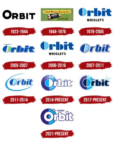
1923 – 1944
From 1923 to 1944, Wrigley introduced a chewing gum called Orbit. The first logo for this brand was minimalist, a popular style at that time that mirrored major design and marketing trends. It featured bold black letters that were memorable and clear black letters communicating the product’s essence. The design’s simplicity and elegance showcased Wrigley’s innovative production methods, and its clean lines symbolized the gum’s ease of use.
Wrigley was already well-trusted and popular among other gum brands, which helped Orbit quickly carve out its own space in the market. The product stood out with its unique packaging design and quality, offering consumers a new experience in chewing gum. Orbit was a fresh addition to Wrigley’s lineup, designed with modern consumer trends and expectations.
1944 – 1976
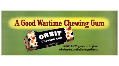
The brand became increasingly popular during World War II, especially among military personnel. Wrigley positioned Orbit as a cost-effective alternative to its other products sent to the front lines. This strategy helped the brand carve out a special place in the market, emphasized by the emblem’s green background, which highlighted its accessibility.
The brand’s ads featured a bright yellow background and a slogan suggesting that chewing gum was ideal for wartime. It was marketed as providing entertainment and a distraction from military life’s difficulties while offering practical benefits. The ads had a fresh, comforting design intended to evoke feelings of home warmth even in tough times.
The packaging design was eye-catching. It featured black borders that seemed to tear open, revealing the gum inside, wrapped in white and dotted with colorful bubbles. This design aimed to create a festive, joyful impression, emphasizing the sweet moments in life, even during the war.
A small caption on the packaging noted that the gum was made from purified, safe, and beneficial ingredients. This added to the image of Orbit as an eco-friendly and healthy choice, reinforcing the brand’s commitment to quality and safety during a critical time. Although some might view these marketing claims skeptically, they effectively strengthened the brand’s positive image among consumers.
1976 – 2005
In the 1970s, Orbit gum was upgraded with a new, improved formula. The gum’s makeup and appearance also changed a lot during this time. The logo was also changed to showcase the gum’s health benefits.
The new logo had sharp geometric shapes in shades of blue and green. These colors are linked to freshness. The design made the gum look pure and fresh, showing that Orbit was serious about making gum that helps with oral care.
The logo had rectangular shapes resembling the soft cushions used to make gum. This helped show that the gum was comfortable to chew and different from other gums.
The packaging included the name of the company that makes Orbit, which was meant to make people trust the gum more. They used a black font for this part, which made it look more serious and focused on quality.
2005 – 2007
The Orbit logo features a white outline with a light blue shadow, giving it a clean and elegant look that resembles a neatly shaped tablet. This design reflects Orbit’s ability to whiten teeth without sugar, emphasizing the brand’s focus on health. The logo suggests that gum is tasty and helps maintain oral hygiene.
The logo’s thin lines suggest that the gum is calorie-free, making it a good choice for people who care about their health and figure. Each piece of gum is wrapped in a thin white shell, shown in the logo as a white contour, highlighting the gum’s purity and protective qualities.
The logo’s lines also symbolize protection against germs and support for oral health. The green part of the ‘O’ points to the natural ingredients like mint and menthol, which refresh and protect against bacteria, adding to the gum’s appeal.
2006 – 2012
In 2006, Wrigley again used the 1970s logo design for its main brand, Orbit. This decision helped reinforce the brand’s original values and its history of providing fresh breath to its customers. The logo from the 1970s was simple and conveyed the idea of being available to everyone.
2007 – 2011
In 2007, Wrigley updated its brand with a new logo that featured a prominent white border. This design was chosen to reflect the whitening benefits of Orbit’s new gum products, which were created to improve dental health and enhance the appearance of teeth. The border made the logo stand out and effectively represented the gum’s ability to brighten teeth.
The logo, resembling a sticker, symbolized a reward for good dental hygiene, adding a fun and attractive element to the product and promoting its benefits for oral care.
Orbit gained support from dental associations, marking a key achievement for the brand. This endorsement helped Orbit strengthen its position in the market as a gum that freshens breath and promotes healthier, whiter teeth through its clinically proven effects.
2011 – 2014
Brand recently launched an Orbit Mega Mint product, which boosts minty freshness. This new product features an orbital symbol in the brand’s logo to represent the enhanced flavor and extended dental protection it offers. This symbol also reflects the brand’s growing popularity and increase in sales.
The logo now includes a star element, representing the infinite nature of space and the strong, lasting freshness of the gum. This addition underscores Orbit’s promise to deliver immediate freshness and ongoing oral protection, day or night.
2014 – today
Orbit recently updated its logo to include a double circle around the letter ‘O’, symbolizing continuous oral protection. The logo features a purple section for nighttime and a blue section for daytime, enhancing communication and brand recognition.
The ring’s light reflection highlights the advantages of Orbit gum in maintaining a bright smile. The white text on the product packaging corresponds with the gum’s color, reinforcing Orbit’s dedication to dental health and cleanliness.
The logo includes a lavender outline around the letters, accentuating the gum’s antibacterial properties and emphasizing round-the-clock protection against microbes.
2017 – today
When Orbit merged with Mars Inc., the brand’s visual identity changed significantly. The brand name’s letters were updated to a deep blue, reflecting Mars Inc.’s logo, known for its involvement in the sweet products and food industry.
The letters now have a white outline and added sparkle, designed to evoke the appearance of clean, healthy tooth enamel. This detail highlights Orbit Gum’s benefit of promoting oral health and underlines its dedication to its consumers’ dental care.
The logo continues to feature the theme of day and night, representing continuous protection and care for oral health at all times. This element emphasizes the brand’s commitment to providing high-quality oral care products.
2021 – today
In 2021, Orbit refreshed its logo to make it more playful and appealing. The logo features rounded letterforms that resemble children’s toys, outlined in elegant purple to add vibrancy. The background transitions day to night, emphasizing the brand’s promise of continuous protection.
A twinkling star in the logo enhances Orbit’s image as lofty and reliable, adding a magical touch to the design. This star represents Orbit’s market leadership and commitment to innovation and quality in the chewing gum industry.
Font and Colors
The Orbit logo features a custom-designed, bold sans-serif font in uppercase letters. Although exclusive to the brand, the design resembles fonts like CFB1 Shielded Avenger STRIPE Normal or Habanera Outline, but with significant modifications to make it softer and more accessible.
This font centralizes Orbit’s branding, highlighting the gum’s clean and refreshing character. It conveys a sense of fun and accessibility, fitting the brand’s friendly image. The clean lines of the sans-serif font reflect the refreshing effect of the gum.
The logo’s youthful and modern look helps Orbit stand out in the competitive chewing gum market. Outlines around the characters add a playful contrast, enhancing the text’s visual appeal.
The logo’s colors—white and two shades of blue—create a feeling of freshness and cleanliness, evoking the cool, minty sensation of the gum. White offers clarity and purity, while the blues are associated with freshness and reliability, key qualities that Orbit aims to communicate to its customers.
FAQ
Is Orbit owned by Wrigley?
The Wrigley Company, a big name in chewing gum and sweets, makes Orbit. William Wrigley Jr. started this company in 1891, first selling soap and baking powder, but then he switched to making gum, which took off. Orbit, one of their top products, came out in 1944 as a sugar-free gum, a new idea back then. Considering people’s dental health, it was made to be a healthier choice than sugared gum. Over time, Orbit became popular for its no-sugar recipe, many flavors, and unique packaging, making it a go-to anytime for a clean, fresh feeling.
In 2008, Mars, Incorporated, a huge company that makes many different foods, drinks, and pet care products, bought Wrigley. This move helped Orbit and Wrigley’s other products reach even more people globally.
What does the Orbit logo mean?
The logo design has a unique look. The “O” in the logo is split into two colors, one dark and one light. It symbolizes how the Earth orbits the sun, bringing us day and night. The logo matches the brand name “Orbit” and represents the idea of constant movement and reliability. The design suggests that, like the dependable cycle of day turning to night, Orbit gum is something you can always rely on for freshness, no matter the time.
Using two contrasting colors is a statement of balance and wholeness, reflecting the brand’s commitment to providing a refreshing chewing experience. The logo tells you that Orbit gum is designed to fit perfectly into your life, keeping your breath fresh 24/7.
Is Orbit a good gum?
The gum is good for your teeth. The American Dental Association says chewing Orbit Sugarfree Gum 20 minutes after eating can help prevent cavities. This is because it produces more saliva, which lowers acid, strengthens teeth, and keeps enamel healthy. Saliva also cleans your mouth and fights off germs.
Orbit Sugarfree Gum also helps keep your smile bright. A clean mouth is important for good oral health and confidence. The fact that Orbit is sugar-free means it doesn’t cause tooth decay like sugary gum. Dental experts recommend Orbit to keep your mouth healthy and your smile shining, all with a sugar-free snack after meals.
Why is Orbit gum called Orbit?
Orbit gum is a well-known brand from the Wrigley Company. The name “Orbit” points to its modern and worldwide image and cleverly mentions sorbitol, one of its main sweeteners.
The term “orbit” brings to mind space, satellites, and planets. This fits the era when space exploration was a big deal, making “orbit” a word that people connect with new technology and the future. The Wrigley Company used this name to make Orbit gum seem fresh and innovative. This matches the company’s ambition to make Orbit a key player in the global gum market.
Specifically, “Orbit” hints at “sorbitol,” a sweetener in the gum that doesn’t cause tooth decay. Sorbitol and other sweeteners like mannitol and xylitol make the gum better for oral health. The name hints at this benefit, clarifying that Orbit gum is tasty without being bad for your teeth. Choosing the name “Orbit” was a smart marketing move. It captures the gum’s worldwide appeal and commitment to innovation and health. The name is easy to remember and has a positive vibe, helping it stand out.
