The Mars logo, part of the legendary Mars chocolate bar, is known to generations of sweet lovers. This dynamic brand visualization embodies high taste and symbolically depicts space and the eponymous planet.
Mars: Brand overview
Mars is a well-known brand of chocolate bars founded in 1932. Today, the company is one of the world’s largest manufacturers in its segment and owns various bar brands that are valued and recognized worldwide.
In 1932, against a backdrop of ambition and familial discord, Forrest Mars Sr. left an indelible mark on the confectionery world by establishing Mars Limited in Slough, England. That same year, he introduced the Mars Bar, a blend of nougat, caramel, and milk chocolate that quickly became the company’s hallmark product. This era marked the start of Mars’s rapid expansion across Europe, introducing beloved products like Maltesers.
The growth of Mars necessitated a move to a larger headquarters in Slough by 1940, setting the stage for another landmark event in 1941. Forrest Mars Sr.’s return to the U.S. and his collaboration with Bruce Murrie from Hershey’s led to the birth of M&M’s, which would become synonymous with Mars’s brand innovation.
The ’50s and ’60s were periods of continued expansion for Mars in Europe and North America, with the introduction of new products such as Skittles and Whiskas. The 1967 merger with Kal Kan Foods, Inc. marked Mars’s entry into the pet food market, a segment it would dominate in the ’80s through strategic acquisitions like Advance Pet Care and Royal Canin.
In the ’90s and 2000s, Mars further enhanced its brand portfolio by acquiring Uncle Ben’s and Pedigree. In 2008, Mars significantly entered the gum industry by purchasing Wm. Wrigley Jr. Company for $23 billion.
The 2010s were defined by Mars’s focus on sustainability, commitment to reducing greenhouse gas emissions, and assurance of ethical supply chains. Today, Mars is a colossus in the private confectionery and food production sector, with its headquarters in Slough, England, and operations in over 80 countries.
With flagship brands like Mars Bar, M&M’s, and Pedigree, Mars has significantly influenced the confectionery and pet food industries. Its continued focus on sustainability, innovation, and producing joy-bringing and nourishing products for people and pets worldwide keeps Mars at the forefront of its industry.
Meaning and History
Mars is an iconic brand that is popular in many countries around the world. As a legend, this brand has a strong and recognizable visual style. It was first created after the company’s founding and has only slightly changed today.
The Mars logo has a wordmark: bold red letters in a yellow outline are placed on a black background. The brand style was created in the mid-20th century.
Later, in the 1980s, the wordmark was placed on a black background, repeating the outlines of the letters. The font was also replaced with a more modern one.
The logo we know today was developed in the early 2000s and consists of a wordmark, a modern font that looks hand-drawn and resembles Comic Sans with its playful, energetic lines and red letters with specks of yellow gold. The logo has a three-dimensional and dynamic appearance.
The Mars inscription is placed on a horizontally positioned black oval, slightly stretched, creating a sense of a cosmic plane and adding to the brand name the meaning of the planet.
It’s a strong and simple visual identity built on confident lines and bright color combinations. The logo shows the brand as timeless and powerful, one that has always been here and will remain for many more years – an instantly recognizable classic.
What is Mars?
This name is used both for the American company Mars Incorporated, which has been producing food products since 1911 and for its brand of chocolate bars that appeared in 1932.
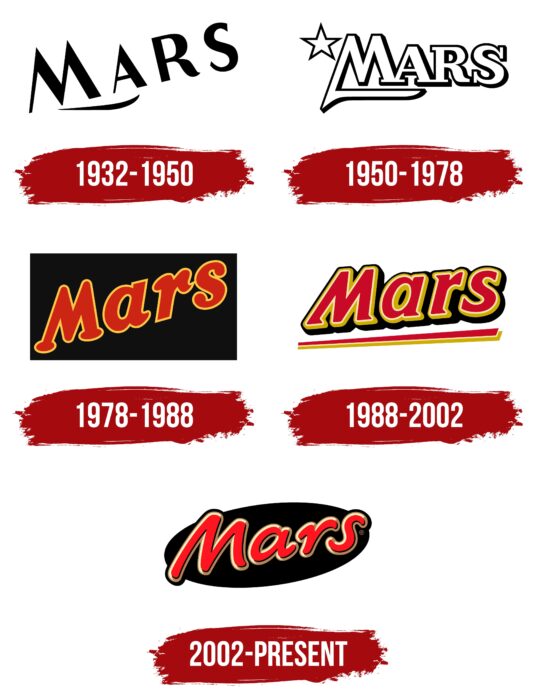
1932 – 1950
The first Mars logo was simple and monochromatic. The only thing that distinguished it was the diagonal inscription. It consisted of contrasting letters: “M” and “A” had straight lines and pointed elements, while “R” and “S,” on the contrary, were dominated by smooth curves and roundings. Under the first two characters was a single graphic element – a short stroke with thickening.
1950 – 1978
After the redesign, the logo changed significantly. It became modern and original. The glyphs were hollow inside, consisting of thin black lines with emphasized shadows on the right side. The inscription was placed horizontally and decorated with serifs, as well as a short underline coming from one of the legs of the letter “M.” The letters were capitalized and placed close to each other. In the top left corner was a white star with five sharp rays.
1978 – 1988
The owners of the confectionery company decided to keep the word style in the logo, so they removed the star and added some color. Capturing the connection between the founder’s name and the name of the well-known celestial body, the designers suggested a red-yellow version of the emblem so that it resonated with the concept of the “red planet.” As a result, they achieved attractive brightness. Black was chosen for contrast. The word “Mars,” as before, received an oblique placement. The letters became lowercase (except the first), round, and with smooth lines.
1988 – 2002
The developers presented a logo with a modern font – more accented and attractive. The glyphs had angular transitions, sharp expansions at the ends, and solid black shadows across the inscription. They repeated the contours of the letters. Underneath the lower part was an underline. The text’s slope was minimal.
2002 – today
In the early 2000s, Mars got an emblem with a font resembling Comic Sans. It was non-classical and individual, with a free style of writing. The serifs disappeared from the glyphs, but they remained bold. Designers also removed the yellow outline around the letters, replacing it with a blurred white stripe. The logo’s background is a black oval.
Mars: Interesting Facts
Mars, Incorporated is a big company that makes a lot of the candy and food we know and love, and they do a bunch of other cool stuff, too.
- Started by a Family: Frank C. Mars started the company, and his family still runs it. This means they can think about the future without worrying about what stockholders think.
- More Than Just Mars Bars: Sure, the Mars bar is famous, but they also make M&M’s, Snickers, Twix, Milky Way, and Dove chocolates. Plus, they’re into pet food and care with brands like Royal Canin and Pedigree, and they even make Uncle Ben’s rice.
- All Over the World: Mars sells its goodies in almost every country, making its yummy products known worldwide.
- Caring for the Planet: They work hard to protect the environment. Mars wants to stop contributing to climate change and is looking into ways to help farmers grow better crops without harming the Earth.
- Pets Matter Too: Mars isn’t just about candy; it’s big on pet health and nutrition. It provides vet services and makes pet food to keep our furry friends happy and healthy.
- The Story of M&M’s: M&M’s was invented in 1941 for soldiers who wanted chocolate that wouldn’t melt easily. The candy’s hard shell keeps the chocolate inside from getting all melty.
- Snickers, A Big Deal: Snickers is super popular worldwide. It got its name from a horse the Mars family loved.
- Big on Research: Mars spends a lot of money on research to make better products and to figure out how to grow cocoa beans without hurting the planet.
- Doing the Right Thing: Mars tries to be good by making sure the stuff they use is bought fairly for everyone and teaching farmers how to grow things more effectively.
- Mars’s Five Rules: Mars has five important rules: Quality, Responsibility, Mutuality, Efficiency, and Freedom. These rules help Mars make good decisions and conduct business in a way that’s good for everyone.
Mars has grown from making just one chocolate bar to being a giant that produces all sorts of foods, takes care of pets, and tries to do good for the planet and its inhabitants.
Font and Colors
The Mars company logo stands out with a unique, smooth, and friendly typeface. This font features rounded, full strokes, creating a welcoming look similar to casual fonts like Comic Sans and Sign Language Italic. Still, it’s specially tailored to match Mars’s distinct brand identity.
The logo uses a vibrant color mix of red, gold, and black to highlight the luxurious quality of Mars chocolate bars. Red brings warmth, gold brings luxury, and black adds sophistication. This color scheme makes the logo eye-catching and conveys the brand’s dedication to excellence and fine detail.
FAQ
What is Mars a brand of?
Mars, Inc., is a global powerhouse creating delicious snacks such as chocolates, gum, mints, and fruity candies. It’s celebrated for its range of popular brands, which many people enjoy. Mars dedicates itself to producing tasty, high-quality snacks, winning over countless fans.
Chocolates Mars produces a variety of chocolate treats, from bars to candies. Their chocolates are famous for their delicious taste, achieved through quality ingredients and innovative production methods.
Gum and Mints Mars offers a wide selection of gum and mints to freshen your breath and provide a flavorful chewing experience. They constantly introduce new flavors and products to keep their lineup exciting.
For those who prefer non-chocolate options, Mars also excels in fruity candies. These treats are crafted with the same commitment to quality and enjoyment as their chocolate products.
Doing Good Mars focuses on more than profit. It is deeply committed to ethical sourcing and production practices and strives for sustainability, ensuring its operations are environmentally friendly and supportive of the communities it engages with.
Spreading the Word, Mars effectively markets its snacks, utilizing advertising and social media to highlight the joy its products bring. It continually adapts and improves its offerings in response to consumer preferences, aiming to satisfy and delight its customers.
Is Mars a US company?
Mars Inc. is a major US company headquartered in McLean, Virginia. This location highlights its strong ties to American culture and commerce. With over 7,000 employees nationwide, Mars Inc. significantly contributes to the US economy and employment.
Mars operates 15 manufacturing facilities in the US that produce various products for Americans and an international audience. This setup underscores the company’s significant presence in the US and its integral role in Mars’s global operations.
Is Mars a Nestle?
Mars and Nestlé are two big companies in the snack and drink industry. Nestlé is from Switzerland and sells many products, including coffee, bottled water, frozen meals, and dairy items. It is famous worldwide but does not produce M&M’s or on Mars. On the other hand, Mars, an American company, is known for creating popular sweets and chocolates such as M&M’s, Snickers, Skittles, and Starburst. It plays a significant role in the candy industry and offers a wide range of treats that are loved globally.
Both Mars and Nestlé are important in the food and drink market. They operate their businesses independently, focusing on their unique brands and product types. While sharing the same market, they concentrate on their strengths and contributions.
What is the Mars logo?
The Mars logo is famous, mostly because we see it on popular chocolate bars. It’s simple and effective, using a bright red color for the name “Mars,” which catches your eye and fits the brand’s energetic personality. The logo sits on a black oval background, which makes the red stand out more and gives the logo a sleek, classy appearance. This black backdrop also hints at the vastness of space and the planet Mars, cleverly linking to the brand’s name.
The design of the “Mars” text is also noteworthy. It leans forward, suggesting the brand values progress and innovation. The font looks like it was written by hand, which adds a personal, friendly touch and contrasts well with the oval’s precise shape. The letters are outlined with a shadow, making them stand out against the black and adding depth to the design.
What does the Mars logo symbolize?
The Mars logo stands out with its clever design that reflects the brand’s essence. You immediately notice the bright red “Mars” text against a black oval. This choice links to the brand’s space-themed name and influences our perceptions and emotions.
The black oval suggests outer space, adding an intriguing, adventurous feel to the brand. The black background makes the name Mars stand out, especially on crowded store shelves. The red color of the “Mars” text is a powerful choice. Red can stimulate appetite and capture attention, making it an excellent pick for a brand looking to stand out with its delicious chocolate bars. The slanted and slightly uneven letters in “Mars” resemble the gooey filling of a Mars bar, hinting at the chocolate’s creaminess and enticing you to try one.
What font is used in the Mars logo?
The Mars logo uses a unique font created specifically for Mars chocolate bars. Forrest Mars Senior’s signature inspires it and reflects the company’s heritage.
The letters in the logo tilt to the right, giving it a dynamic, forward-moving appearance. This design choice conveys a sense of excitement and adventure, aligning with the Mars brand’s image. The lettering features rounded ends, reminiscent of the soft, gooey caramel inside a Mars bar. This detail enhances the logo’s appeal by evoking the taste and texture of the chocolate bar. The Mars logo’s font was carefully selected to embody the brand’s history, personality, and connection to its product.
Who designed the Mars logo?
The Mars logo was created by the team at Jones Knowles Ritchie, a well-known creative agency. A senior designer, Peter Gibbons, led the project, but it was a collaborative effort. Carl Bartram enhanced the logo digitally to ensure it looked great online, and Vincent Wakerley, the illustrator, added unique artistic details. Alan Levett focused on the typography, ensuring the font perfectly matched Mars’s brand style.
As designers, David Mann, Robert Brooks, Dom Mallin, and Vicky Roberts contributed to refining the logo. Chris Halton played a key role in the strategy, aligning the logo with Mars’s broader goals. Ian Ritchie, the creative director, was crucial in coordinating the team to produce a logo that accurately reflects the Mars brand.
What is the slogan for Mars bars?
The slogan “Work, Rest, and Play” was synonymous with Mars chocolate bars, suggesting they’re perfect for any time of day—during work, relaxation, or play. This phrase was central to Mars advertising until 1997 and became a key part of its brand.
In 1997, Mars introduced new slogans like “The pleasure you can’t measure” and “Must be Mars,” emphasizing the unique joy and satisfaction Mars bars offer, focusing on their distinctive taste.
In 2007, the slogan returned to “Work, Rest, and Play Longer,” aligning with Mars’s new focus on sports and active lifestyles. This suggests that Mars bars could help boost energy.
By 2015, the slogan evolved to “Add a little play to your day,” encouraging people to enjoy moments of fun in everyday life, with Mars bars enhancing those moments. While these slogans were never part of the Mars logo itself, they were used in advertisements to communicate the brand’s values.
