


 Oregon Ducks Logo PNG
The Oregon Ducks logo symbolizes the strength, unity, and traditions of the University of Oregon. It reflects the university’s deep connection to Oregon’s natural environment, a state known for its forests and green landscapes. The emblem also emphasizes the community spirit and sports culture essential to the team’s and fans’ identities.
The University of Oregon was founded in 1876, while its football program began in 1894. The teams were first known as the Webfoots, a name linked to early Oregon settlers. In the 1920s, a local sports editor began using the Ducks nickname in newspaper coverage, and it gradually gained acceptance among fans.
The football team improved slowly in its early decades. In 1948, it won its conference and reached the Rose Bowl, although it lost the game. The program had uneven results in the 1950s and 1960s, then changed direction under Rich Brooks in the 1970s. He led the team back into bowl contention in 1989 and to another major Pasadena appearance after the team won the Pac-10 in 1994.
Mike Bellotti became head coach in 1995 and turned the Ducks into a regular conference contender. In 2001, the team finished second nationally. Chip Kelly took over in 2009, built one of the country’s fastest offenses, and led the team to the 2010 national title game, where it lost to Auburn. Oregon then defeated Wisconsin in 2011 and Kansas State in the 2012 Fiesta Bowl. Marcus Mariota led the 2014 team to the national championship game before Mark Helfrich replaced Kelly after Kelly’s move to the NFL.
Mario Cristobal later led the Ducks to Pac-12 Conference titles in 2019 and 2020 before Dan Lanning arrived in 2022. Beyond football, Oregon reached the men’s basketball Final Four in NCAA play in 2017, developed strong women’s basketball teams, and kept a major track and field profile through Hayward Field. The school’s athletic image was also shaped by alumnus Phil Knight, who founded Nike and supported its uniform culture.
Oregon Ducks Logo
What is Oregon Ducks?
This is the name of the athletic teams of the University of Oregon, based in Eugene, Oregon. The Ducks, who play in the Pac-12 Conference, are recognizable because of their mascot, a duck, and their eye-catching green and yellow colors. Oregon’s athletic programs have become better known nationwide, especially in soccer and track and field. The soccer team is known for its creative, fast-paced offense and the dynamic, eye-catching jersey design that has become a symbol of the program. Through close ties to Oregon resident and Nike co-founder Phil Knight, the athletics program has produced many Olympians and elite athletes.
The university has 18 Pac-12 Conference athletic teams that are NCAA Division I members. They include soccer, track and field, basketball, baseball, and tumbling, among others. Overall, they have won 28 NCAA team events and 60 individual events. The initial roster of players was introduced in 1893, and a year later, they played their first game. The first serious victory came to them in 1917. The basketball players won the first NCAA basketball tournament. This happened in the 1938-1939 season.
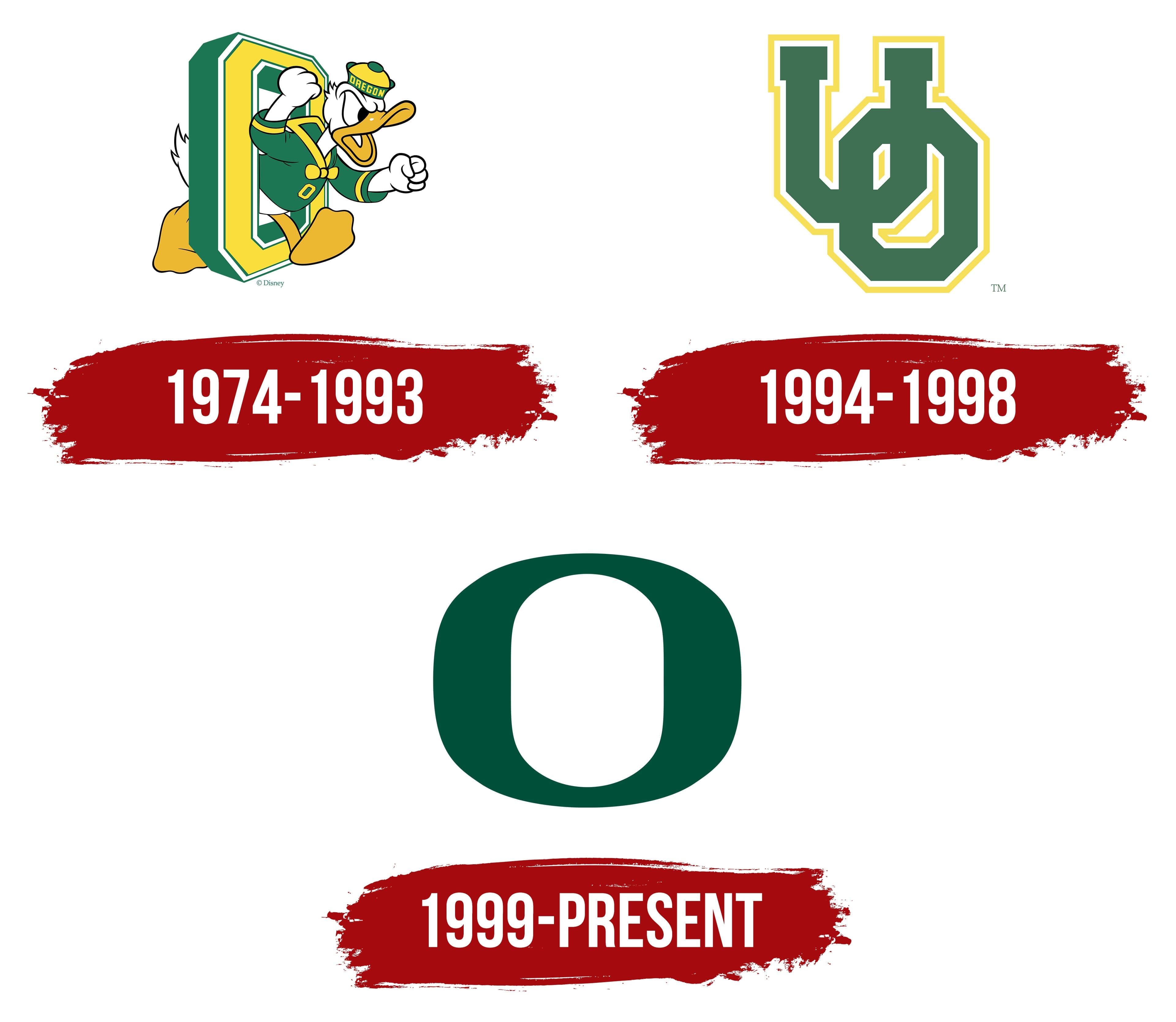
1974 – 1993
The sports logo features a large letter “O” with trimmed corners, making it an octagon. The letter is tilted, revealing only one side, colored green, while the rest is yellow. Thin white borders run along the letter’s outer and inner edges. At the center of the emblem is an anthropomorphic drake wearing a jacket and a brimless cap. The drake is menacingly shaking its fists as if ready to attack an opponent. This image is directly associated with the name of the University of Oregon’s sports department, the “Oregon Ducks.” All elements of the visual mark are colored in the official university colors, yellow and green.
In the 1970s, American sports teams frequently used bright and memorable mascots to give their teams a unique identity and evoke an emotional response from fans. The anthropomorphic drake, chosen as the symbol, embodies courage and readiness to fight. It appears energetic and determined, intended to inspire the team to victory and intimidate opponents.
The green color represents Oregon’s natural environment, reflecting its connection to local traditions and nature. The yellow adds energy and vibrancy to the logo, which is associated with sunlight and optimism. The white borders provide clarity and contrast, highlighting the logo’s elements and making them more prominent.
1994 – 1998

The university administration changed the logo to avoid any direct resemblance between the sports mascot and the cartoon character Donald Duck. As a result, the University of Oregon’s acronym, “OU,” was introduced on the emblem. The letters have clear geometric proportions, making them appear similar. The main difference is that “U” has serifs, while “O” does not.
The shape of the letters remained the same as in the previous emblem: the corners are rounded, and the color scheme is green and yellow, with a white stripe added. However, the composition has changed; the primary color is now green, the secondary color (the outline) is yellow, and a light stripe has been added between them. The letters are arranged diagonally and intertwined, creating a sense of dynamism and movement.
Green symbolizes nature and the region’s lush vegetation, while yellow represents the sun and the energy athletes need to achieve victory. The white line between the colors adds clarity and contrast, emphasizing the team’s precision and confidence.
The logo reflected the spirit of the time, and it was important to create a unique and easily recognizable image that would unite the team and its fans. The university aimed for the logo to become a symbol of unity and strength, with its elements geometric precision, color scheme, and interwoven letters highlighting the team’s drive for victory and growth.
1999 – today
The logo is a single letter “O.” It is wide, with an oval inner space that visually resembles two large brackets connected. The sports department opted to simplify the color scheme to just green.
The letter “O” in the emblem is designed with simplicity yet a strong presence. It symbolizes continuity and unity. The circular shape has always been associated with completeness and wholeness. This symbol can convey the team’s cohesion, integrity, and indomitable spirit.
Green is the color of nature, life, and growth. This is significant for a team representing a university. The color symbolizes energy, renewal, and hope for the future. This shade of green is associated with Oregon’s fields and forests, creating a connection to the environment and the region’s traditions.