Oregon Fruit Company, a family-owned business from the Willamette Valley, has undergone a significant rebranding to reflect its heritage and mission. Oregon Fruit is recognized for its quality as a well-known processor of premium fruit products, including canned, frozen, and shelf-stable goods. With this update, the company aims to strengthen its connection to its roots while positioning itself for growth in both B2B and B2C markets.
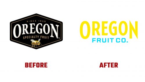
The new logo shifts from the previous design, which featured a hexagonal frame and a bee, creating confusion about the brand’s focus. While loosely related to fruit, the bee mistakenly suggested the company was involved in honey production. The rebranding brings a clearer focus on the company’s long history in fruit processing.
A standout feature of the new branding is the updated wordmark. The typography highlights the company’s name, with large “O” and “N” letters framing the wordmark to evoke balance and stability. The quirky and slightly imperfect script typeface adds an organic, handcrafted feel, reinforcing the brand’s authenticity and connection to real, natural fruits.
The brand’s vibrant, modern look is reflected in the color palette, which includes bright yellow and cyan. While the colors have sparked some debate, as they don’t immediately evoke the natural, fruity essence typically associated with a fruit company, the bold choice helps the brand stand out, especially against the black background used in promotional materials. Moving away from traditional colors like red and green sets Oregon Fruit apart from competitors like Del Monte and Dole, giving it a distinctive, eye-catching presence.
Once a central figure in the branding, the bee has been minimized. Now simplified and used in a badge-like role, it nods to the company’s past without being a primary focus. This change clarifies the company’s emphasis on fruit products and helps reduce confusion about its offerings at trade shows and industry events.
The new wordmark takes inspiration from Oregon Fruit’s historical branding and advertising. The vintage aesthetic is paired with modern elements, maintaining the brand’s connection to its past while embracing a fresh, contemporary identity. The script in the logo draws from the company’s historical advertisements, giving the design a timeless quality.
This rebranding reconnects Oregon Fruit with its history while positioning the company for future success. The updated identity blends tradition with innovation, offering a design that works in wholesale and retail markets. With its fresh approach to color and typography, Oregon Fruit stands out in a crowded marketplace, ready to grow.


