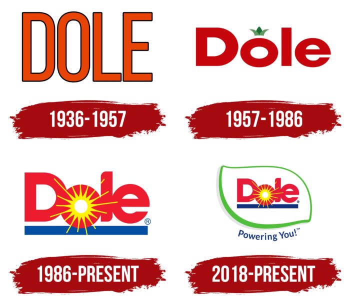
Dole logo has an unusual style that reminds you that the company is associated with agriculture. It’s cute, gentle, and appealing. It gives off an energy of positivity, whose rays emit the soft light. Thanks to that, the emblem glows from the inside out, underlining the importance of plants in human life.
Dole: Brand overview
| Founded: | June 2, 1851 |
| Founder: | Samuel Northrup Castle, Amos Starr, Cooke James Dole |
| Headquarters: | Dublin, Ireland |
| Website: | doleplc.com |
Meaning and history
Visual recognition of the brand is at a high level. And Dole’s vast experience is not the main factor. The logo, which has hardly changed during this time, has a greater influence. In total, four versions of the logo were presented to the target audience. As a rule, the redesign was about small changes that made it more modern and attractive to the target audience.
What is Dole?
This is one of the most famous brands in the agricultural industry. The company has been operating on the market for more than 150 years and, during this time, has gained immense popularity from buyers who number in the millions.
1936 – 1957
The first version of the logo was presented to the public in 1936. As a rule, it was a red inscription with the brand name on a dark blue background. The letters in the word “DOLE” were not on the same line, which created the effect of “waves.” The title used a classic bold sans-serif font with rounded corners.
1957 – 1986
The first redesign of the logo made it more modern and attractive. The red color for the inscription remained unchanged, but at the same time, it became more saturated and confident. All letters were on the same line. The most notable update is the crown that has appeared above the “O.” Visually, it looks like a pineapple. The target audience immediately liked this logo, and therefore it is not surprising that it lasted for more than 30 years.
1986 – today
The current logo appeared in 1986. Now a brighter shade has been used. Also suffered updates and style of writing letters. At this stage, a smooth sans-serif font was used. Spaces between characters have been removed. A blue horizontal line appeared under the wordmark. The crown disappeared, and instead, an abstract image of the sun appeared inside the letter “O.” The rays also touched the neighboring “D” and “L.” Perhaps the shade of red is associated with the appearance of this element.
2018 – today
In general, this redesign did not change the verbal inscription at all. However, a white frame with a thick green outline appeared around it. Visually, it resembles a leaf of a tree.
Font and Colors
Throughout the development of the Dole company, a generally identical bold sans-serif type with rounded corners in letters was used. However, the arrangement of the letters was different. In some versions, the effect of “dancing” symbols was used somewhere; it was about removing spaces, and somewhere the brand name was on the same line without “unique” elements.
Traditionally, the red and blue color palette is considered the main one for this brand. It conveys the passion and desire to continue to develop. At the same time, sometimes additional shades are also used: yellow and green. They may be associated with the sun and life. These qualities are necessary for a modern agricultural company.
Dole color codes
| Alizarin Crimson | Hex color: | #e61938 |
|---|---|---|
| RGB: | 230 25 56 | |
| CMYK: | 0 89 76 10 | |
| Pantone: | PMS 185 C |
| Canary Yellow | Hex color: | #fff100 |
|---|---|---|
| RGB: | 255 241 0 | |
| CMYK: | 0 5 100 0 | |
| Pantone: | PMS 3955 C |
| Air Force Blue | Hex color: | #11317e |
|---|---|---|
| RGB: | 17 49 126 | |
| CMYK: | 87 61 0 51 | |
| Pantone: | PMS 287 C |
| Kelly Green | Hex color: | #50be3a |
|---|---|---|
| RGB: | 80 190 58 | |
| CMYK: | 58 0 69 25 | |
| Pantone: | PMS 354 C |
| Platinum | Hex color: | #e5e5e5 |
|---|---|---|
| RGB: | 229 229 229 | |
| CMYK: | 0 0 0 10 | |
| Pantone: | PMS 663 C |


