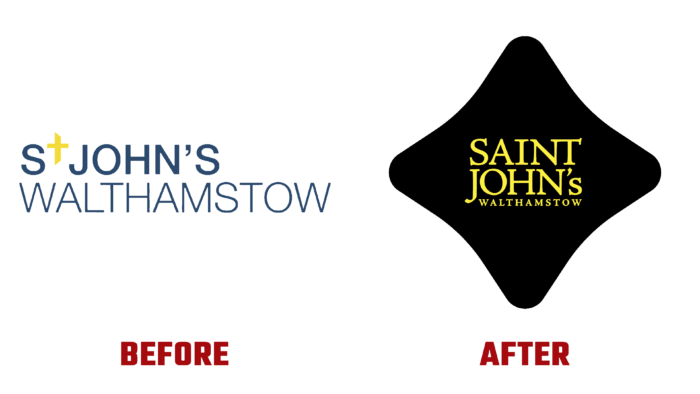
The desire for one’s development and to create an appealing one that reflects the fundamentals of one’s essence is also characteristic of religious organizations. Saint John’s Walthamstow recently presented its parishioners with a new visual interpretation of its design, logo, and branding. Being more than just an architectural structure, it represents the people who make up the foundation of the religious community, building it as an important component of service to that community. A special feature of the organization’s location is its location of quality housing, which attracts wealthy people. As a religious center, the Church is always concerned about its members’ leisure and spiritual and physical development, including children and women. The desire to expand its influence on society has been fundamental in shaping the appearance of the religious brand.
One of the main goals that went into creating the logo, a print imaging project, was to engage parishioners in the active life of the Church. Participants in the new project took their inspiration from the talented local erudite and artist William Morris created all the unique models for the visualization used in the new identity. In addition, a unique URL was developed.
The formation of the new image was based on the rich creative history of Walthamstow. Many famous artists and musicians lived here and live here today who greatly influenced the formation of the corporate identity through their works. The typography drew on elements once created by Kelmscott Press, known for its exceptional work on many unique publications. He developed the original Golden Type font adopted for the formation of the wordmark, based on the work of the 15th-century Venetian engraver and printer Nicolas Jenson. The main font used in the logo was a slightly revised Jenson Pro from Adobe with NT ligature, which acquired a structure that provided the design with better consistency.
Attractive and eye-catching was a platform with the image of a four-leaf clover, taken from the architectural version of the socket window of the church gable. To strengthen the appeal, an original combination of two contrasting colors – black as the background and gold – was used, in which the name of the Church was executed in different font sizes. The readability of the font in different sizes, its contrast, and clarity created all the necessary prerequisites for the formation of brand recognition, ease of perception of the text information, and memorability not only by members of the community.


