


![]() Orlando City SC Logo PNG
Orlando City SC Logo PNG
The Orlando City club logo is shaped like a shield, reminiscent of the team’s early emblems. The lion on the logo refers to Disneyland, where the club originated. The twenty-one rays in its mane symbolize its place in the MLS, and the sun represents the ambition to stand for the entire state of Florida.
Orlando City SC is an American professional soccer club from Orlando, Florida, that competes in the Eastern Conference of Major League Soccer (MLS). Its predecessor, Orlando City, was a USL Pro club. The original Orlando City SC was founded as Austin Aztex FC, which moved to Florida in 2011. The Austin Aztex was established in 2008 and played in the USL First Division.
Phil Rawlins, a British businessman, owns all three clubs. He founded the “Austin Aztex” and then moved the team to Orlando, renaming it after the new location. In 2011, the reorganized team briefly switched to the United Soccer League. On November 19, 2013, “Orlando City SC” was announced as the twenty-first MLS franchise. The team paid $70 million to join the league. The original franchise, which remained in USL Pro, moved to Louisville on June 3, 2014, becoming Louisville City FC.
“Orlando City SC” is owned by a group led by Flavio Augusto da Silva. On February 17, 2013, Brazilian investors became the majority shareholders. The ownership group also includes Brendan Flood (a board member of Burnley FC), John Bonner, and Phil Rawlins (founder and president of “Orlando City SC”).
The team’s primary color is purple. When the team was in USL Pro, its colors were red, purple, gold, and white, the same colors used by Italian Serie A club ACF Fiorentina. The color scheme of the team’s Texan predecessor, “Austin Aztex,” was red and white.
Meaning and History
![]()
Due to relocations and league changes, the club underwent several rebrandings. During the “Austin” period, the “Orlando City” emblem was an English heraldic shield in the shape of a triangle with two arches at the top. After the franchise relocated to Orlando, the logo changed. The final version was introduced after the team joined MLS in 2014.
What is Orlando City SC?
It is an American professional soccer club from Orlando, Florida. It participates in MLS, representing the Eastern Conference. The team was formed in 2013 and began playing in Major League Soccer in 2015, replacing the USL Pro league. The team’s home arena is Exploria Stadium. Businessmen Mark Leonard and Wilf Zigi own the franchise
2010 – 2012
![]()
When the Austin Aztex football club relocated to Orlando ahead of the 2011 USL Pro season, fans were eager to see the new team’s look. The answer appeared early on December 16, 2010, on the local WOFL channel. At 7 a.m., the club emblem, created by Dixon Minear Design Marketing, was unveiled for the first time.
The foundation of the Orlando City identity became a shield with a three-color outline. The inner and outer edges of the shield are gold, with a crimson red contour running between them. The inner background is purple, a color that became central to the club’s identity.
Along the upper arc of the shield, the word ORLANDO is written in white serif letters, while the lower part is symmetrically occupied by the word CITY.
The center of the shield features the club symbol, the legendary three-headed lion. The nickname Lions is closely tied to Orlando’s sports traditions, making this image choice clear and logical.
The central lion head faces forward, while the two side heads turn outward. Their mouths are open, emphasizing an aggressive nature and a will to win. In the lion design, the authors used a golden body color, complemented by dark purple and white tones around the mouth and cheeks. The luxurious mane is rendered in red, strongly highlighting the overall silhouette. The image details are carefully worked out. Fangs, facial folds, and whisker lines make the image realistic.
2012 – 2014
![]()
In 2012, the Orlando City football club updated its emblem by adding a single element. A ribbed five-pointed star appeared at the bottom of the shield beneath the word CITY. All other elements of the symbol remained unchanged. The shield retained its shape and previous outlines.
2014 – today
![]()
Before entering Major League Soccer MLS, Orlando City began updating the brand. To meet league standards, a new emblem was required, and the management started searching for a designer. Priority was given to involving local studios, and in November, a competition began, with 10 of the largest Orlando agencies submitting more than 30 concepts.
The winning work came from an independent designer, a club supporter for 20 years, and a season-ticket holder. He anticipated the club’s move to MLS and began preparing early sketches back in 2012.
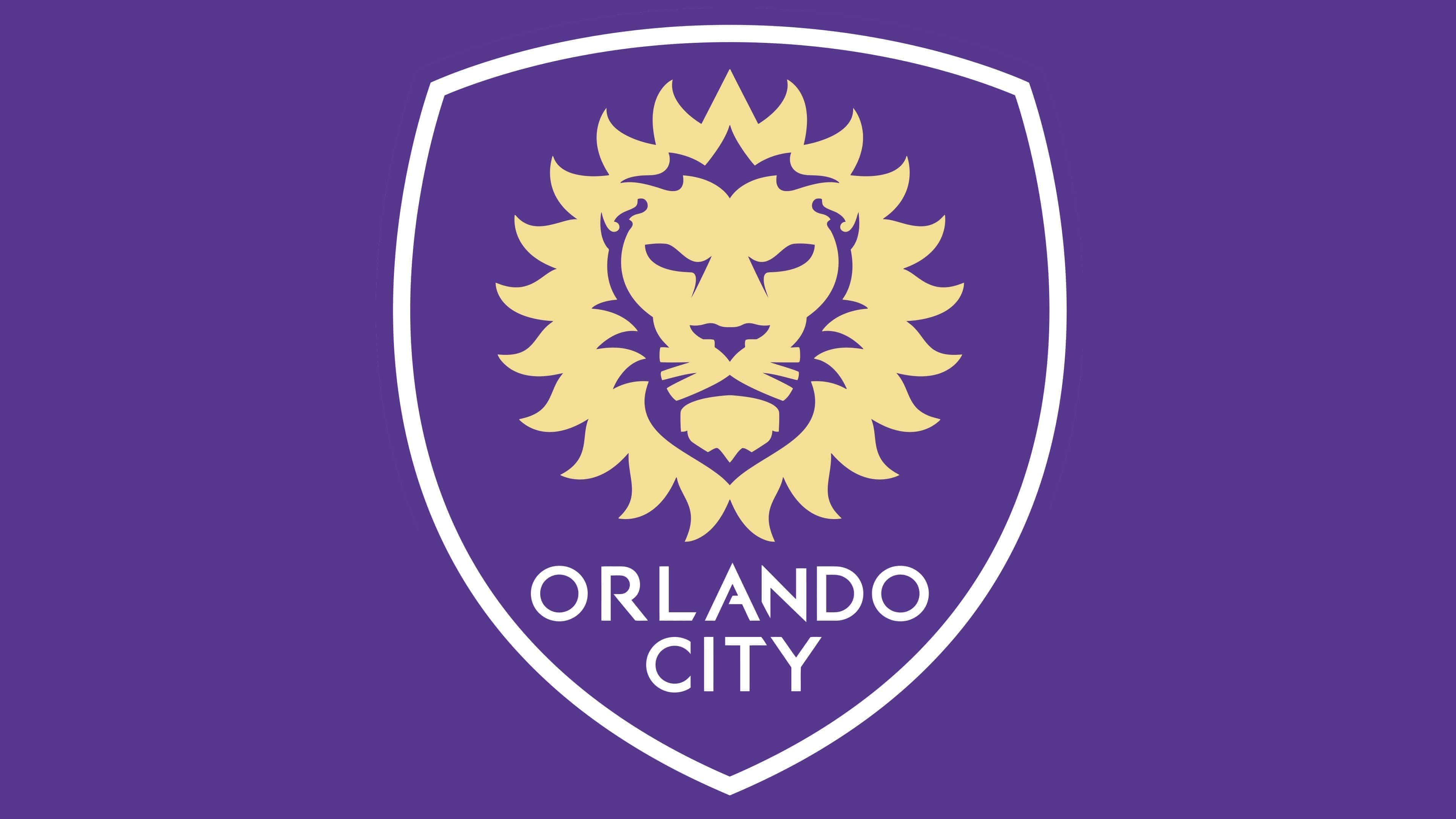
On May 13, 2014, the public saw the final logo. Purple and gold colors were retained, while red was completely removed. The shield received a Norman silhouette, while remaining triangular, with an inner white outline and an outer purple outline.
The center of the new emblem is occupied by a minimalist golden lion facing forward. Its face is calm and strict, with schematic eyes, eyebrows, and whiskers. The lines of the mane suggest the shape of the sun and consist of 21 pointed petal-like rays forming a neat circle. This number highlights that Orlando City became the 21st MLS team, while the sun refers to the unofficial nickname of the state of Florida, the Sunshine State.
In addition, the lion image is associated with Disney’s The Lion King, and Orlando is home to Disneyland. In the negative space of the mane, a thin crown can be seen at the top, hinting at the club leadership in the USL PRO league.
The club name is written in large letters below the lion symbol. The emblem features a clear, simple structure, with golden elements that stand out strongly against the bright purple background.
Font and Colors
Throughout its history, “Orlando City” has had two graphical symbols, both depicting lion heads on a heraldic shield. They differ only in style: the first is cartoonish, while the second favors a minimalist approach. Moreover, the current emblem is presentable and contains many symbolic elements; the lion’s head alone, reminiscent of the sun with its “radiant” mane, is noteworthy.
To highlight the city’s name, designers used the Rams Bold font. The Rams family features sans-serif fonts inspired by the 1930s style. The author of the geometric letter set is Ramiz Guseynov, and the publisher is TipografiaRamis.
The logo’s colors match the official club palette: purple (#61259E) and gold (#FFE293). White is present in a small amount: it is used for the shield’s border and the inscription “ORLANDO CITY SC.”