Osome, the trailblazing online platform renowned for simplifying bookkeeping and accounting for entrepreneurs, has proudly unveiled its new brand identity, featuring a modernized Osome logo. This rebranding reflects the company’s commitment to streamlining business administration for E-commerce ventures, allowing business owners to focus more on growth and less on paperwork.
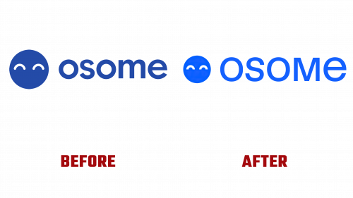
The newly designed Osome logo is a sleek and subtle upgrade from its previous version. It showcases a more refined and contemporary look, aligning with the innovative and forward-thinking services that Osome offers. The brand’s mascot, previously a friendly face, has been given a modern overhaul. The new design features eyes with straight cuts instead of round caps, imparting a sharper, more sophisticated demeanor. This small but impactful change signifies Osome’s evolution and readiness to face future challenges.
In addition to the updated mascot, the wordmark has also undergone a significant transformation. The new unicase style exudes a sense of sleek professionalism and approachability. This balance underscores Osome’s dual commitment to providing top-tier, friendly service and maintaining a professional, reliable image. The refined size relationship between the icon and the wordmark offers a more mature and less whimsical feel, indicating that Osome is serious about quality and precision.
Accompanying the revamped logo is an energetic and playful brand identity that breathes new life into the company’s visual presentation. A series of engaging and minimalist illustrations depict various aspects of business and entrepreneurship. These illustrations avoid the trap of corporate genericness, instead offering a fresh and personal touch that makes the brand stand out. Whether it’s the charismatic depictions of people or the whimsical spot illustrations, Osome’s new visual language is all about adding joy and simplicity to the often complex world of business administration.
The brand’s new identity also features a dynamic mix of serif and sans-serif typefaces. This textual interplay adds depth and modernity to Osome’s communications, creating a textual landscape that’s as diverse and vibrant as the entrepreneurs it serves. The lively interplay between illustrations and typography further infuses the brand with a sense of energy and approachability.
The refreshed Osome logo and accompanying brand identity are not merely cosmetic changes. They represent Osome’s commitment to innovation, quality, and customer satisfaction. As the company continues to expand its global presence, this new brand identity positions Osome as a contemporary and trustworthy partner for businesses seeking to simplify their operations and focus on growth. With this bold new look, Osome is ready to continue its journey as a beacon of efficiency and support for entrepreneurs worldwide.


