Trust me with your letter, and I will deliver it to its destination, says the Outlook logo. The emblem reflects the motif of personal and business correspondence. The visual sign exudes reliability and an invitation to cooperation.
Outlook: Brand overview
| Founded: | 1996 |
| Founder: | Microsoft Corporation |
| Headquarters: | United States |
| Website: | microsoft.com |
Meaning and History
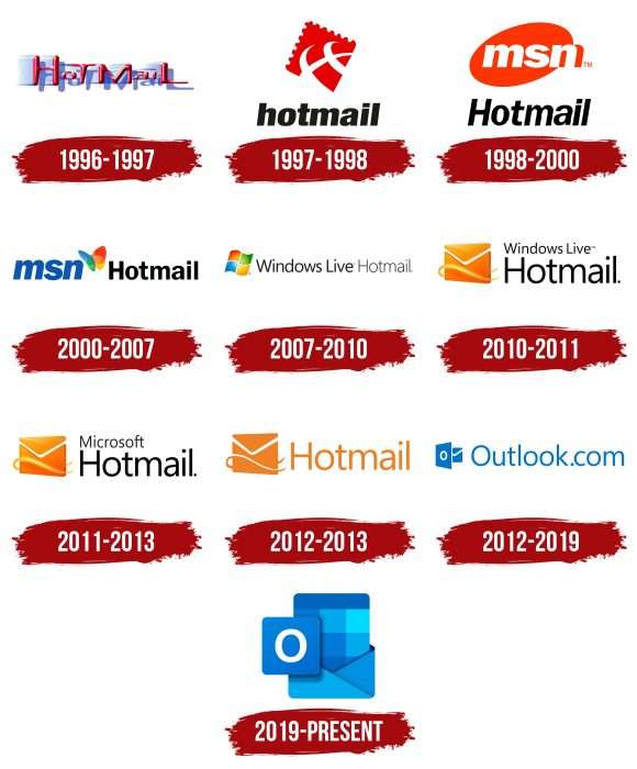
Distinguish Outlook with the “.com” domain from a similar Microsoft Office application. They are two different things, although their logos have been identical since 2019, and the software icons have been the same since 2013. Despite the visual similarity, they have different stories that converged on one point only after the disappearance of Hotmail.
What is Outlook?
Outlook is a multifunctional email client created in 1997 by Microsoft Corporation. It allows users to send and receive emails, manage contacts, and track scheduled events in a calendar. Synchronization with other applications, such as SharePoint and OneNote, is available. The software can be used on Windows, Android, iOS, and macOS operating systems.
1996 – 1997
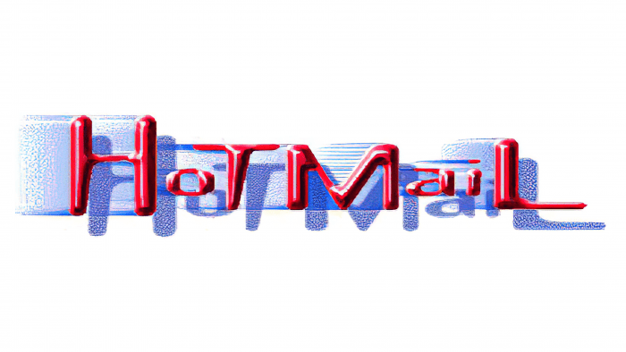
In 1996, the era of the HoTMaiL postal service began. Its name on the logo was written just like that – with “H,” “T,” “M,” and “L” in upper case. The fact is that the developers used HTML when creating web pages, so they decided to pay tribute to the popular programming language. The lettering was double: in the foreground, there were crisp red letters with three-dimensional shading and highlights, and in the background, there were their translucent blue shadows with a slight blur effect.
1997 – 1998
A year after the service was created, the owners decided to renew its visual identity. To do this, they chose the emblem in the form of a rhombic red postage stamp depicting parallels and meridians. In the animated version, the planet was spinning. At the bottom was the name of the service, written in black letters. The font is sans-serif lowercase italics.
1998 – 2000
In late 1997, HoTMaiL was taken over by Microsoft. The global company incorporated it into MSN and redesigned it to match the new MSN Hotmail name. This is how the corresponding inscription appeared on the logo, divided into two parts. The abbreviation took pride of place at the top against the background of an inverted orange oval, and the second word was located below the bottom. The letter “H” is now capitalized.
2000 – 2007
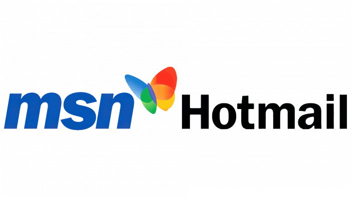
At the start of the new millennium, MSN changed its logo. This was reflected in the identity of the postal service because the management wanted to unify all brands. In the new version, the blue abbreviation “MSN” was on the left, and there was a multicolored butterfly above its upper right corner. On the right, the designers have rendered the word “Hotmail” using a solid black font.
2007 – 2010
In 2007, the brand became Windows Live Hotmail. His logo now has this phrase, written in a sans serif font of different weights. On the left side, there was a distinctive Windows checkbox.
2010 – 2011
The logo’s creators split the label into two lines: “Windows Live” at the top and “Hotmail” at the bottom. The flag was replaced by an icon with an orange envelope in 3D style.
2011 – 2013
In 2011, the Windows Live brand disappeared, so the name was replaced by Microsoft.
2012 – 2013
The word “Microsoft” was removed, “Hotmail” was orange, and the envelope was two-dimensional.
2012 – 2019
In 2012, Outlook.com replaced the old email service. Its name on the emblem took the same place as “Hotmail.” A rectangle with a white “O” has been added to the envelope. The designers preferred blue as the main color.
2019 – today
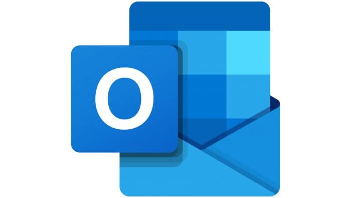
In 2019, the web application began using the same logo as the Microsoft Office program of the same name: a large blue envelope with two rectangles. One shape with the letter “O” was on the left. The second one looked out of the envelope and consisted of pixels of different shades.
Outlook: Interesting Facts
Microsoft Outlook is a popular tool for organizing personal information and is best known for handling emails. It also helps with calendars, task lists, contacts, notes, journaling, and web browsing.
- Works Well with Microsoft Exchange: Launched in 1997 with Microsoft Office 97, Outlook’s big deal worked smoothly with Microsoft Exchange Server. This made it useful for handling emails, schedules, and workplace tasks.
- Two Versions for Different Users: Outlook came in two flavors early on: one for home use (Internet Mail Only version) that was simple to set up with email accounts and another for businesses (Corporate/Workgroup version).
- Outlook replaced Microsoft Schedule+: Outlook replaced Microsoft’s old scheduling software, Schedule+, merging its time management features with new email functions to offer a better way to manage personal information.
- Rich Text Emails: Outlook was among the first to let you send emails in Rich Text Format (RTF), meaning you could make your emails look fancy with bold, italics, and other formatting.
- Outlook Today Feature: Early versions of Outlook had “Outlook Today,” a handy page summarizing your emails, tasks, and calendar events at a glance.
- Stores Data in PST Files: Outlook’s data (like emails and contacts) is kept in Personal Storage Table (PST) files. This is crucial for backing up or transferring your Outlook information.
- Available on Multiple Platforms: Although Outlook started on Windows, it is now available on Mac OS, iOS, Android, and as a web app, making it accessible almost everywhere.
- Better Security Over Time: Outlook has improved its security features, adding better spam filters, phishing protection, and encryption support to keep your email safe.
- Integrates with Microsoft 365: Outlook works closely with Microsoft 365 tools (like OneDrive, Teams, and Office apps), making it easier to work and communicate within teams.
- Interactive Emails with Adaptive Cards: Outlook now lets you use adaptive cards in emails, so you can do things like answer surveys or respond to invites right from your inbox, making email more interactive and useful.
Outlook has kept up with the times, evolving from a simple email program to a crucial part of Microsoft’s productivity tools. Its value in personal and work communication is clear.
Font and Colors
The letter “O” stands for the name of the Outlook service. The rectangle in the background symbolizes paper writing. All corners are rounded to inspire subconscious trust in users.
The current logo is not labeled, but it used to be a sans serif font. Blue has a shade of # 0072C6.
Outlook color codes
| Vivid Sky Blue | Hex color: | #00daff |
|---|---|---|
| RGB: | 0 218 255 | |
| CMYK: | 100 15 0 0 | |
| Pantone: | PMS 311 C |
| Spanish Sky Blue | Hex color: | #00aaed |
|---|---|---|
| RGB: | 0 170 237 | |
| CMYK: | 100 28 0 7 | |
| Pantone: | PMS 2925 C |
| Celestial Blue | Hex color: | #0091e3 |
|---|---|---|
| RGB: | 0 145 227 | |
| CMYK: | 100 36 0 11 | |
| Pantone: | PMS 279 C |
| French Blue | Hex color: | #0079d8 |
|---|---|---|
| RGB: | 0 121 216 | |
| CMYK: | 100 44 0 16 | |
| Pantone: | PMS 2727 C |
| Bright Navy Blue | Hex color: | #0065bc |
|---|---|---|
| RGB: | 0 101 88 | |
| CMYK: | 100 46 0 26 | |
| Pantone: | PMS 7455 C |
| Dark Sapphire | Hex color: | #002967 |
|---|---|---|
| RGB: | 0 41 103 | |
| CMYK: | 100 60 0 60 | |
| Pantone: | PMS 281 C |
