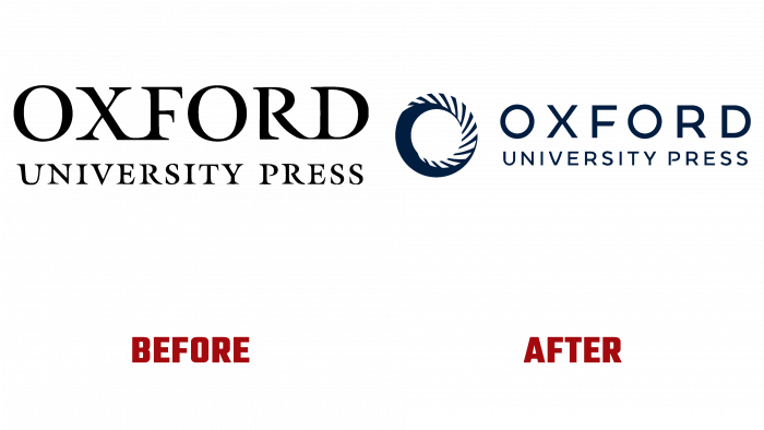
Oxford University Press – one of the world’s oldest higher education institution divisions, founded in 1586, showed its new logo. The style update was carried out for the first time in the last 30 years. Designed by Superunion branding agency and renowned logo designer Rob Clarke.
As the largest publishing house globally, Oxford University Press has the largest annual financial turnover among such organizations. To ensure the speed and convenience of distribution of educational, children’s, scientific and other literature, the publishing house has opened 60 branches in various countries of the world, where printing is carried out in the country’s language. The first such representative office was a branch in the United States, which opened in 1896. Today the publishing house carries out printing of literature of two directions – “prestigious scientific works under the Clarendon Press brand, and the rest of the literature under its name.
Despite such significant fame, Oxford University Press did not stand aside from the changes that characterize today. The widespread introduction of new technologies into every person’s life, a change in views on the methods of receiving and consuming information by the new generation, and finally, a pandemic – all these are features of the current time, which required a revision of even rooted traditions. To support the ongoing transformation required in the current environment, Oxford University Press has decided to rebrand.
The new logo is a confirmation of the university’s commitment to digital focus. As the main element of the updated style, demonstrating the transition to the latter’s use to increase the availability of knowledge and simplify learning, the logo also reflected the transition from typical British conservatism to flexibility and understanding of modern conditions. Willingness to keep up with the times is the main message that Oxford University sent to the whole world.
The emblem is a circle with a cavity inside, next to which is the text of the institution’s name. The sign has stripes at the top of the circle, symbolizing the book’s pages to be turned. The sign itself is a reflection of the first letter of the university name. This combination refers to the huge legacy of the institution as one of the first publishing houses, which in 1480 became the main printer of biblical works. At the same time, the current transformation symbolizes the current and future multi-format publishing trends.


