


 Pace University Logo PNG
The Pace University logo has only been changed twice, highlighting this private institution’s stability, commitment to tradition, and unwavering consistency. The modern brand identity retains all these key aspects while standing out for its beauty and deep symbolism. The logo is aesthetically appealing and carries important meanings that reflect the essence of the university. This is expressed in the elegance and clarity of each letter, which, upon close examination, appear aligned in a straight and confident row. The bold, wide letters convey a sense of solidity, much like the knowledge students acquire at university.
The brightness and expressiveness of each vowel and consonant emphasize the high status of this educational institution. Arranging the words in two rows creates accents that make both words equally noticeable and attractive to viewers, regardless of their size and style. As a result, the modern emblem is easily recognizable and strongly associated with the name Pace University, an organization with a unique development history. The university, founded in 1906, has borne its current name since 1973 and continues to strengthen its reputation in education.
Pace University began in 1906, when brothers Homer and Charles Pace opened a school of accounting and business in one room of the New York Tribune Building in Lower Manhattan. Known as Pace Institute, it enrolled 13 students in its first year. Demand for accountants and business managers pushed enrollment above 1,000 by 1920.
In 1935, the institute gained authority to award a Bachelor of Commerce degree. Wartime enrollment declined, then rose after 1945 through the GI Bill and returning veterans. The school became Pace College in 1948. A second campus opened in Pleasantville in 1962, extending its reach beyond New York City.
Pace became a university in 1969 and opened its law school in the same year. The School of Education followed in 1977, while the School of Computer Science and Information Systems opened in 1979. Research centers in environmental law and applied ethics appeared during the 1980s. A White Plains campus for graduate and legal programs opened in 1997.
Infrastructure expanded with a Pleasantville student center in 2002 and a New York residence hall in 2005. Pace marked its centennial in 2006. Renovation of the Pleasantville campus finished in 2016, followed by the Momentum plan in 2017 and a performing arts building in 2018. Cybersecurity and artificial intelligence programs arrived in 2019. Hybrid teaching shaped 2020 and 2021, while academic partnerships and interdisciplinary programs expanded through 2023.
Meaning and History

What is Pace University?
This is one of the most prominent private universities in New York’s academic community, known for its “Opportunitas” philosophy. The university has multiple campuses and offers a wide range of programs, including business, computer science, and performing arts, with its main office located in the heart of Lower Manhattan. With a strong foundation in the liberal arts, it has established itself as a leader in professionally focused disciplines. The university takes pride in its diverse student body, attracting students worldwide due to its emphasis on career opportunities and urban life in New York City.
Before 2021

For a long time, the university used only a seal. Then, a logo was introduced, which, although fairly simple, remained unchanged for many years. It was far from ordinary and possessed a unique, almost magical beauty that set the university apart from other educational institutions. The logo combined brightness and restraint, creating a harmonious unity. Its vividness and originality left no one indifferent; it consistently attracted attention.
Although the logo contained only two words, this did not diminish its impressiveness. On the contrary, it was elegant and symmetrical. Just fourteen letters, but each one was thoughtful and refined. The word “Pace” was written in tall, superscript letters but not too dense, giving the inscription a sense of lightness. Meanwhile, the word “University” was typed in capital letters, smaller in size. It is worth noting that both words were placed in two separate rows, aligned so that they began and ended on the same vertical line. To achieve this harmony, the spacing between the letters in “University” was twice as large as in the upper word.
A key feature of the first logo was a yellow line resembling an incomplete circle that drew attention and was part of the letter “A.” This element looked stylish and unusual. The blue letters, yellow arrow-like line, and white background created harmony and emphasized the identity’s originality.
2021 – today
In 2021, the university’s logo was completely redesigned. The line, which was previously considered the main element, disappeared forever. The text elements remained but were rendered in different fonts, giving the logo a more restrained appearance. This change is connected to the university’s elevated status: it has four campuses and offers over 100 academic programs. Such significant achievements call for a more presentable, rather than bright, identity that reflects the institution’s seriousness and stature.
The color palette was partially retained, except for the yellow elements. The word “Pace” is bold and colored in a rich, dark blue shade. All letters are uppercase, uniform, and lack embossed accents. “University” is done in a light blue tone with superscript letters, giving the logo an elegant look. In the new version, the previous parallel arrangement of the words is no longer present.
The Seal
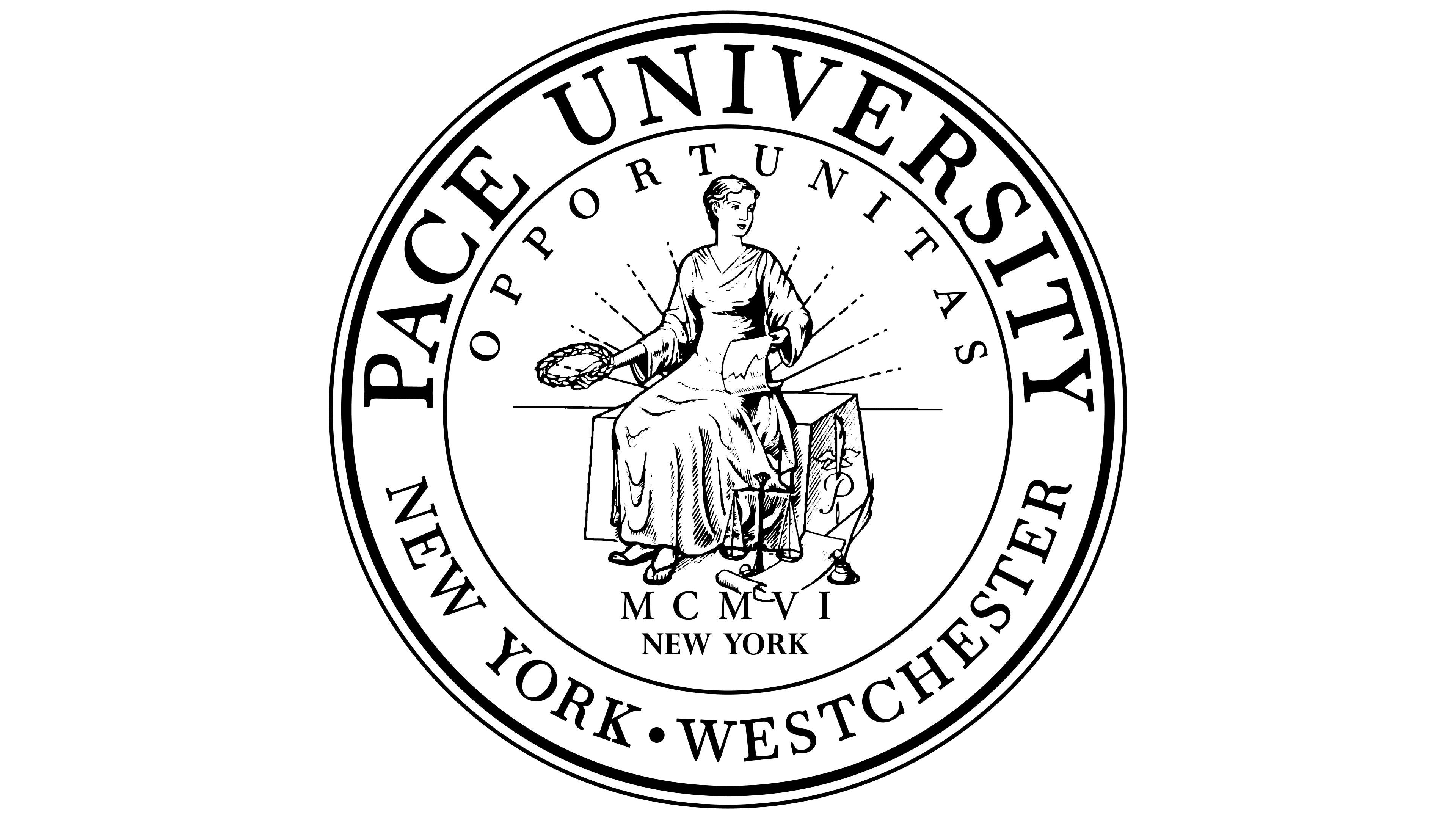
The Pace University seal was also updated, acquiring a stylish, original appearance. Its design features motifs from the past, complemented by timeless elements. Two outer circles, differing in width and color, emphasize the importance of the words and images. Along the contours, the institution’s name and its territorial affiliation are inscribed in large letters. A third inner contour helps focus attention on the central elements of the seal.
At the center is a graphic depiction of a graceful lady. She is wearing a robe, sitting on a rock, holding a scroll and a wreath, symbols of knowledge and eternity. The lady emits light, seemingly conveying the message: “Knowledge is power.” Nearby is an inkwell, symbolizing education and intellect. This image perfectly reflects the mission and activities of Pace University. Around the inner contour is the university’s motto and the year of its founding, written in words rather than numbers. The phrase “New York” appears twice, emphasizing the institution’s connection to the city.