What is going on with the Parler brand identity can be understood, perhaps, only by an employee or a brand insider.
One of the key figures in the company, CEO John Matze, was fired by the board of directors. And they decided to update the platform to come out again with an interesting identity and cool business ideas.
With the departure of the director, all messages on his behalf were deleted. As they say, the person is gone—no information or explanation. What to do, business is sometimes ruthless and taciturn, so it makes no sense to get into someone else’s territory and figure out who is right and who is wrong.
We are interested in visual solutions that emerged after the departure of the head of the brand.
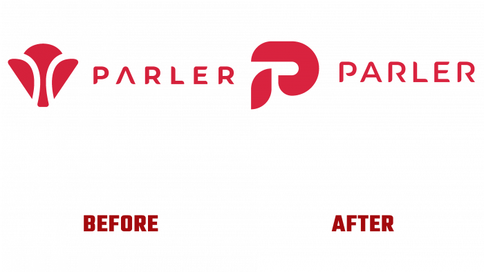
The new logo was launched in early February 2021. It is impossible to understand unequivocally what it is. Someone saw the letter V, someone saw an hourglass, and some even saw a flower.
And before that, there was an interesting logo depicting the letter P in the form of two bold light lines, which were a kind of contour outline of the letter. Everything is clear here: the graphic element and the first letter of the brand name.
But some internal processes began to dominate the company, something went wrong, and in the end, it turned out that the strange new Parler logo did not take root. Most likely, the matter is in the availability of rights to a particular design.
Be that as it may, at the moment, going to the brand’s website, we see the following picture: there is a font part of the logo with the name (all capital letters), and on the left, there is an icon P, which is very similar to the one to which they tried to return.
I must say that the logo now looks clear and aesthetically pleasing. The point is the smoothness of the forms that form its sign. These are rounded parts, like leaves that stretch towards each other.
The management has not yet announced what will happen next with the brand, but clearly, some transformations are taking place. All this is evidenced by the identity and color scheme of the site.


