The unique PartnerStack platform, which is the only one of its kind, has introduced its new identity. Its special feature is the maintenance of affiliates, referrals, and resellers, which provides a steady income for B2B SaaS representatives. The platform was designed to provide affiliate assistance to buyers and sellers of products, services, etc. PartnerStack provides the ability to make decisions through effective and secure non-direct sales or partnerships by expanding methods and volumes of distribution. With thousands of suitable brands in its database, the company promotes any business, allowing it to choose the best option.
Each new client provides the most effective partners with the best and fastest sales promotion by connecting to the platform. Billing and making payments in the system make the processes completely secure. Founded in 2015 by a creative team of like-minded people who put partnerships at the core of the success of any business, PartnerStack immediately became in demand. Its growth and development and the improvements made throughout its operations became the basis for forming a new visual identity.
A different view of how the world is changing and its nature using innovative software formed the basis of the brand renewal. The process was based on the initial desire to develop and the desire to achieve more in a short time. By developing and implementing a different way of selling to the world, the company has created a revolutionary resource, which struck all participants in the partnership market with its innovation and perspective. This gave the developer an immediate opportunity to become a leader in the field.
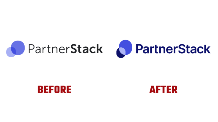
The vision company has not changed; therefore, the logos and identity are very similar at the core, but the new visualization has acquired a more seamless and consistent look. Its display has become clearer and more adapted to the modern display – typographically and digitally. In its graphic design, the brand has ensured that all communication products are closely aligned. At the same time, some inconsistencies in processes caused by rapid growth were brought into overall harmony through some changes in the brand color scheme and fonts. This created a slightly different visual voice and tone in the marketing channels. The result was a better visual system with the possibility of further development.


