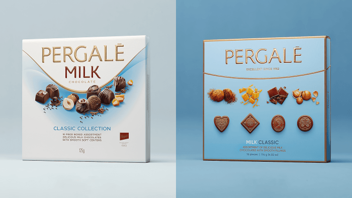
Founded in 1952 in the USSR, the Lithuanian chocolate candy factory – Pergalé, one of the oldest in the country, has undergone a rebranding, making a significant step into the future. Historically, the factory’s products have been loved by many generations of adults and children in Lithuania and the union republics. It was distinguished not only by the variety of tastes, shapes, and designs but also by the colorfulness and attractiveness of the packaging. The growth and development of production are based on the achievements of modern technology, the automation of production lines, which reduce the amount of manual labor. The latter led to the abandonment of old forms, which required adjustments to the packaging form and its design. The creative design studio Behance was charged with solving this problem, changing the graphic design.
Possessing great practical experience and being distinguished by the creativity of their ideas, the studio’s creative team was able to create a new, attractive, and unique appearance of the beloved national dish. So that the cardinal rebranding does not become a lengthy process and, as a result, it was already outdated, it was decided to create a design that would not depend on the time and characteristics of the period of its application. The new visual identity is distinguished by its absolute independence from trends and situational features.
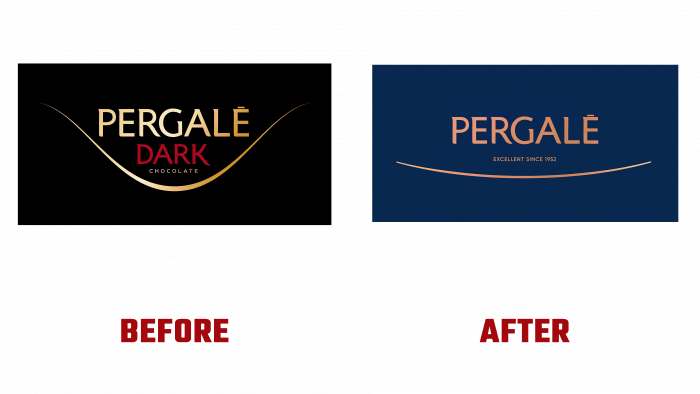
Having changed the packaging design and made dimensional adjustments to the design, the developers tried to preserve the general concept of the packaging design. The characteristics of chocolate – “milk” and “dark” were removed, which reduced the visual load on the image, at the same time smoothing and simplifying the “wave” element, making it look like an elegant ellipse floor. As a result, the logo acquired lightness and a certain “airiness.” A feature of the past design was a visual demonstration of luxury and some splendor. Today, the understanding of these characteristics has changed somewhat, which required changes to the image, giving a new perception. The use of gold has been minimized. The shade itself has been replaced with copper or warm bronze, making it more impressive when conveyed by modern print and digital media. It began to resemble more the tools of professional master chocolatiers. The color palette, selected in a wide variety of shades, has become an effective way of reflecting the entire range of articles produced by the brand.
While retaining their historical essence, all elements of the facial composition have acquired modernity and freshness, standing out for their accuracy of execution and clear correspondence with the display of the essence of the product that is in one or another package. The best option for conveying the flavor of the sweets and creating appeal was the Gilroy font, which was used to create the headlines—considering that the backside had to carry a large amount of information for its application, a thin and tightly docked PT Sans font was chosen. He effectively fulfilled his – legibility and legibility, even on a small scale.


