The Periscope logo is not just a unique design but a real metaphor. It is a kind of “eye” icon looking into the device. This is the essence of this application, and the brand’s visual identity is manifested.
Periscope: Brand overview
| Founded: | 26 March 2015 |
| Founder: | Kayvon Beykpour and Joe Bernstein |
| Headquarters: | United States |
| Website: | periscope.tv |
Meaning and History
Periscope is a development with a long history and a rather interesting development process. The developers’ plans for its creation were ripe back in 2013, but the application was launched a little later.
2013 – 2015
This period became a landmark for Kaivon Beikpur. In 2013, he went on a trip abroad. Once in Istanbul, he saw unprecedented protests erupt in the country. Dozens of people went to Taksim Square and tried to defend their point of view with loud appeals. The future developer wanted to see what was happening there but could not find a video broadcast anywhere.
This situation prompted the idea of creating an application for viewing video in streaming mode. The idea was brought to life in 2014. In February, Bakpour and his like-minded Joe Bernstein founded a company with the bright name Bounty and began work on the utility.
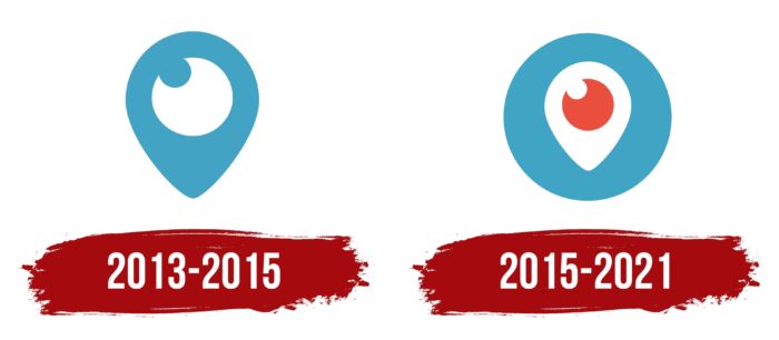
In the process, the inventors decided on the design and name of the future program. They did not invent something complex and confusing. The application received a stylish and understandable logo in the form of an inverted drop. Inside it was an icon, the shape of which resembled a human eye. This design is explained very simply.
The application was created specifically to watch live video broadcasts. This was the decisive factor in choosing the design. The drop evoked associations with the window (screen) of the device, and the inside was similar to the human eye. Complementing the overall picture is the corresponding name – Periscope. Even an uninformed user could immediately understand what the application was intended for.
2015 – 2021
In March 2015, work on creating the utility was fully completed, after which it was successfully launched on the network. In May, a functional version for Android devices also appeared.
Periscope quickly gained a leading position and soon became the object of increased attention for Twitter owners. In January 2015, they acquired the development, and in 2016 some of its functions were integrated into the social network application.
The changes also affected visual identification. The Periscope emblem was presented in several variations:
- an inverted drop in two colors (the blue “pupil” had the same color as the background, and the drop itself was made in white);
- inverted drop, made in 3 colors (the background was blue, the drop was white, and the inside was orange);
- an inverted drop with an inscription (the three-color version of the icon was located on a blue background, followed by an inscription in the form of a name);
- an inverted drop with a “pupil” of red color (the background and main colors remained the same);
Sometimes even a black and white version of the design comes across in the vastness of the network. But, such an emblem rarely comes across. The main logo is an icon made in the form of a drop with an element resembling a pupil. The color scheme includes three shades – red, white, and blue. This design is stylish and modern, and the concise design is associated with simplicity and ease of use.
Font and Colors
Earlier Periscope emblems included, in addition to the basic colors (white and blue), an orange tint. This coloring was associated with comfort, transparency, and reliability. But, over time, the orange was replaced by a rich red color. The overall concept only benefited from this, as the emblem sparkled with new colors and became more recognizable.
Sometimes an extended version is used to identify the application – a drop icon in combination with the company’s name on a blue background. For the inscription, a simple and understandable font was chosen, which any user can easily read. It doesn’t have anything remarkable, but its soft, rounded letters fit perfectly into the overall design.
The combination of rounded inscription, blue background, and elements made in red and white colors evokes only pleasant emotions. The same feeling is provided by the convenient Periscope application, which allows you to see interesting and important events without leaving your home.
Periscope color codes
| Maximum Blue | Hex color: | #40a4c4 |
|---|---|---|
| RGB: | 64 164 196 | |
| CMYK: | 67 16 0 23 | |
| Pantone: | PMS 638 C |
| Cinnabar | Hex color: | #e94f3c |
|---|---|---|
| RGB: | 233 79 60 | |
| CMYK: | 0 66 74 9 | |
| Pantone: | PMS Warm Red C |

