


![]()
Perpetual, previously known as OpenShelf, has introduced a new logo and brand identity, transforming it into a leading provider of self-managing inventory systems for the healthcare sector. The rebranding highlights the company’s focus on automation, precision, and innovation, with its updated name and design reflecting these values.
The new logo features a minimalist design based on geometric squares arranged in a linear pattern. These squares symbolize structured workflows, seamless data flow, and automation integration into complex systems. The spacing between the squares follows the Fibonacci sequence, adding a sense of balance and harmony that aligns with the company’s emphasis on precision and innovation.
![]()
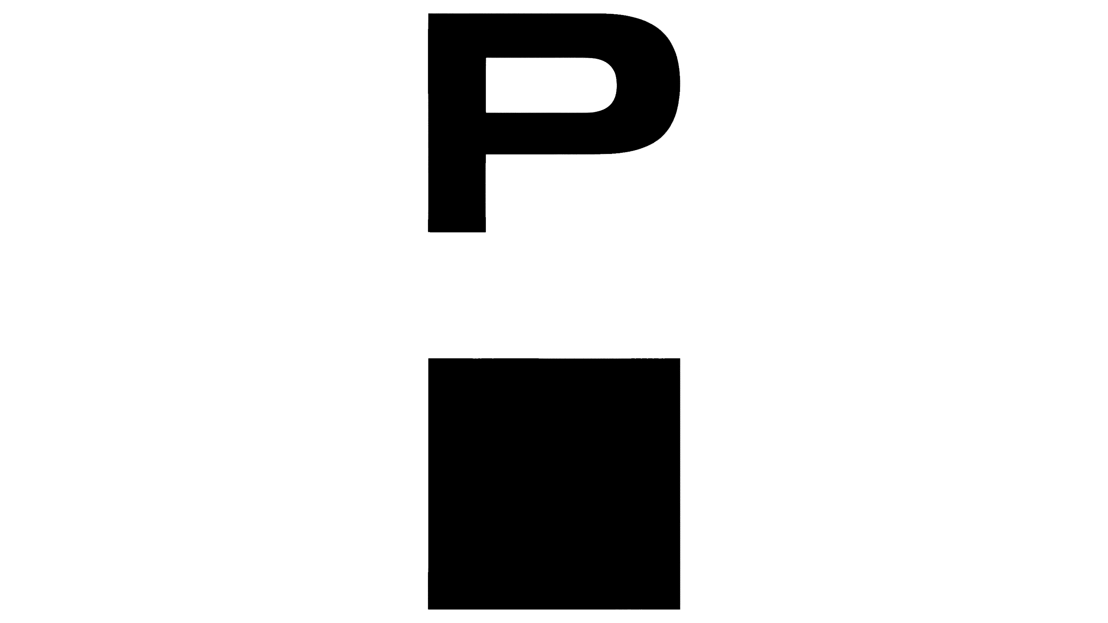
The wordmark uses the Unica77 typeface, a sleek, modern font with clean lines inspired by Swiss design. This choice lends the logo a professional and polished appearance, underscoring the company’s technological expertise. The refined typography contrasts with the softer, more approachable look of the previous OpenShelf logo, signaling a shift toward a more advanced and sophisticated identity.
The color palette has also transformed, moving from the colorful tones of the old branding to a monochromatic black-and-white scheme. This change creates a sleek, high-tech impression while emphasizing the essential elements of the logo. By focusing on simplicity, the new design conveys a sense of clarity and precision.
Elements from the logo’s geometric squares extend into the company’s broader visual identity, appearing in marketing materials, digital interfaces, and other assets. These motifs serve both decorative and functional purposes, reinforcing the brand’s structured and modern image.
This rebranding reflects a broader shift in the company’s message. While the previous OpenShelf identity focused on simplicity and accessibility, the updated branding emphasizes limitless potential, progress, and technological sophistication. The structured design of the logo mirrors the company’s commitment to delivering innovative and reliable solutions tailored to healthcare needs.
![]()
By evolving from OpenShelf to its new identity, the company positions itself as a leader in inventory management technology. The updated branding ensures consistency across platforms, appeals to organizations driven by innovation, and emphasizes the company’s focus on meeting the complex demands of the healthcare industry. Through its refreshed look and name, the company highlights its mission to provide continuous improvement, reliability, and forward-thinking advancements in automation.