Vietnam’s PetChoy, located in Ho Chi Minh City, offers fresh, healthy, and delicious pet food. The young owners of the company consider it an important task for their organization to create conditions for animals that are no different from serving their owners. Over five years, they have perfected their recipes, having studied many specialized formulas from the world’s leading veterinarians, which have become the basis of the brand’s feed, which uses only high-quality fresh ingredients without preservatives and harmful additives. They not only pay serious attention to the quality and healthiness of feed. The brand sets itself the task of organizing training for dog and cat owners, communities of animal lovers, the right approach to the choice of food and their use. At the same time, PetChoy is expanding its knowledge and ability to care for pets to keep them healthy.
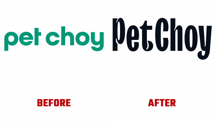
In the summer, with the help of a studio from Ho Chi Minh City-based M-N Associates, the brand carried out its first full rebranding, which touched on everything from visual identity, logo, and style to outdoor advertising packaging digital systems. M – N Associates provides a complete transformation of the offerings of all local feed producers to raise their products above the international level. The studio relied on purely typographic design to begin styling, using TypeType’s TT Trailers as the logo font. Its peculiarity is that its characteristic ink traps resemble cheerful and happy wagging tails and protruding ears.
The main goal was to visually reflect the combination of “choice and joy” of pets who promptly receive their favorite PetChoy food. The new logo in its condensed graphic form, unlike the previous one, carries a lot of information. The distinctive graphics of the font create a visual vibration that brings each letter to life and creates the illusion of a group of playful favorites lined up in a row. This effect is created by playing with the size of the letters – “P” is simply huge, and “h” is very tiny, “t” is strongly shifted down. Everything symbolizes the variety and many types of pets, differing in their size and restlessness. As a result, the logo is perfect for reflecting brand identity with bouncy and playful typography.
The decision to separate the product line for cats and dogs, thanks to using the negative space of the letter “A,” has become effective. The set of icons has become simple, attractive, and easy to remember.


