Exactly one year has passed since the brand became the property of the American group. With deep roots in Alaska, the new owner has achieved a leading position in its field in the region, ensuring the expansion of offers, growth in the number of employees, and prosperity. This was achieved by developing unique offers and the pricing of fish before the start of the season. Attracting attention to such innovations was the main task that needed to be solved in the shortest possible time, which was possible with the help of the rebranding carried out by the company. They created corporate identity was a bold step towards a successful future. For the first time in its 123 years of existence, the brand has achieved such high results in such a short period.
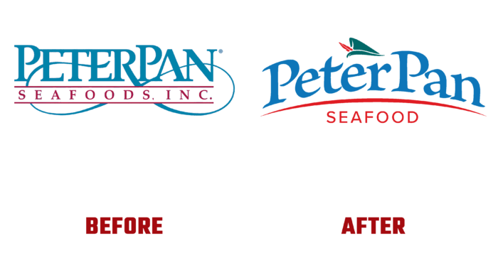
Creating a new image, the designers relied on the company’s extensive historical experience. For 123 years, the brand has carried out various research that has become the basis for creating a new visual identity. As a result, we got a logo and corporate identity, which pay tribute to the history and the founders of the company; we can form a new style to the requirements of modern trends, creating a reflection of the company’s history. This name appeared after the company’s founders saw a theatrical play that had an indescribable impact on them. And the years that have passed since then have not been able to change this decision. Today, thinking about it, the company only became convinced of the correctness of such a decision, finding many parallels between the fairy-tale hero and brand features.
And above all, this commonality is reflected in the boldness of the steps taken in business, which the company takes for its successful development, which is typical for a brave and beloved by many adventurers. Looking at the origin of the name from this angle led to the decision to keep the direct connection between the brand and Peter Pan reflected in the new visual identity. The main element demonstrating such a connection was the hero’s recognizable headdress, made in his original colors. Its original form also ensured recognizability, familiar to everyone since childhood. To connect with the company’s activities’ peculiarities, the logo’s text element was made in a color that symbolizes water with a bend characteristic of an oncoming wave. To create contrast, the text under the name and the line are created using a bright red hue that emphasizes the brand name, making the logo easy to remember and recognizable.


