The French have always been distinguished from other nationalities by their romanticism, glorification of the charm of love objects, and the tenderness of the manifestation of this very feeling. It hovers in the air of France itself, so all spheres of a person’s life should be enveloped in inspiration, enthusiasm, pleasure.
Showing concern for each other in modern society (and even more so for our smaller brothers), you can get an unprecedented portion of reciprocal love, which feeds our personality and creates life itself.
The French company Petty Well, founded in 2018, has such a doctrine. The brand represents food products for dogs and cats, which consist exclusively of balanced ingredients, without gluten and chemical additives, both dry and liquid. The composition includes animal proteins and useful vitamin complexes, for example, glucosamine. Since dogs and cats are loved pets worldwide, the geography of pet food distribution has expanded quite quickly since the company was founded, and the creators of the brand thought to attract attention and give positive to their customers in the current global environment updating the old logo.
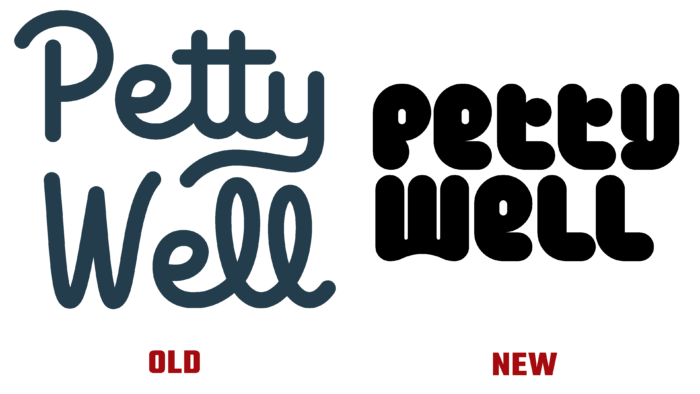
The Parisian agency Brand Brother decided to follow the path of complicating the font and simplifying the color. Previously, the logo was cheerful, tempting orange, the letters were even, but at the same time, in some places, they were connected by graphic connections-squiggles. When you look, you want to touch these “tail” and “eared” letters.
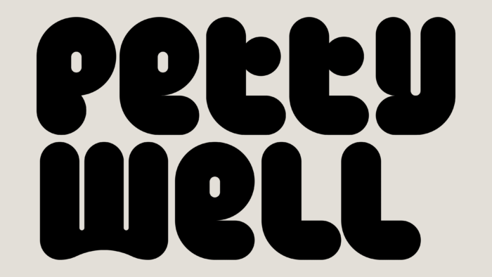
At first glance, the logo attracts attention not by color but by the shape and style of execution of the letters – we can say that it has acquired “edible” forms. The concept is based on the idea of bones. This can be seen in the rounded contours p, e, t, y, l. The masterminds emphasized that there will be several more iterations of the brand renewal since they have not only launched the first redesigned logo in the spring of 2021. Hence, we still have to wait for several stages of rebranding from them. By the way, the font used in publications is Freigeist by Rene Bieder. It is sharp and soft and perfectly shows the “biting” and soft nature of animals.
Animalistic images were also introduced into the identity, which was created in the same way as the logo. Many oblong rectangles with closed corners, pleasing to the eye colors: pink, muted orange and yellow, and grassy green. Such simple, childishly executed pictures create a pleasant impression, even if it looks like a child or an aspiring illustrator made them. But, like everything that the French do with love, it looks very cute and resonates with a caring owner of a cat or dog.


