PEZ, a popular candy brand famous for its unique dispensers, has launched a new logo. The company, which distributes about 70 million dispensers and 5 billion candies annually in over 80 countries, updated its logo to better appeal to a global audience.
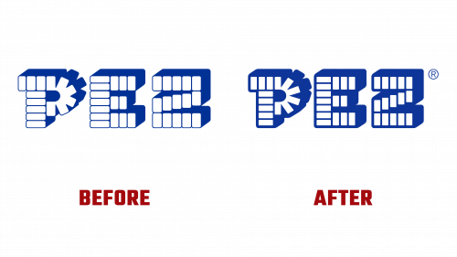
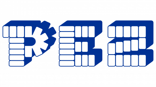
The updated PEZ logo keeps the playful and vibrant style of the old design but is now simpler and more streamlined. It features a bolder, clearer font that works well on large billboards and small smartphone screens. The familiar red and yellow colors are brighter, aiming to attract both longtime fans and new customers.
The new logo design straightens the previous curves in the letters, giving it a modern and strong look. This change makes the logo easier to read on small devices and more striking on large displays.
The redesign also increases the space between the characters, making each letter stand out more. This helps people recognize the brand more easily, whether they see it briefly on digital devices or from far away. The edges of the letters are sharper, and the angles inside them are more defined, adding to the logo’s modern feel.
The new logo does away with the drop shadows of the old design, choosing a flat design that keeps its look consistent across all sizes and uses.
This logo change is part of PEZ’s efforts to stay relevant in a quickly changing market. The new design is made to meet the needs of today’s digital world, ensuring that the PEZ logo continues to represent fun and creativity in the candy industry.


