Phageguard, a pioneering food-tech company founded in 2005, has revolutionized the food safety industry with its cutting-edge phage technology. Known for their unique ability to eradicate harmful bacteria such as Salmonella, Listeria, and E.coli, phages present a potent solution for recurring food-borne diseases without altering the food’s taste, color, texture, or smell.
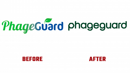
Earlier, Phageguard’s logo was notably substandard. Lobster and FF Cocon typefaces, combined with a disappointing gradient and an overstated leaf, created an impression more akin to a low-grade, chemical-laden pesticide than a state-of-the-art, all-natural solution.
While not entirely embodying a natural motif, the rebranded logo signifies a considerable upgrade. It weaves a more polished design, instilled with relevance by including the hexagonal shape of the phages in the starting “p.” However, the design isn’t devoid of limitations. It presents a degree of inconsistency, showcasing letters with varying attributes, such as a distinctive hexagonal “p,” “g,”s, and “d,” missing a spur, and an “a” with a stem that extends to the top. The focus of the Phageguard logo inadvertently deviates from the “g”s due to their prominence, thereby lessening the effect of the main “p.” Despite these flaws, it outshines the former design. Still, its quest for simplicity seems unintentionally intricate.
The highlight of the rebranding is undoubtedly the innovative shield graphic. Inspired by the 3D hexagonal heads of phages, it depicts a dynamic, transparent 3D shield enveloping diverse food visuals. This clever design component hints at the principal ingredient in Phageguard’s offerings and is delivered freshly and compellingly. The shield’s enchanting gloss, apparent at certain angles and with realistic food pictures, bolsters the notion that Phageguard is the guardian of our food.
The rotation of food images within the shield and the dark green backdrop significantly boost the visual allure. The background accentuates the shield’s multicolored gleams and echoes Phageguard’s natural methodology. The selection of FK Display as the main typeface proves effective, infusing a dash of technological elegance that mirrors Phageguard’s scientific facet.
Despite the minor logo glitches, this rebranding represents a significant progression that more accurately conveys Phageguard’s mission. It positions the company as a reliable and respected figure in the food safety market, amplifying its stature as a trailblazing entity in the food-tech space.


