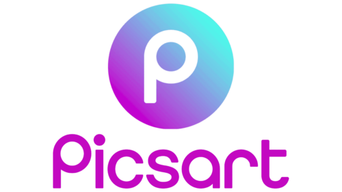
The Picsart logo is filled with creativity. The emblem demonstrates the quick and easy operation of the application. Create unique photos with digital tools and user-guided artificial intelligence.
Picsart: Brand overview
| Founded: | 2011 |
| Founder: | Hovhannes Avoyan, Artavazd Mehrabyan, Mikayel Vardanyan |
| Headquarters: | Miami, Florida, U.S.; Yerevan, Armenia |
| Website: | picsart.com |
Picsart is a popular Armenian creative editor for artistic photo and video processing in 180 countries with its social network for sharing impressions, experiences, and images. The Picsart logo can be seen on Google Play and the AppStore, where the app has been downloaded 1 billion times.
The app debuted for Android in 2011 and for Apple devices in 2013. The origins of the company were two programmers and a businessman from Armenia. Now the company has 1,000 employees and, at the insistence of investors, it moved to the United States. For director Hovhanness Avoyan, this is the fifth and most successful startup, inspired by the desire to help his daughter, whose paintings were constantly criticized online.
Meaning and History
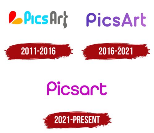
Although relatively young, the Picsart logo has been updated twice, moving from artistic to digital standards.
What is Picart?
Phone application for photo editing, which 150 million users per month use. The application’s main functions are free; additional ones are paid by subscription—project headquarters in Miami.
2011 – 2016
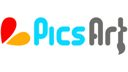
The first logo consists of an emblem and a stylized name. The inscription focuses on the purpose of the application and the history of its name.
The word Picsart is visually divided into two parts due to different colors and the capital letter A. It turns out Pics (photos) and Art. Co-writing can be translated as “the art of photography” or “photos that have been processed into a work of art.”
In addition, the Pics part is an abbreviation for the word pixel, which refers the user to computer graphics and informs that artistic processing is carried out by influencing pixels with computer tools.
The last letter, Art, is stylized as a brush, which visually demonstrates the word’s meaning.
The first part of the word is in sky blue and hints at a computer screen. The second part is dark gray, like a rough pencil sketch. Indicates the creative process leading to the transformation of the picture.
There are two colored petals in front of the name: red and orange. They resemble the paint squeezed onto the palette with which the master will work.
Red and orange shades denote beauty and attractiveness, which indicates the process of improving the photo. The colors represent communication and contacts. Reflects the presence in the program of a community of passionate users who support each other.
2016 – 2021
Avoyan understands that investors are needed for the further development of the application, for which he goes to the United States. The Sequoia Capital fund supported the entrepreneur, investing $10 million. In general, the project received 35 million. At the insistence of the investors, the headquarters moved to California. In 2015, Picsart was recognized by Forbes as the hottest startup.
The app logo changes from a bit childish to more solid. The new emblem is a purple inscription. The word is still divided into two parts by a capital letter A, but the brush and palette have been removed. The main user tools are digital. Working with them is not like the strokes of an artist.
A purple hue indicates creativity, fantasy, and self-realization. The spacing between the letters has increased, demonstrating the scale of the application and its popularity.
2021 – today
Currently, the functions of the application are based on artificial intelligence. It will do most of the work. Ready-made filters are also available to users. The work no longer resembles art and is more like technical skills with digital tools. Therefore, the emphasis on the word “art” was removed.
In the new Picsart logo, it’s a one-piece title done in a lilac-violet hue. Neatly rounded letters resemble pixels. The smoothing of sharp elements indicates ease of operation. To use the application, you do not need to be an artist and have a special talent.
Photo processing is simple and familiar to those who know how to use a computer.
Font and Colors
The main shades of the logo are purple and lilac. These colors highlight the app’s focus on user experience—the development of creativity and imagination.
For the name, a font was used with smoothed protrusions of the letters r, a, and p, demonstrating the elimination of all defects in the photographs.
Picsart color codes
| Deep Magenta | Hex color: | #c309c1 |
|---|---|---|
| RGB: | 195 9 193 | |
| CMYK: | 0 95 1 24 | |
| Pantone: | PMS 807 C |
